
How to communicate with children, and what to avoid
Shapes, colors, typefaces and words: what reassures a child, what pushes them away, and why the same choice speaks to their parents too
When you work for children the first research isn’t done in manuals, it’s done on yourself: you have to go back to when you were small and ask what frightened you, what made you smile, what made you dream. Our imagination was simple and boundless at once, loosely structured and for that very reason enormous, and whoever designs for a child has to step back into it without carrying the rules of an adult.
Memory alone isn’t enough, though, because it tends to embellish, so it’s worth setting it beside what the psychology of perception has measured, to find that on many things intuition was right and on others less so.
Starting from what frightens
We didn’t like pointed shapes, and it isn’t just nostalgia: in 1975 Robert Fantz and Simon Miranda observed that newborns, with area and contour length held equal, look longer at curved figures than at angular ones, so the preference for roundness is there from birth, before any experience of pain. In adults, sharp objects are liked less and activate the amygdala more, the region of the brain that assesses threat (Bar and Neta, 2006 and 2007), and already at two and a half a child pairs the made-up word “bouba” with the round shape and “kiki” with the spiky one (Maurer, Pathman and Mondloch, 2006), a sign that roundness isn’t learned, it’s recognized.
In the same way we preferred the warmth of wood to the cold of metal, and here too the reason is physical before it is emotional: at the same temperature metal draws heat from the hand much faster, and that is why we feel it as cold. We looked for the softness of a pillow and not the roughness of bark, tactile sensations that a designer translates into visual signs, and that the eye recognizes before the hand even touches.
Color, a code that depends on context
Of color we remember the blue of the sky and the green of the meadow where we ran happily, and it’s tempting to think that red, the color of blood, frightened us, but research says otherwise: asked how each color made them feel, five and six year olds associated positive emotions with bright colors, red included, and negative ones with dark colors such as brown, black and gray (Boyatzis and Varghese, 1994). Red isn’t frightening in itself, it becomes frightening when context gives it a meaning, and in a dental practice that meaning is precisely blood; it is a convention, not a law of the eye, which is why there it must be used with care, while in a playroom it can be the color of celebration.
The same goes for pastels, because children love full, saturated colors, while pastel tints speak mostly to parents, evoking care, calm, cleanliness, and in material that has to win over both they work as a ground, leaving bright color to the points where you want to draw the child’s gaze. More than hue, what counts is lightness, because it is light against dark that makes a page readable and gives it a serene or gloomy tone.
Recreating the comfort zone
Communicating to a child and for a child therefore means rebuilding the context in which they feel safe, with soft-shaped typefaces and, for headings, even a slightly wobbly handwriting that resembles their own; for text meant to be read, on the other hand, you need a clear typeface, with the “a” and the “g” drawn the way they are learned at school, because a child learning to read gets lost in front of a letter they don’t recognize. The rest is done by soft subjects, surreal elements, inverted proportions, materials that invite touch, and friendly language, never intimidating.
Inverted proportions deserve a closer look, because a large head, large eyes and round cheeks are what the ethologist Konrad Lorenz called Kindchenschema, the baby schema that triggers the caregiving instinct in adults. In 2014 a research group led by Marta Borgi showed that children between three and six also recognize it and are drawn to it, with their gaze landing first on infantile features, which makes it one of the rare signs that speak in the same way to the child and to the parent.
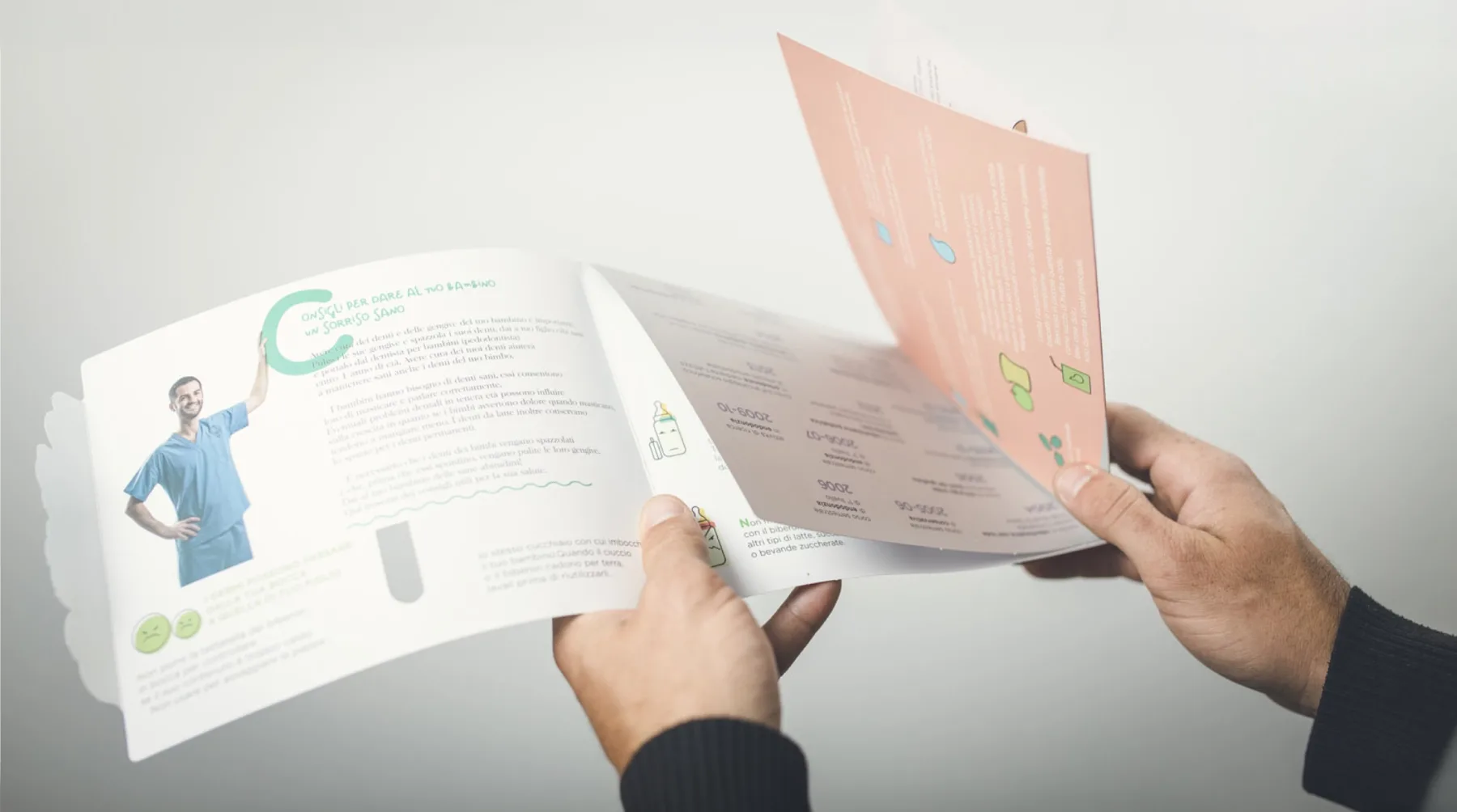
A case, the leaflet for Dr. Agresti
I have worked on communication for children several times, and one project stays with me in particular: the information leaflet for Dr. Daniele Agresti, a pediatric dentist, designed to raise awareness of dental hygiene and prevention among children and pregnant women. Among the technical choices I simulated an off-register print on the illustrations, with color slipping past the outline the way it does when a child colors over the edge, and it isn’t a printing error, it’s the trace of a hand that hasn’t yet learned the rules and for that reason thinks outside them, with a purity adults have lost. In semiotic terms it is an index, a sign that carries the proof of the gesture that produced it, and it is the most credible way to tell a child that here we speak their language; it’s a solution I would use in other projects too, wherever the spontaneity of an uncorrected gesture is needed.
Then there is a moment the child discovers alone, the ice cream drawn on the page that, when the page is turned, becomes a toothbrush: pleasure and care live in the same gesture, with no prohibition and no lecture, and that is the difference between material that explains prevention and material that makes it desirable. The full project is in my portfolio and on Behance.
Strategy comes before form
None of these choices comes from taste, because before designing a page I always ask myself the same four questions, those of THE BOOK: who the client is, who they address, how they position themselves or want to, what they exist for. In Dr. Agresti’s case the client was a pediatric dentist who wanted to tell a professional story without the coldness of a medical practice; the leaflet addressed two audiences at once, the child and the pregnant woman, who read the same page with different eyes; the aim was to be recognized as the doctor you trust before you even sit in the chair, and the leaflet existed to bring prevention before the problem.
From those answers the choices followed, the soft palette that reassures the mother, the off-register print and the ice cream that speak to the child, and with the choices came the renunciations, which in a project for children matter just as much: the clinical image, the color that recalls blood, the typeface a child can’t yet read, the sentence that sounds like a reproach, all things avoided not because they are ugly, but because they work against the goal.
Trust is built early
To the questions about the client three more are added about the child, what their world is, what makes them curious, how I can move them, and whoever answers these earns the appreciation of the audience, because “a friend of the child is a friend of the parents too”.
In the case of a dentist the point goes further, because a study from the University of Toronto found that in half of adults afraid of the dentist that fear began in childhood (Locker and colleagues, 1999). Whoever takes care of a child’s first encounter with the practice isn’t just shaping a calm little patient, they are preventing the anxious adult that child could become, and they are speaking to the parent too, who may have carried that fear for a lifetime: if a child trusts their dentist, an adult who was afraid as a child can finally let themselves be cared for.
And you, do you remember what frightened you as a child, and what made you feel safe instead?
I’m curious to hear your thoughts.
S. Forcina / Design Director
Comments
No comments yet. Yours could be the first.