Form does not precede meaning
In 1896 the architect Louis Sullivan wrote that “form ever follows function”, and the line, often credited to the Bauhaus, became the most quoted rule of modern design. In brand identity, though, function is not enough to explain a form, because a mark does not only have to work, it has to mean something, and that is what separates a sign people remember from one they see and forget.
Beauty is not a goal
When beauty becomes the goal of a project, the work starts from the palette, the typeface, the reference saved months earlier, and it ends with a result that is consistent with itself and with nothing else; the surface is tidy, it pleases everyone in the meeting, and six months later it has not moved the perception of the brand by a millimetre.
The beauty that lasts comes from somewhere else, it is the consequence of an order in which form, function, culture and meaning hold the same relationship, and to get there you always start from the bottom, from what that brand has to say and who it has to say it to.
Meaning first, as Vignelli wrote
In The Vignelli Canon, published in 2010, Massimo Vignelli divides design into three dimensions, semantics, syntactics and pragmatics, and puts semantics first; the very first thing he did with any new assignment, graphic, product, exhibition or interior, was to search for its meaning, starting from the history of the subject, the company, the product, its market position, the competition and the people who would use it.
He wrote that design without semantics is shallow and meaningless, and that the final look of anything is the by-product of the clarity, or lack of it, during its design phase. These are the words of the man who drew the New York subway diagram, and they work as a rule of method, form is the result of a clarity reached beforehand, not its starting point.
Brand and mark are not the same thing
In Brand Identikit, Gaetano Grizzanti separates the brand from the mark with a precision worth remembering; the brand is a conceptual entity that sums up the reasons why a person prefers and chooses, while the mark is the visual and verbal code through which that brand presents itself, and it is also a legal entity.
If the mark is the code, the brand is the message, and nobody writes a code before knowing what it has to carry. This is why a logo does not fix a confused offer or a weak positioning, it only makes them more visible.
Meaning is found by listening
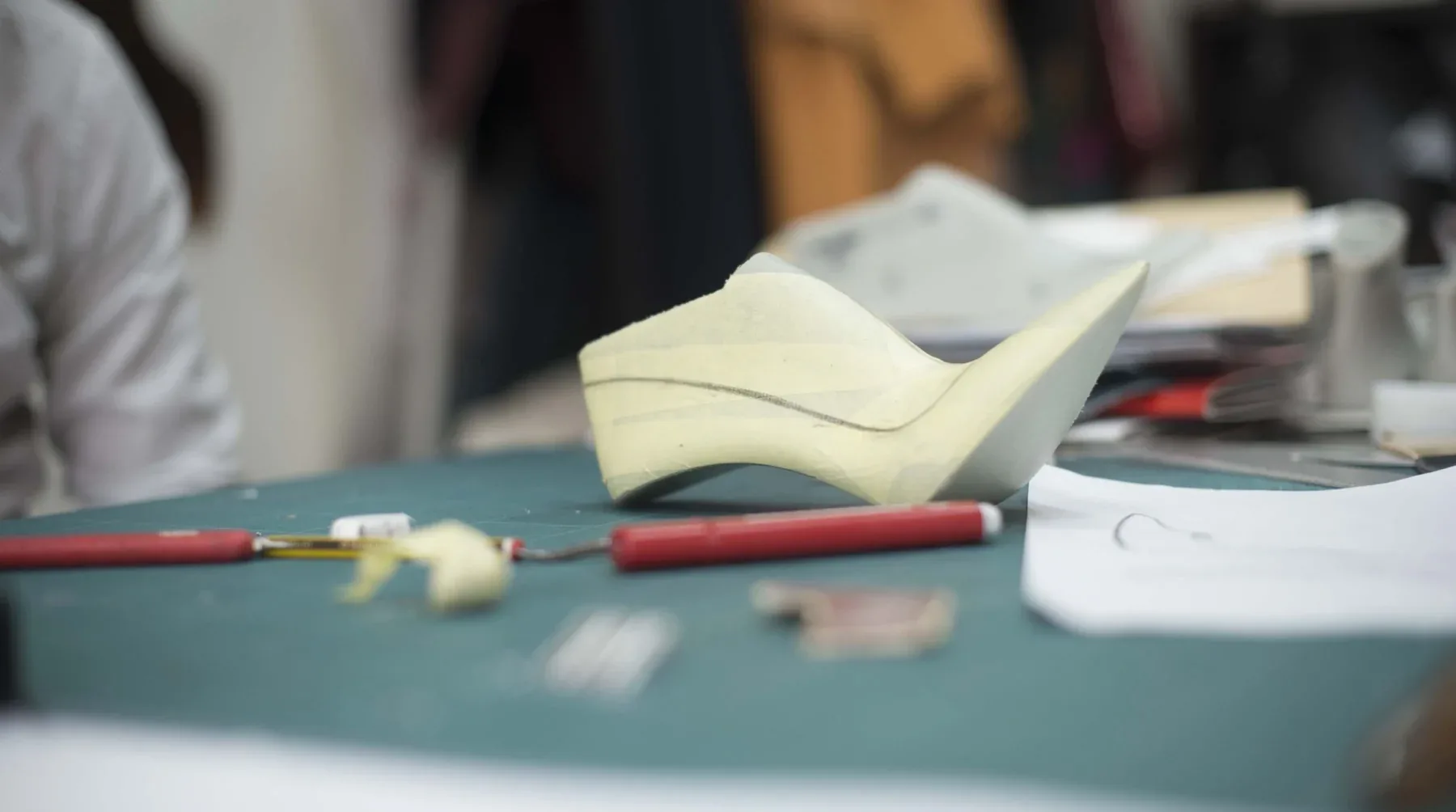
Meaning is not invented at the drawing table, it is found by listening, and before I draw I learn the craft of the people in front of me. When I worked on the restyling of L’Arianna I went into the workshop, I watched the hands tracing a pattern in pencil, the shoe last taking shape on the cutting mat, the boxes leaving the factory, because a sign that does not know the hands that will carry it remains a surface.
Then comes the brief, which works like a road sign, if it is not drawn precisely it leads somewhere else, and the time lost correcting the course is always paid for in consistency. The brief puts in writing who the client is, who they speak to, how they are positioned or want to be positioned, and why they exist, four questions answered in full sentences, because continuous prose forces you to choose what comes first.
Every choice must be defensible
Once the meaning is clear, form stops being a matter of taste; the typeface is chosen for the voice and the memory it carries, the colour for the relationships it builds with the positioning and the audience, the composition for the hierarchy it gives the message, and every element can be defended in front of the client with a reason, not a preference.
It is also why an identity is not judged on the moodboard, it is judged when the sign is applied to a touchpoint nobody had planned for, and it still holds, because it was built on an idea and not on an image.
Time is the test
Sullivan spoke of function, Vignelli of meaning, and more than a century apart they were looking for the same thing, a form that does not depend on the season it was born in. Vignelli wanted design to go beyond fashionable modes and temporary fads, and time is the only test an identity cannot fake; a mark built on meaning grows old with the brand, a mark built on a trend grows old with the trend.
“Form does not precede meaning, it is always its consequence”.
Think of a mark you have remembered for years, what made it stay, the form or what that form told you?
I am curious to hear your thoughts.
S. Forcina / Design Director
Comments
No comments yet. Yours could be the first.