
Material is perceived before it is seen
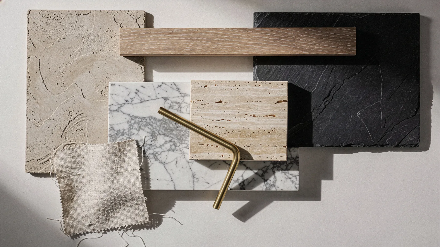
Before we look at a room we have already perceived it, through the temperature of the floor, the acoustic response of our footsteps, the light a wall holds back or gives back, and by the time we actually look the judgement has already begun. Material speaks before form does, and what it says stays with the people who live in a space far longer than any colour or piece of furniture.
Jet and its imitation
In Victorian England, after the death of Prince Albert in 1861, Queen Victoria wore mourning for the rest of her life and black jewellery became a fashion, most often in Whitby jet, a fossilised wood that is light and warm to the touch. Alongside jet circulated its imitation, so-called French jet, which was black glass; in a display case the two looked alike, in the hand they did not, because glass is heavier and stays cold. The difference between a genuine material and its copy is rarely visible, it is almost always perceived through touch.
The perceived temperature of materials
An oak floor and a marble floor, in the same room and at the same temperature, give the foot two opposite thermal perceptions, and it is not suggestion. Skin does not measure the temperature of an object, it measures how much heat that object draws away from it, and stone draws it away quickly while wood holds it close to the surface.
This is why stone in a summer entrance brings relief and wood in a bedroom brings a sense of retreat, and the choice is not a matter of taste, it depends on what the people who enter are meant to feel.
Every material carries its own time
In The Eyes of the Skin, published in 1996, Juhani Pallasmaa observes that twentieth-century architecture privileged the eye and neglected the other senses, while the experience of a place passes through the whole body; in Atmospheres, Peter Zumthor devotes pages to the temperature of a space and to the way materials attune to one another. Both say, in different words, that the quality of an interior is measured by what the skin, the ear and the step register without our noticing.
There is also a quality that only genuine material possesses, memory. Oak darkens in the light, brass takes on a patina where the hand touches it, leather softens where people sit, stone is worn smooth along the most travelled path, and in semiotics each of these marks would be called an index, the physical trace of whatever produced it. Every mark left by use is proof that a space has been lived in, a signature no catalogue can print.
Pairing materials so each enhances the other
A material on its own says one thing, set beside another of a different nature it begins to tell a story. Porous travertine beside brushed brass, oiled oak beside raw linen, matte lime plaster beside polished stone, wool beside metal, are pairings in which each makes the other’s quality more legible, because rough is perceived better next to smooth, warm next to cold, matte next to what reflects.
It is the same principle of contrast that holds a well-composed page together, applied to touch and temperature instead of black and white; an interior made of a single material is as monotonous as a text set entirely in bold, one made of too many materials no longer has a voice. The work lies in finding a few materials that answer one another, three or four, and giving each one its role.
Material as brand vocabulary
In a boutique, a boutique hotel or a hotel that carries the name of a maison, materials are as much the brand’s vocabulary as the mark and the typeface. Visitors do not read the identity manual, they touch the counter, perceive the weight of the door, walk on a floor with a solid or a hollow acoustic response, and from these signals they infer the value of what is on display. When material, form and brand concept say the same thing, the space becomes the physical proof of the positioning.
When the material pretends
This is why finishes that imitate a genuine material, laminate printed with oak grain, ceramic that reproduces marble, vinyl that passes itself off as stone, work in photographs and give themselves away in person. The eye soon recognises a grain that repeats identically every so many centimetres, the step picks up the hollow acoustic response of the floor, the hand finds the same temperature on every surface, and what remains is the impression of a stage set. A copy does not age, it wears out, and where genuine material gains character over the years the imitation only reveals the substrate beneath the print.
It is not a question of price, because there are affordable genuine materials, lime plaster, local timber, terracotta, linen, and there are extremely expensive imitations. It is a question of honesty towards the people who live in the space, and an honest interior is recognised the way an honest brand is, it has no need to declare what it is.
Giving every interior the right sensation
An interior design project begins with the same question as an identity project, what the people who will live in it should feel, and material is the most direct answer because it reaches the body before the mind. A hotel room meant to convey calm calls for matte surfaces, fabrics that absorb sound, woods that stay warm under the hand; a boutique meant to convey precision calls for stone, metal and controlled light; in both cases form comes afterwards, once the material has already said what the place is and who it speaks to.
Comments
No comments yet. Yours could be the first.