Aphrodite
The strategic premise
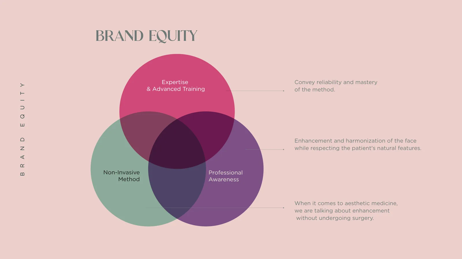
Aphrodite is Dr Daniele Agresti’s aesthetic medicine practice, dedicated to non-surgical facial treatments; the brand had to hold together three values, expertise and advanced training, a non-invasive method and the professional conscience of those who enhance the natural features of a face without distorting them.
The first sketches
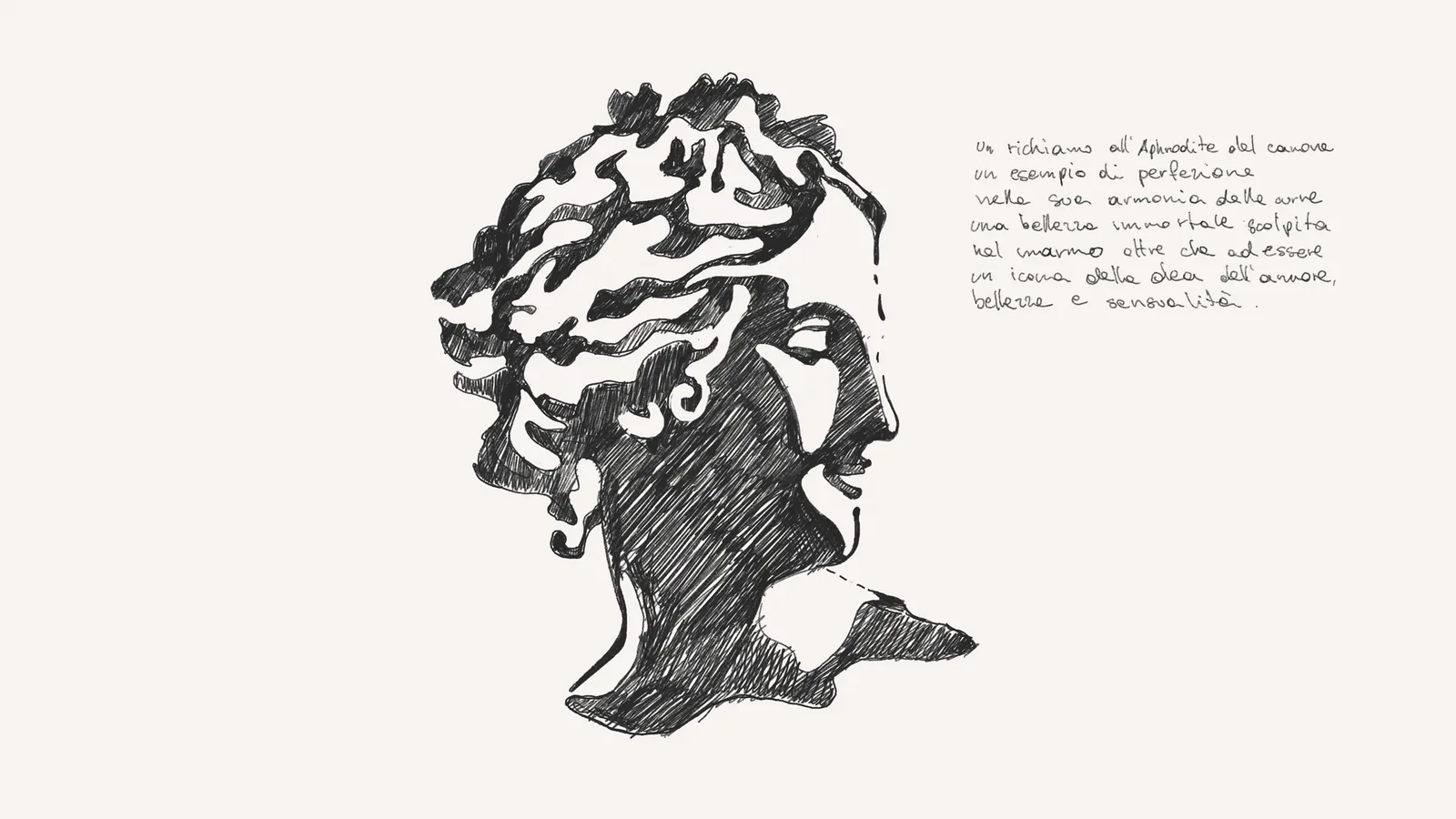
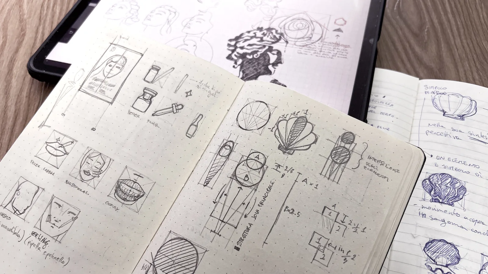
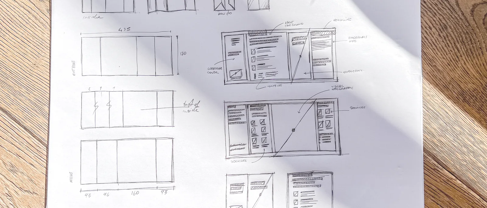
The work starts on paper, a pencil profile of Canova’s Venus, chosen as an example of harmonious and timeless beauty, then the notebook with shells, roses and faces, and the layout sketch for the brochure.
Development
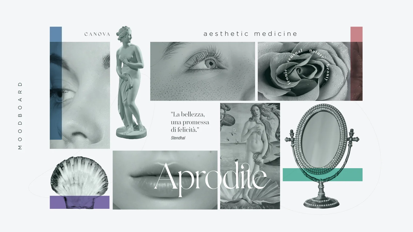
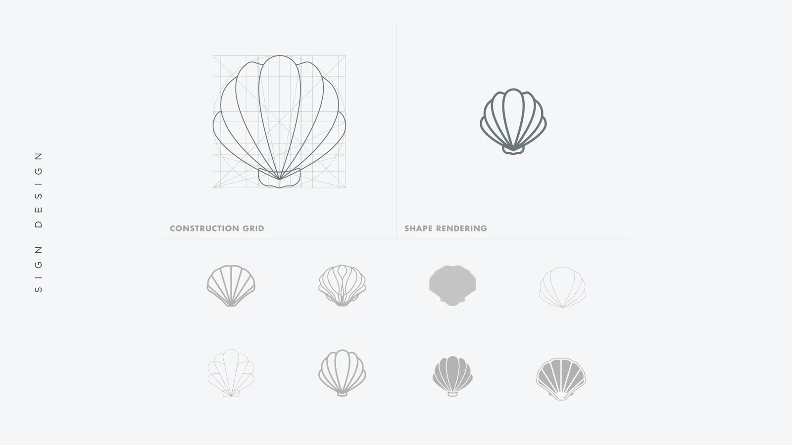
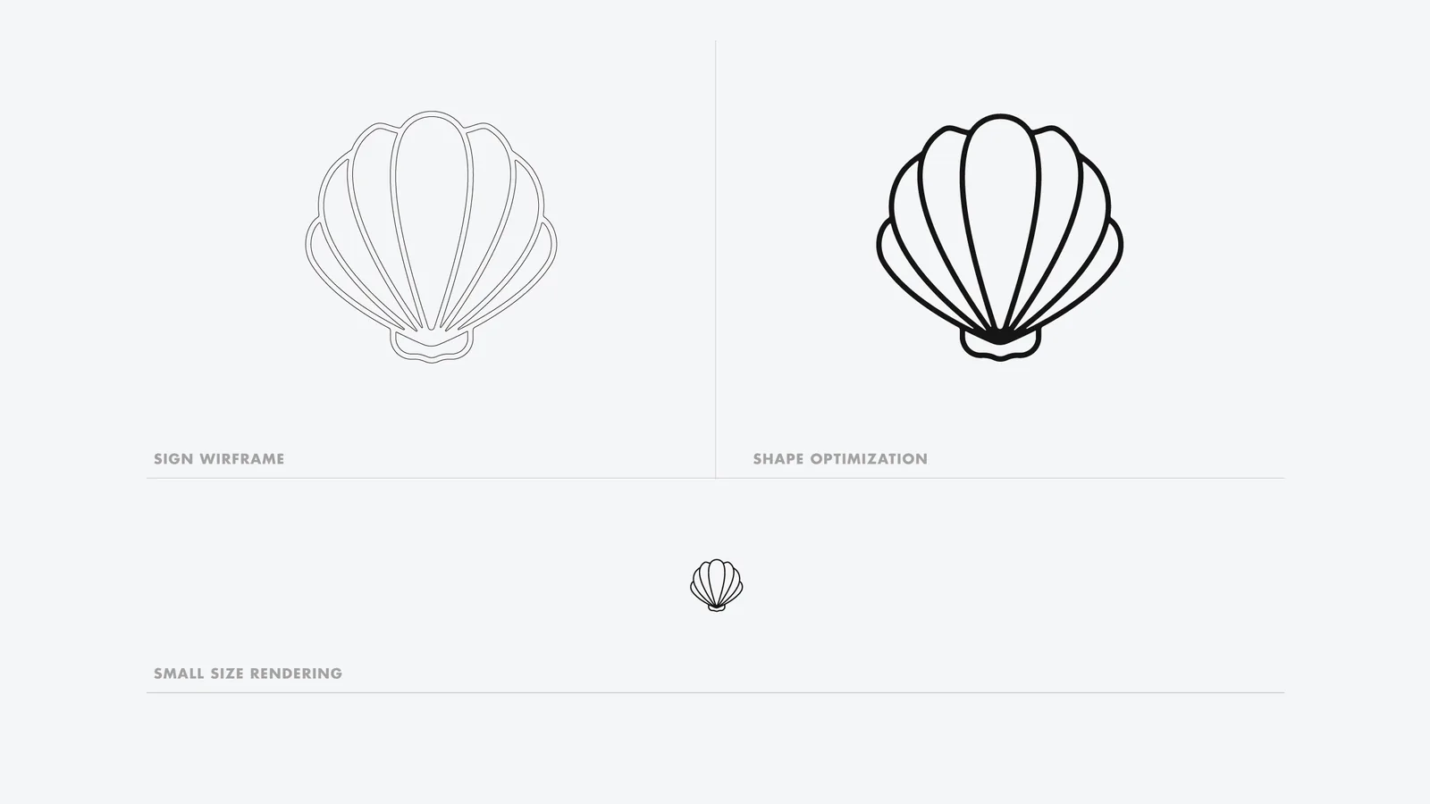
The moodboard brings together classical statuary, details of the face, the rose and the mirror; among the routes explored the shell prevails, the element that in myth accompanies the birth of Aphrodite, drawn on a grid and optimised to stay legible at just a few millimetres.

The system
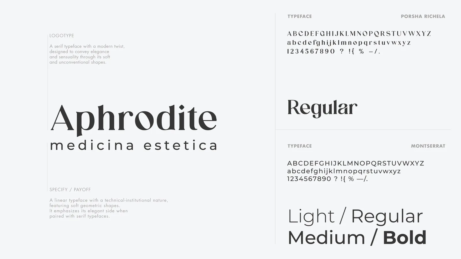
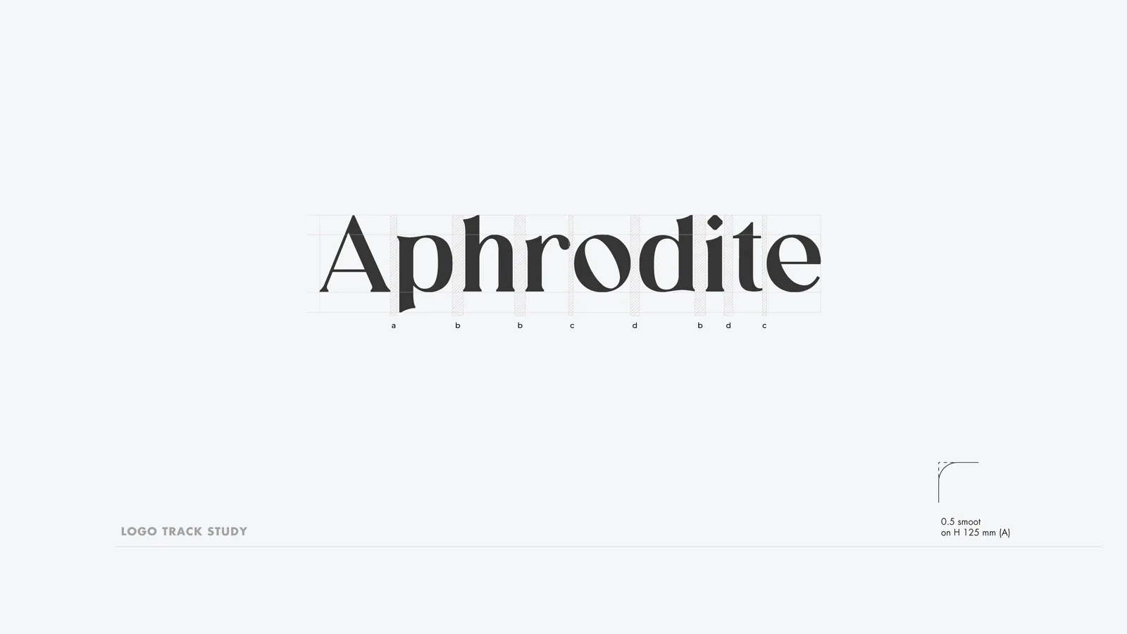
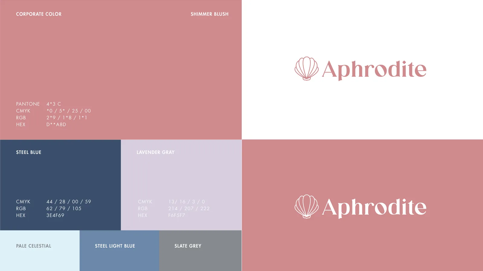
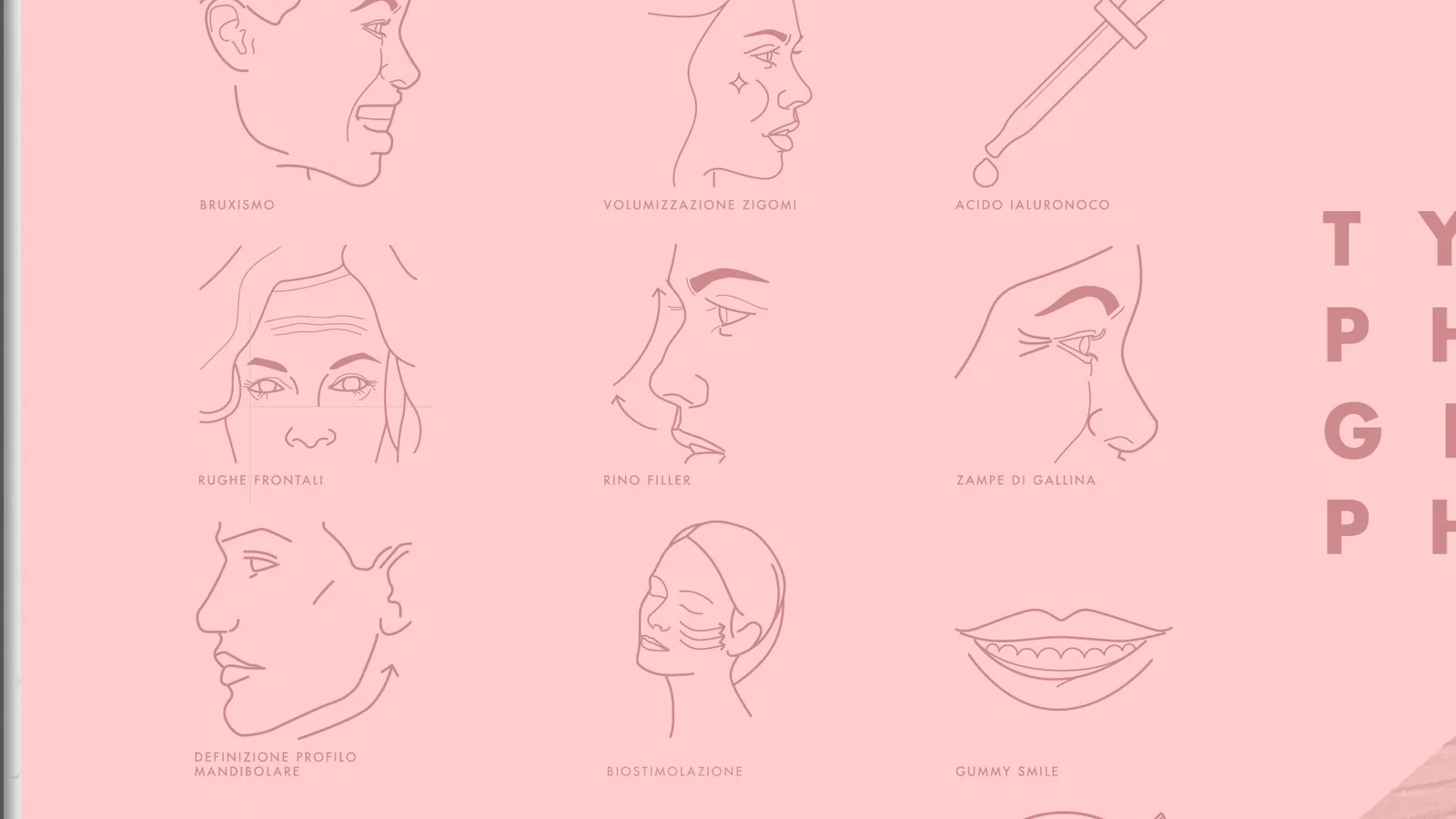
A modern serif logotype accompanies the symbol, a technical sans serif carries the information, and the palette starts from a powder pink alongside blue and lilac; for the treatments an icon system in line drawing shows where and how each one acts on the face.
Applications
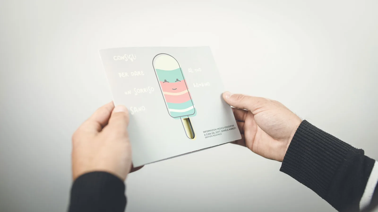
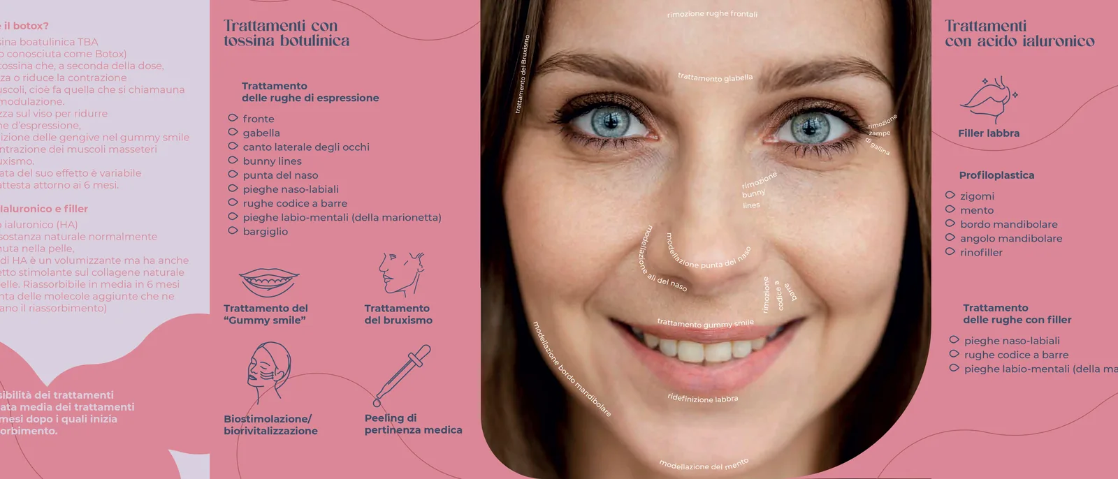
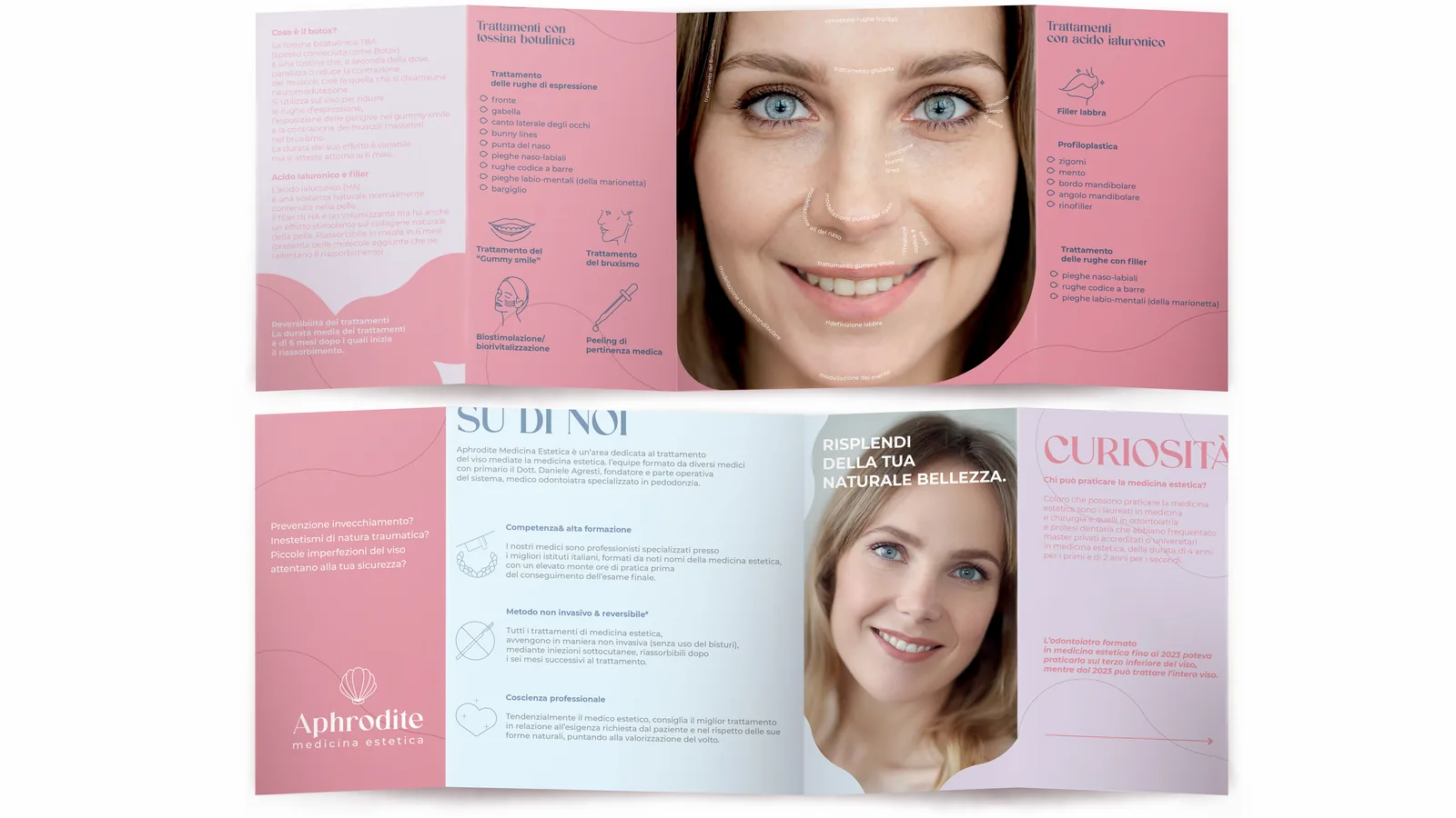
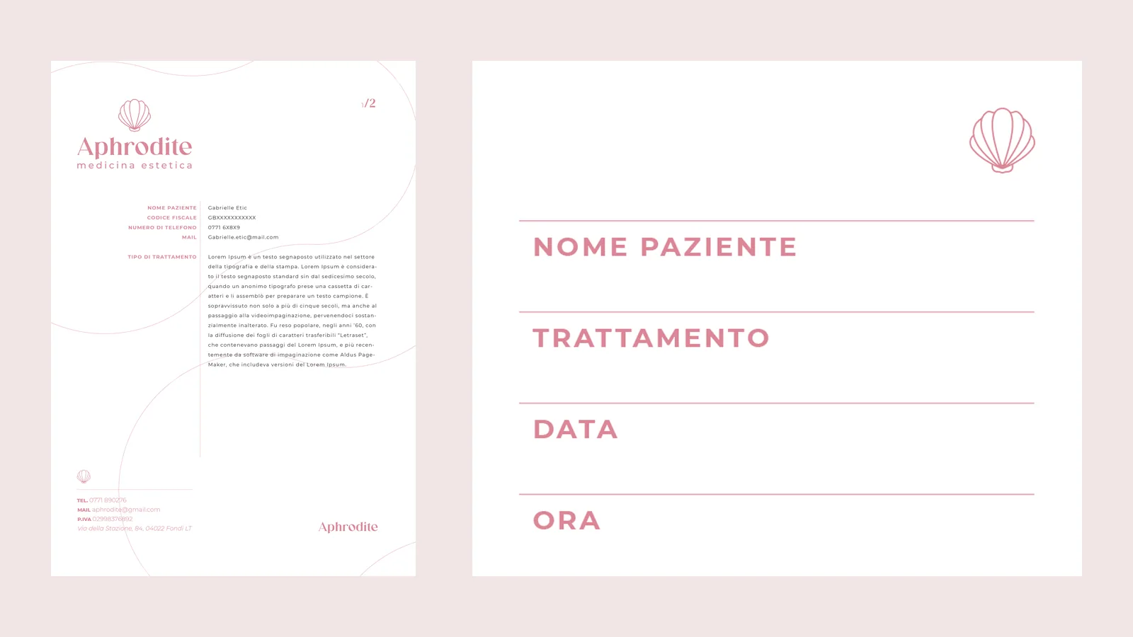
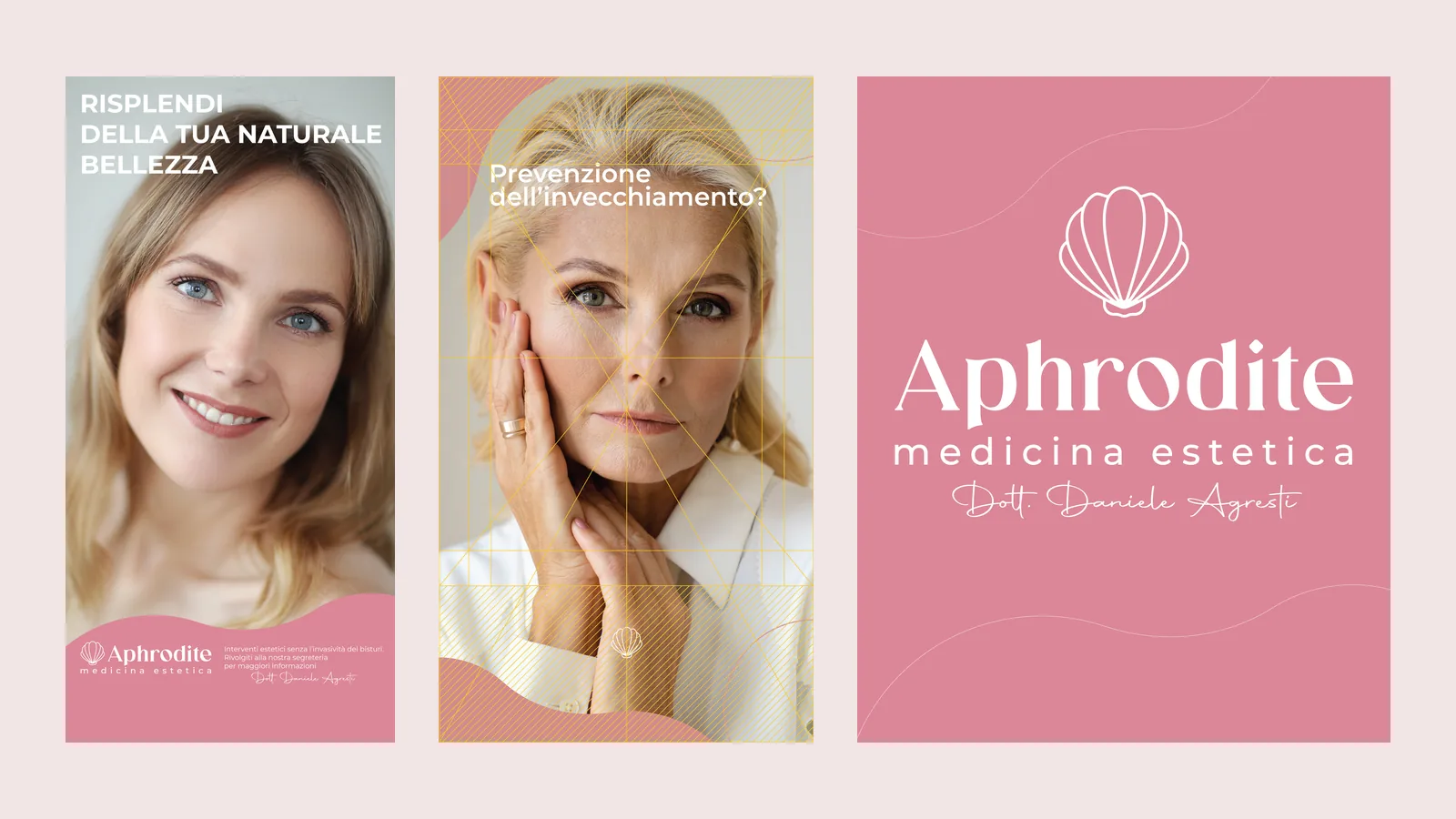
The brochure presents treatments, method and doctor with the icons of the system, alongside the letterhead, the appointment card, the advertising totem and the social media content.
The mark in motion
The animation draws the shell line by line, the way a valve opens.
The outcome
The result is an identity that speaks of beauty with restraint, an ancient and light symbol that promises harmony instead of transformation, consistent with a method that respects the face of those who choose it.
Let us talk about it, or keep exploring the rest of the work.