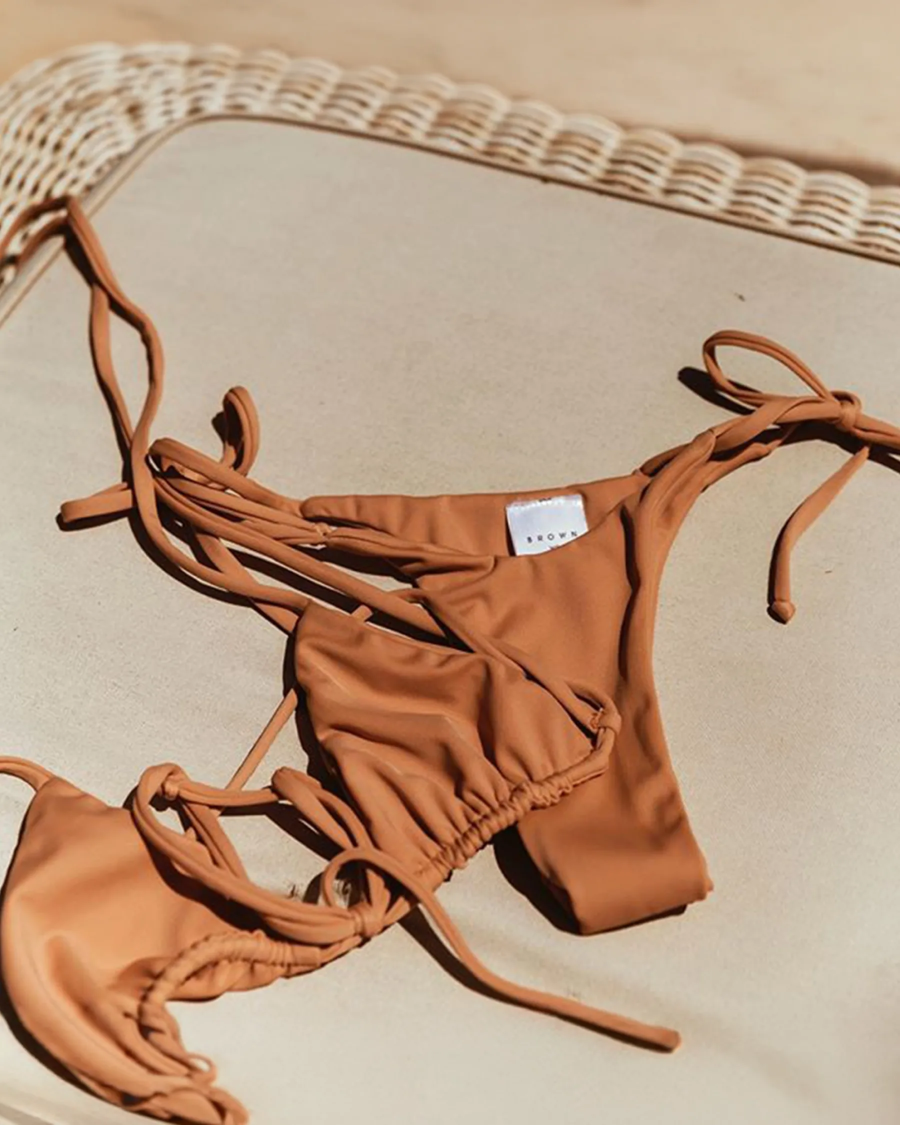
BROWN - beachwear
A visual identity for BROWN that fuses sensuality, tailoring craft and culture through a Romanesque monogram and a contemporary logotype.
The strategic premise
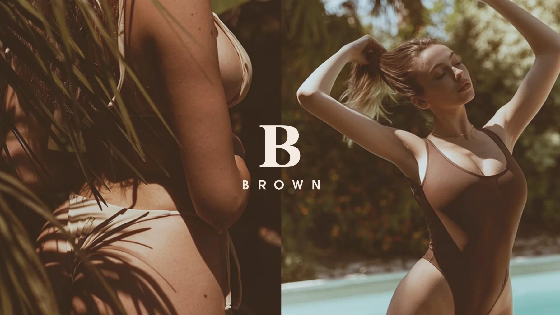
BROWN comes from a precise tension: the sensual freedom of beachwear meets the rigour of artisanal production controlled at every step. The brand governs the entire process, from conceptual design to the choice of yarns, from tailored prototyping through to packaging.
The strategic challenge
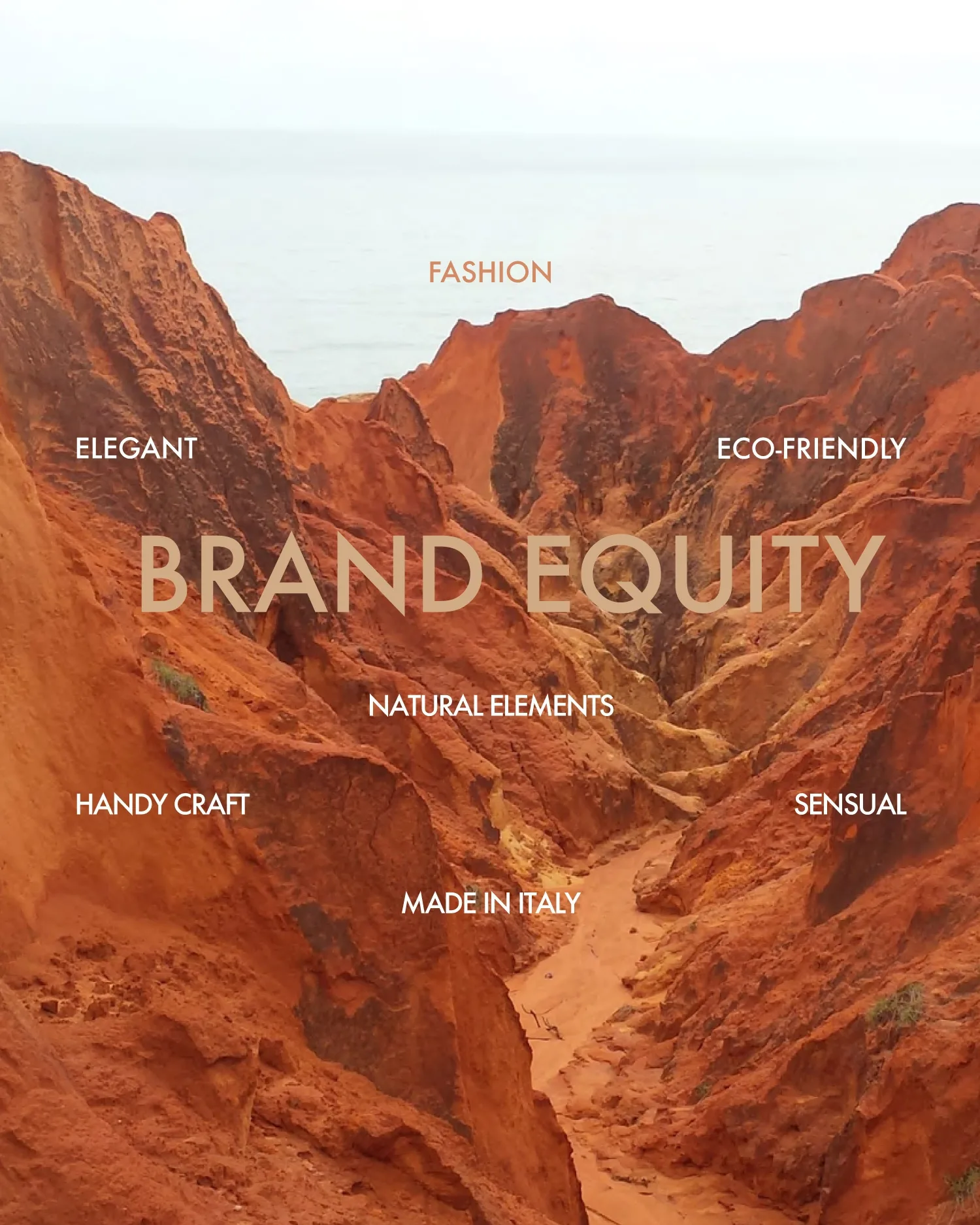
The task was to translate into a coherent identity a positioning made of feminine sensuality, timeless elegance, cultural depth and fashion authority. It meant giving form to a perceptual memory able to carry the brand within contemporary fashion.

The process and the vision
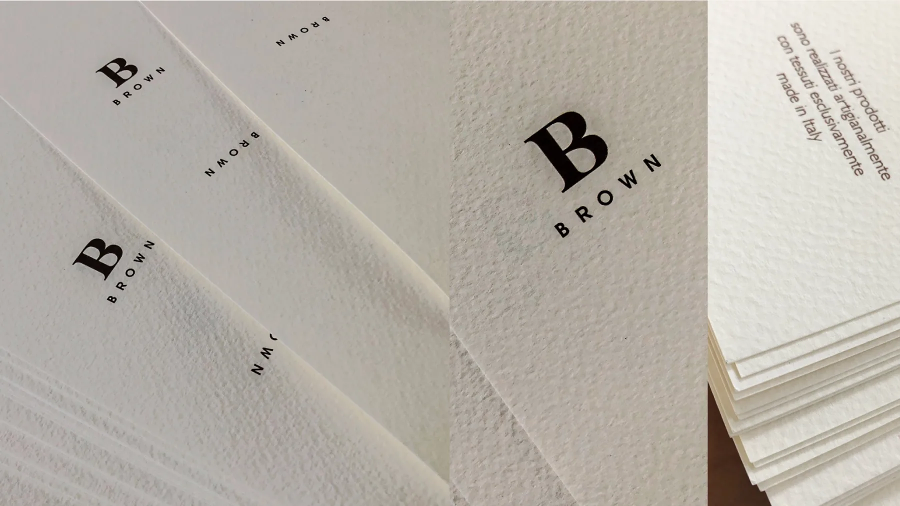
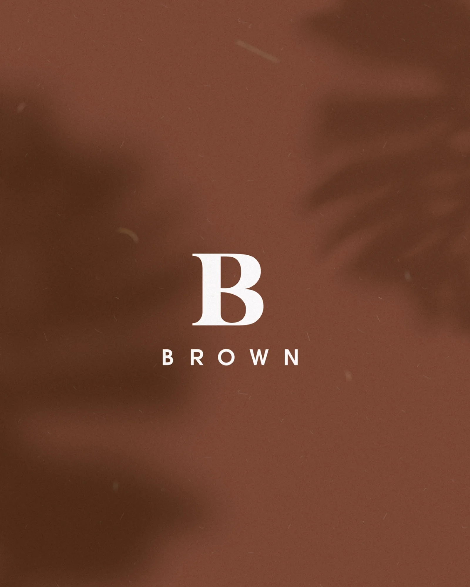
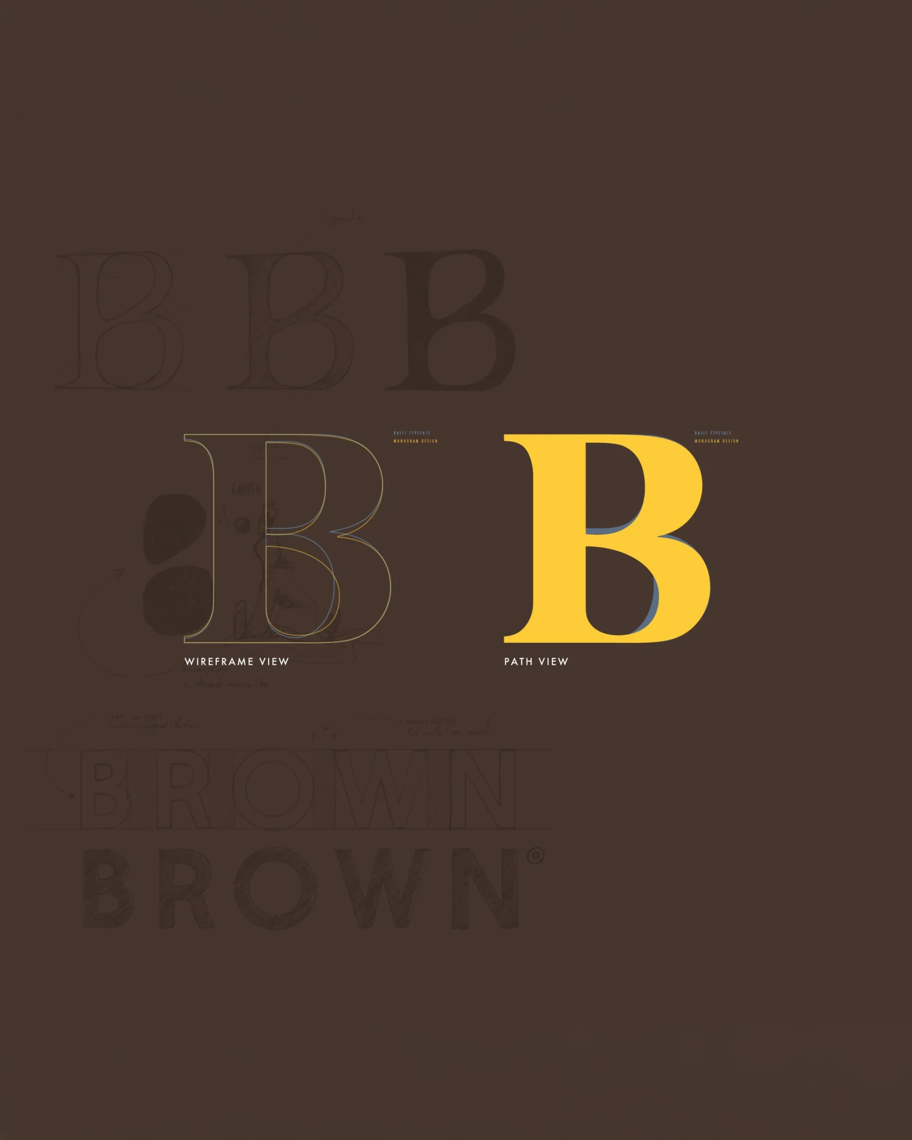
The research worked on the tension between the classical and the modern. The monogram comes from a glyph of ancient Roman origin; the letter B was optically corrected in its vectors and its inner counters to make sinuosity, sensuality and femininity legible.
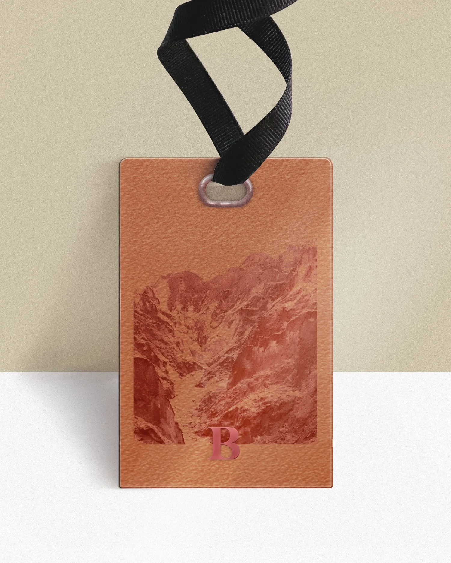
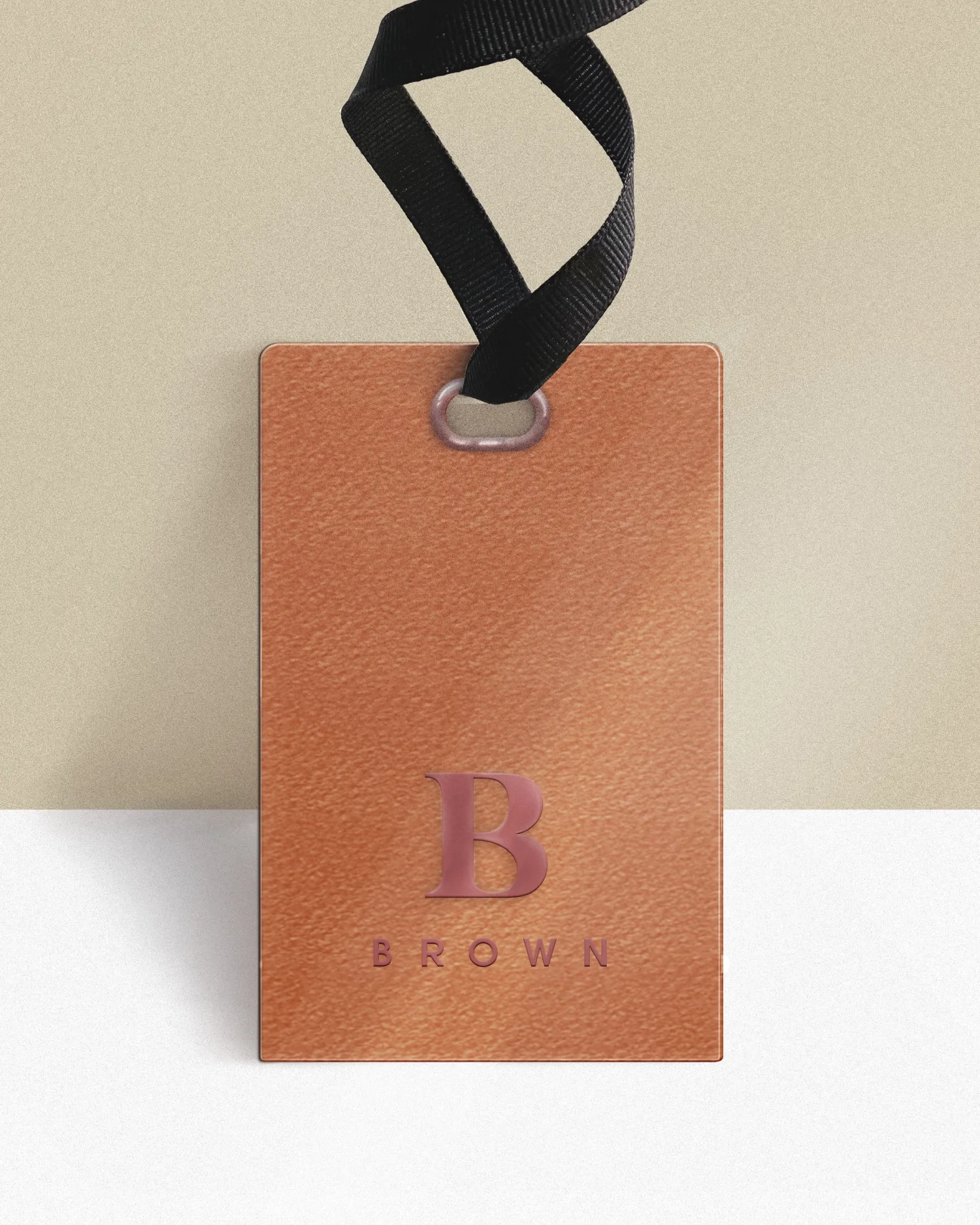
Set against the monogram is a geometric, linear, sans-serif logotype, able to introduce stability and contemporaneity. The red-brown palette, deep and material, roots the identity in the earth and in its authenticity.
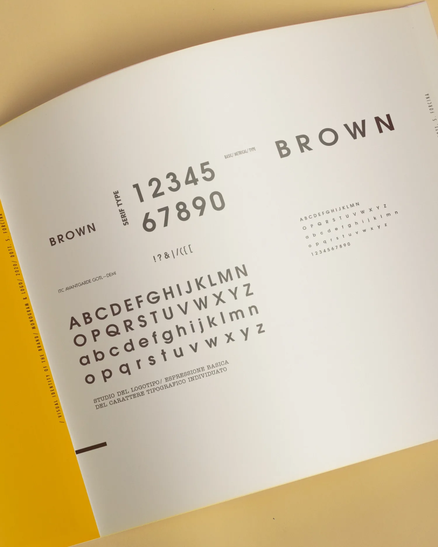
The design synthesis
The result is an identity built on attraction and contrast: a historical sign becomes sensual, a geometric logotype becomes stable, an earthy tone becomes a surface of belonging. BROWN does not declare its character, it lets it settle.