La Meridiana
The strategic premise
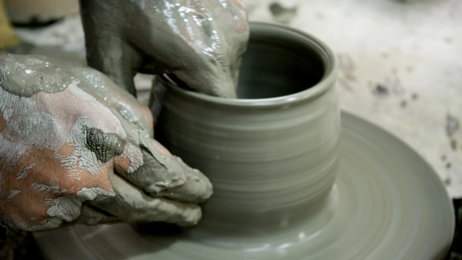
La Meridiana is an Italian brand of handmade ceramics, and its name recalls the sundial, the instrument that measures time with the sun’s shadow, the same slow time clay needs to become an object, between the wheel, the firing and the hand decoration.
The first sketches
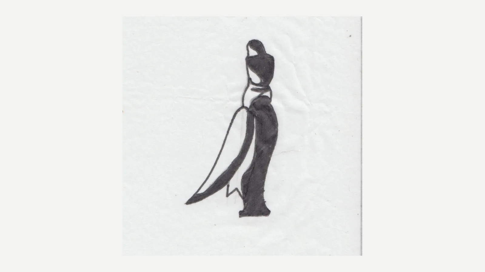
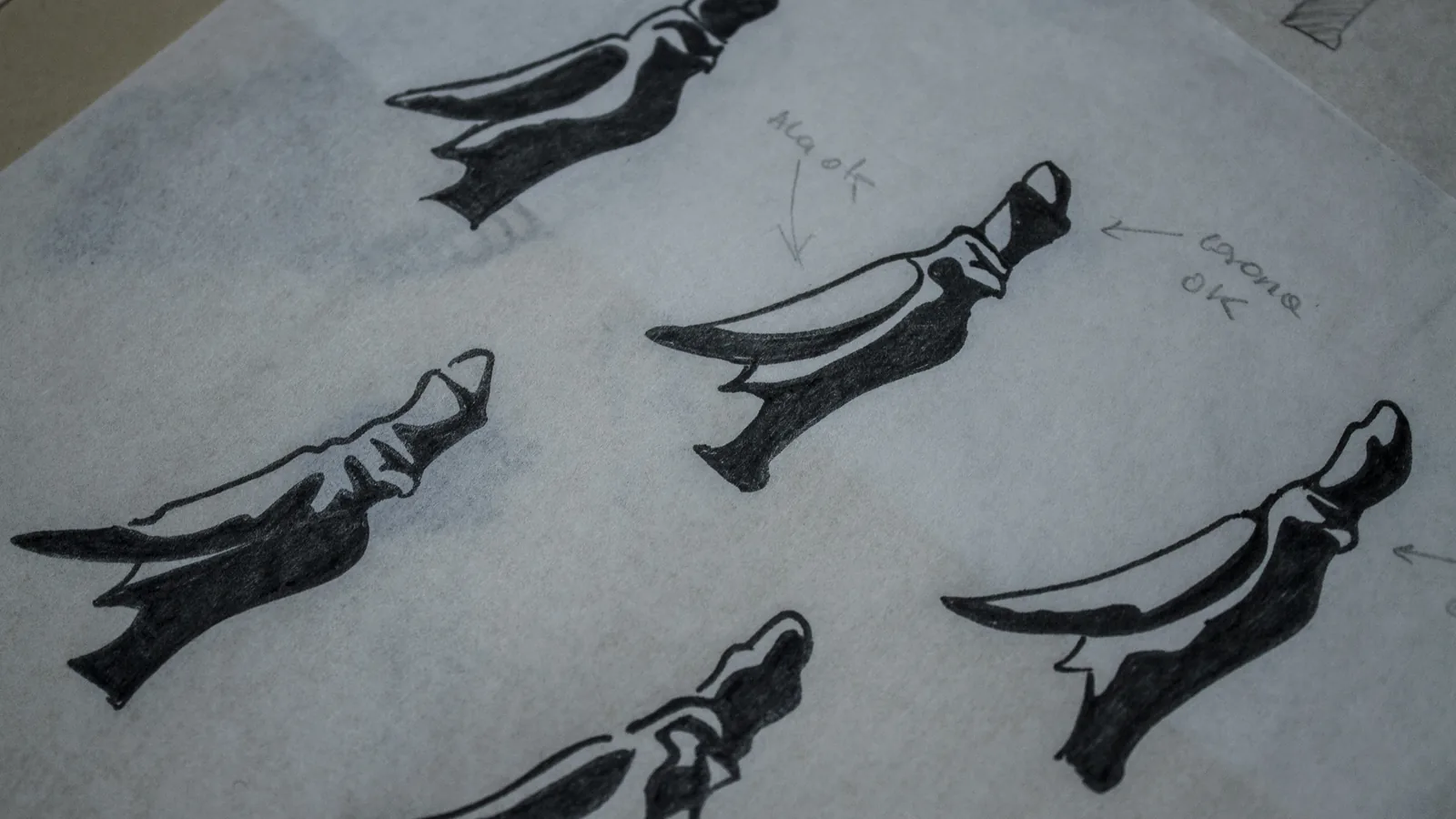
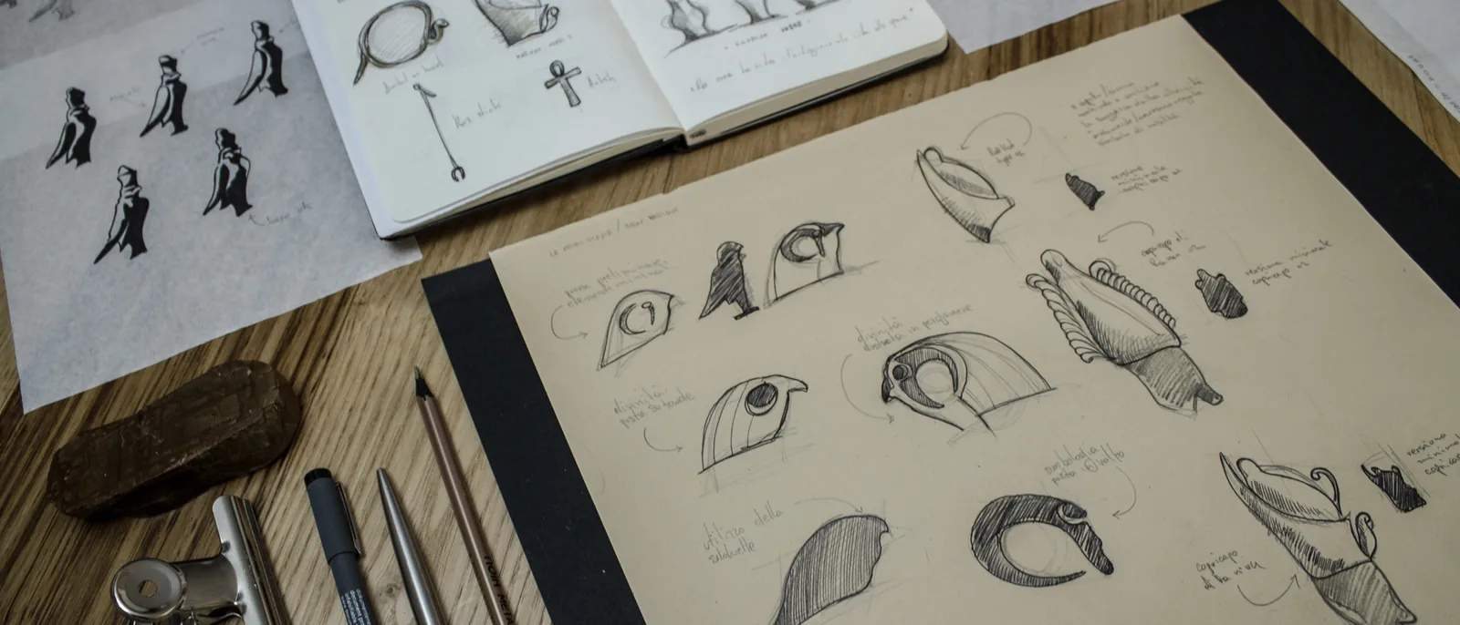
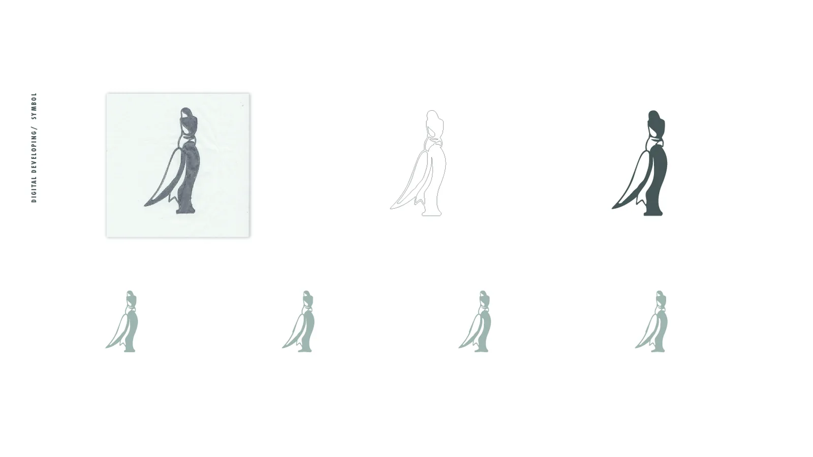
The symbol begins in brush and Indian ink, a female figure in profile drawn in a single gesture, then taken up again in the notebook beside the shapes of vases and studies of the silhouette.
Development
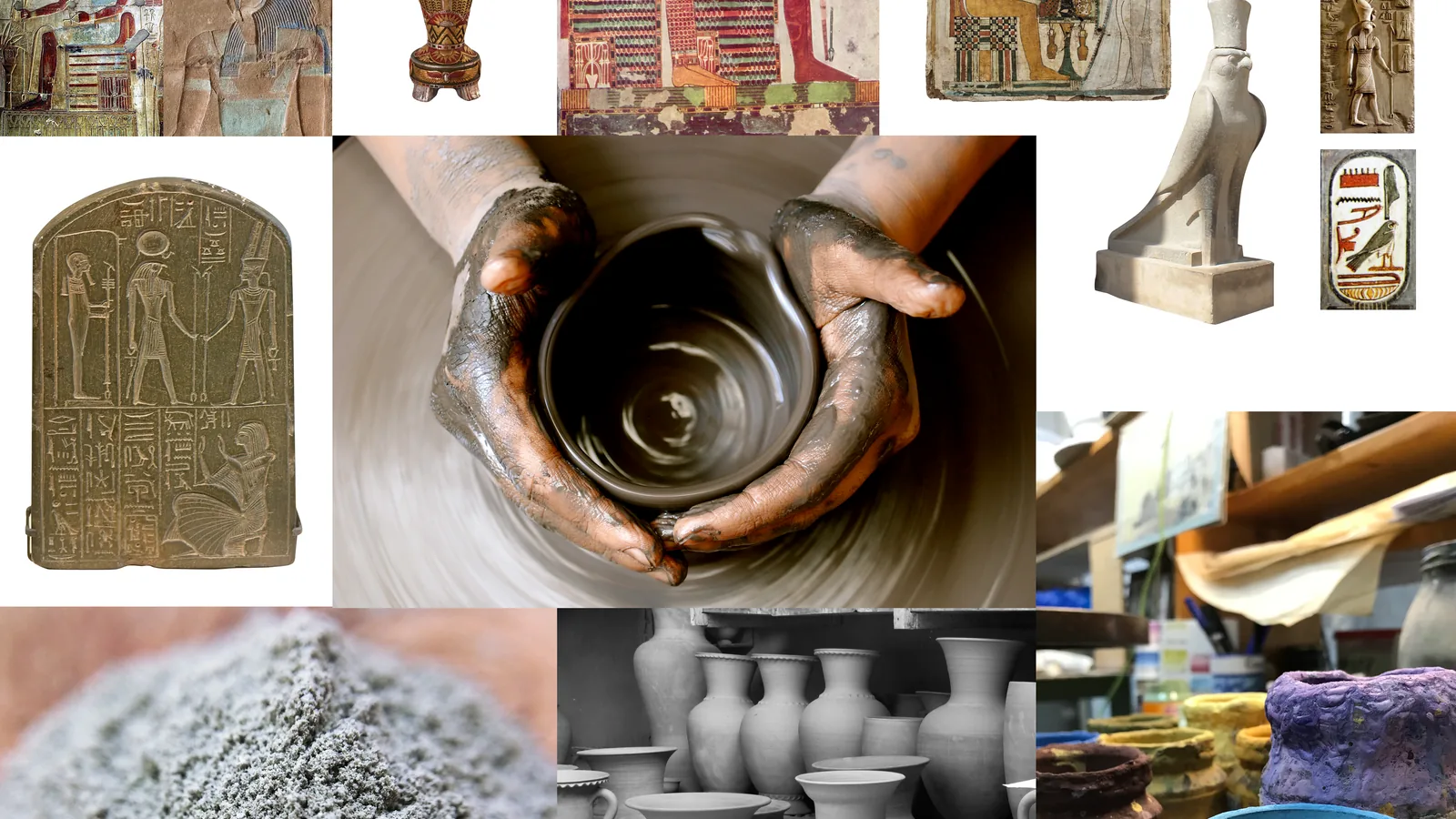
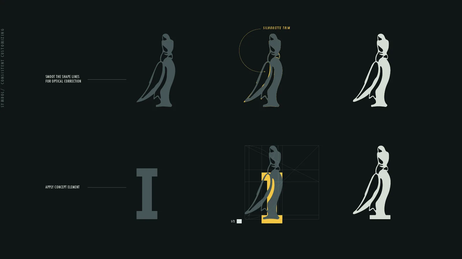
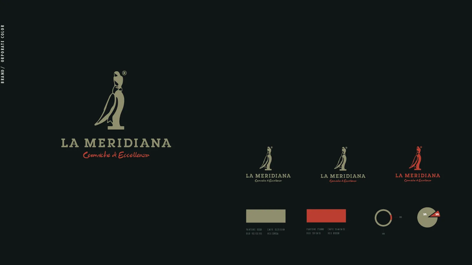
The moodboard brings together Egyptian reliefs of the sun god, the sundial, clay and the wheel; from the sketch the mark moves to vector, is optically corrected and takes the I of the logotype as its base, so the figure stands on the name like a statuette on its pedestal.
The system
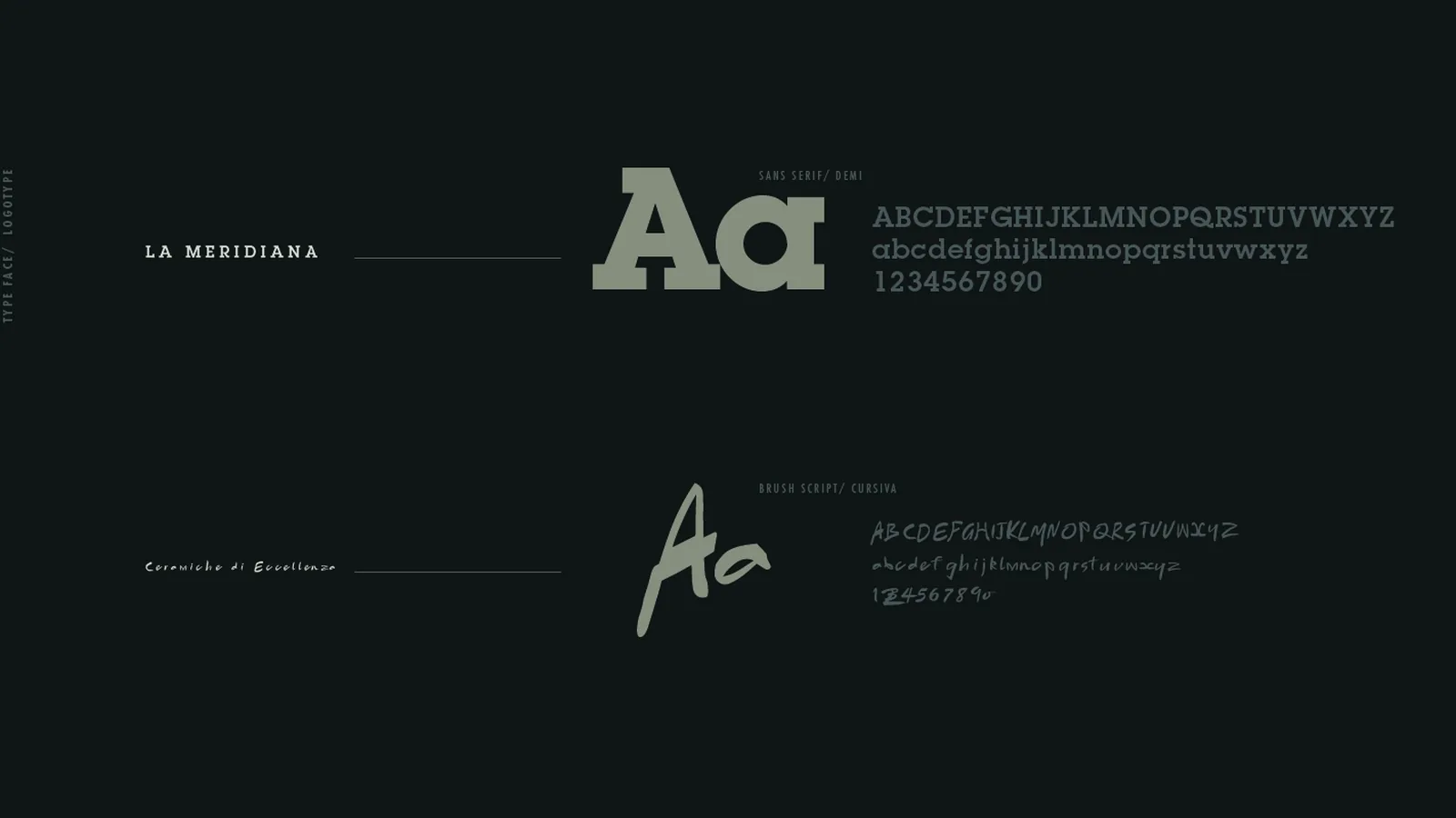
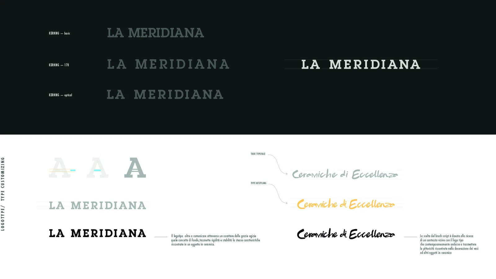
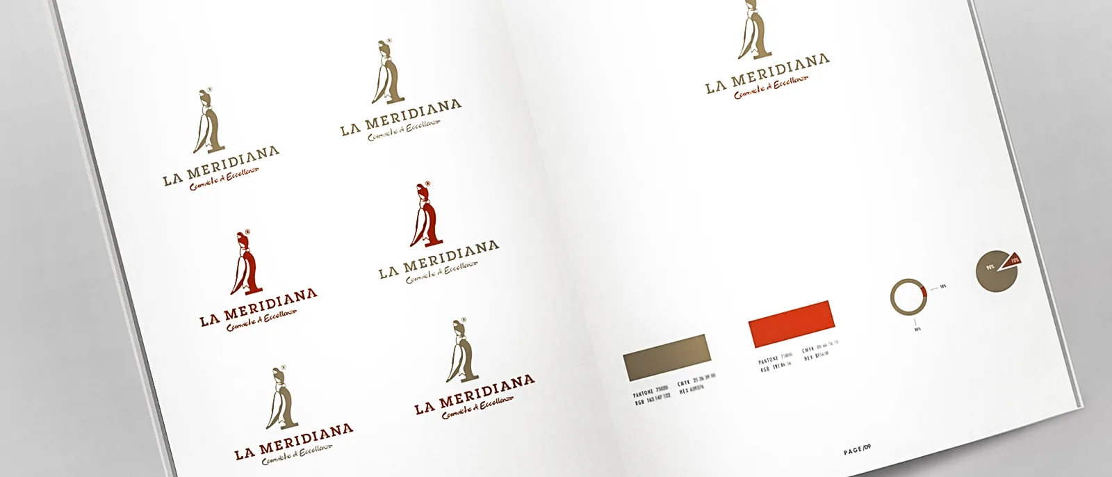
The logotype uses a slab serif, rigid and stable like a ceramic object, while the payoff in a brush script echoes the painting on the vases; there are two colours, a sand and a terracotta, close to the tones of clay before and after the kiln.
Applications
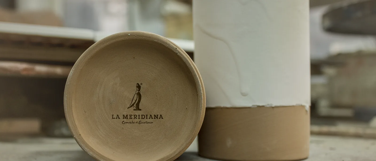
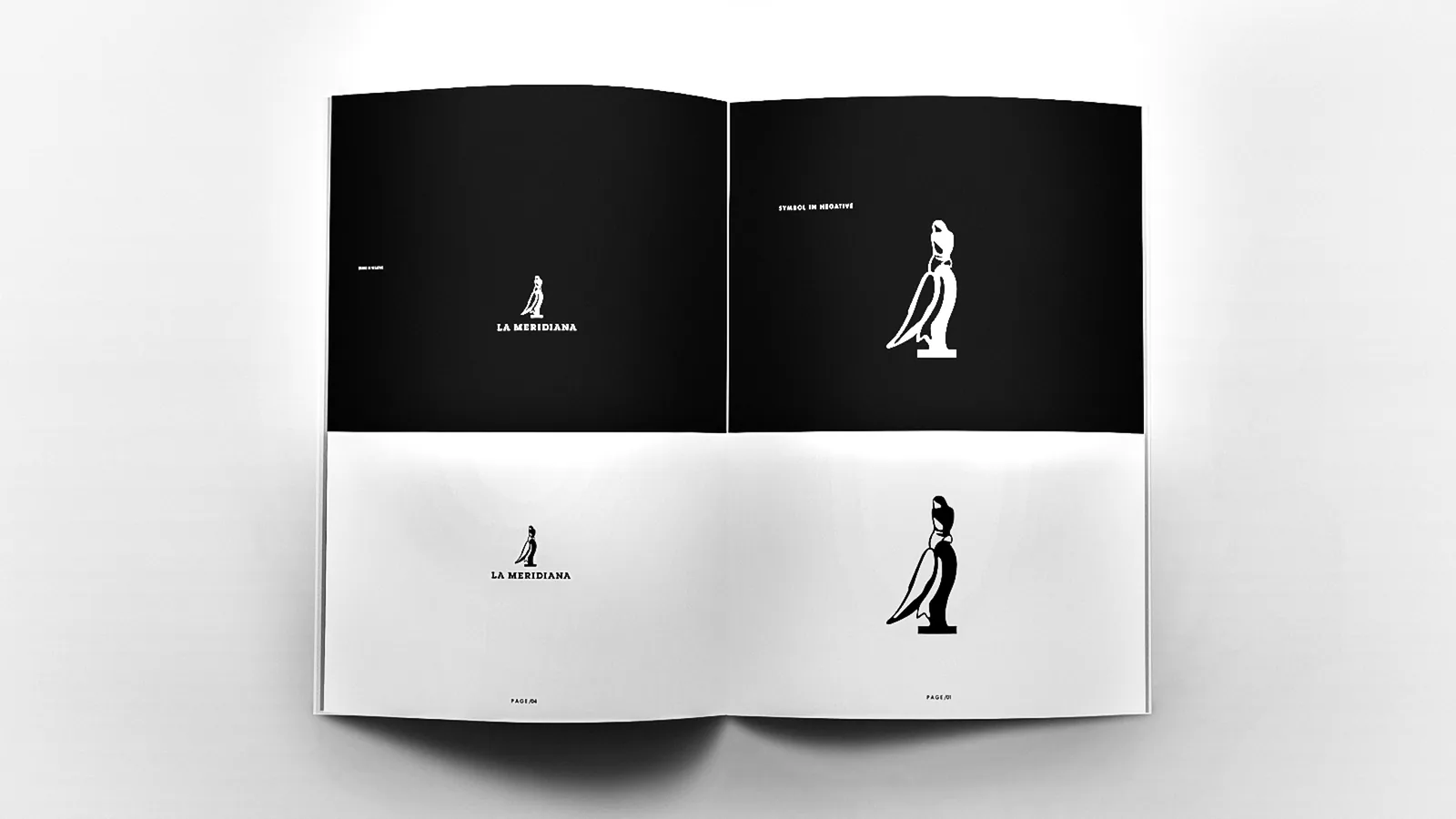
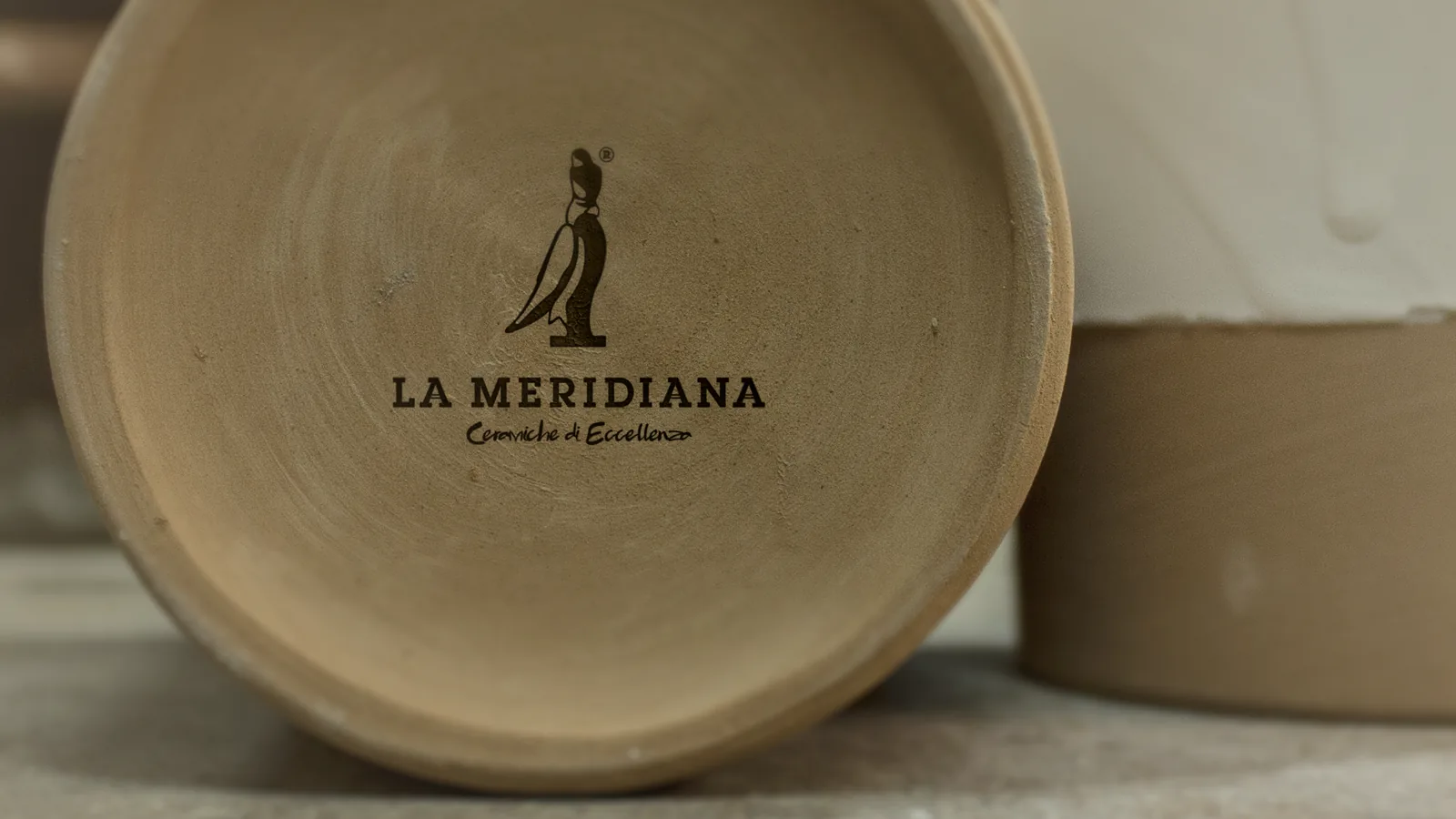
The starter brand book covers construction, proportions, reversed versions and legibility down to favicon size, and the logo was tested on the finished piece, at the centre of the bowl.
The mark in motion
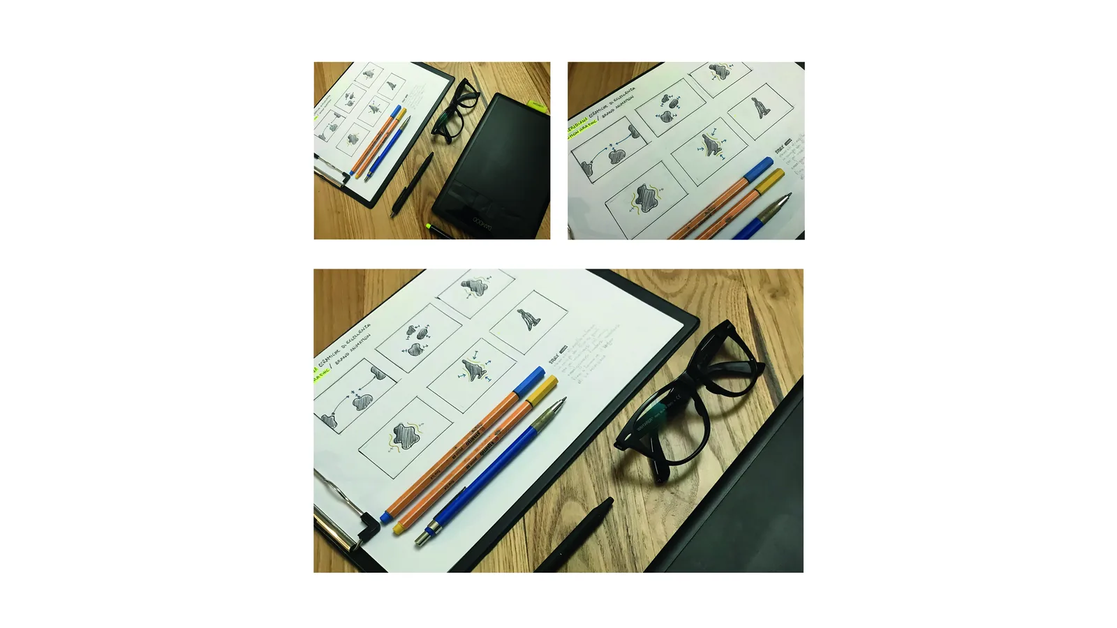
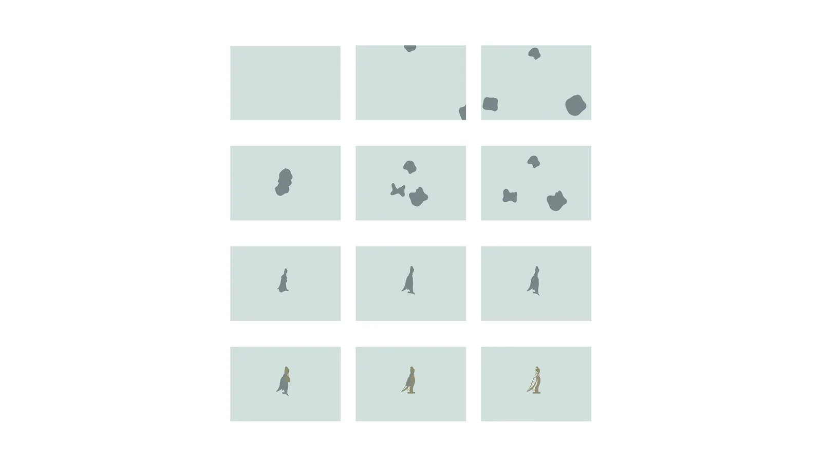
The animation stages the idea behind the logo, fragments of clay enter the frame and merge into the silhouette, then a beam of heat fires it to its final colour.
The outcome
The result is a logo that tells the story of the craft before the product, a figure standing on its own name and carrying with it the earth, the fire and the time of ceramics.
Let us talk about it, or keep exploring the rest of the work.