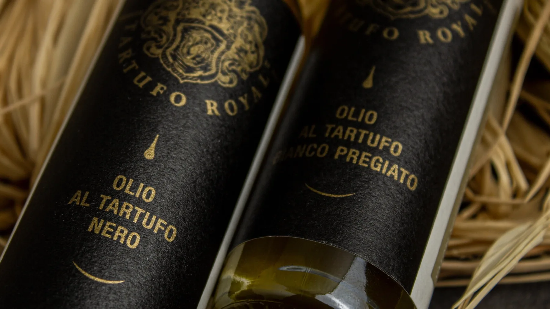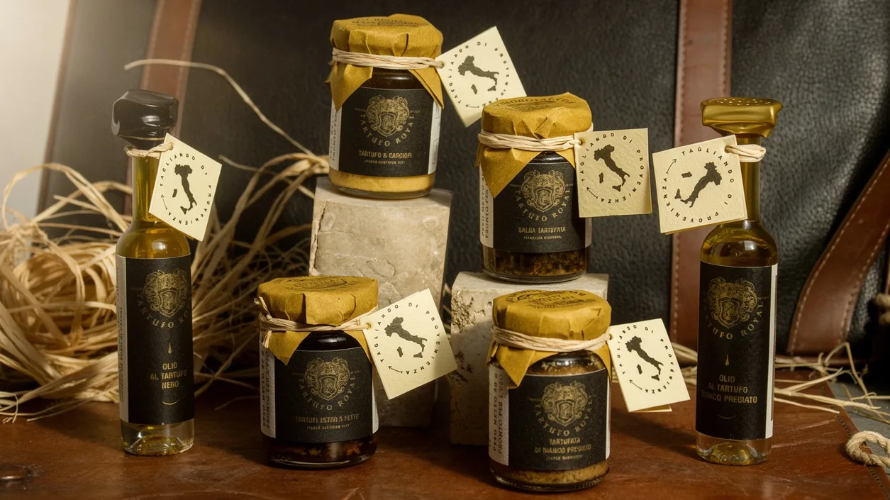
Tartufo Royal - luxury food
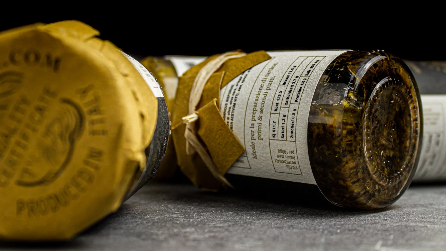
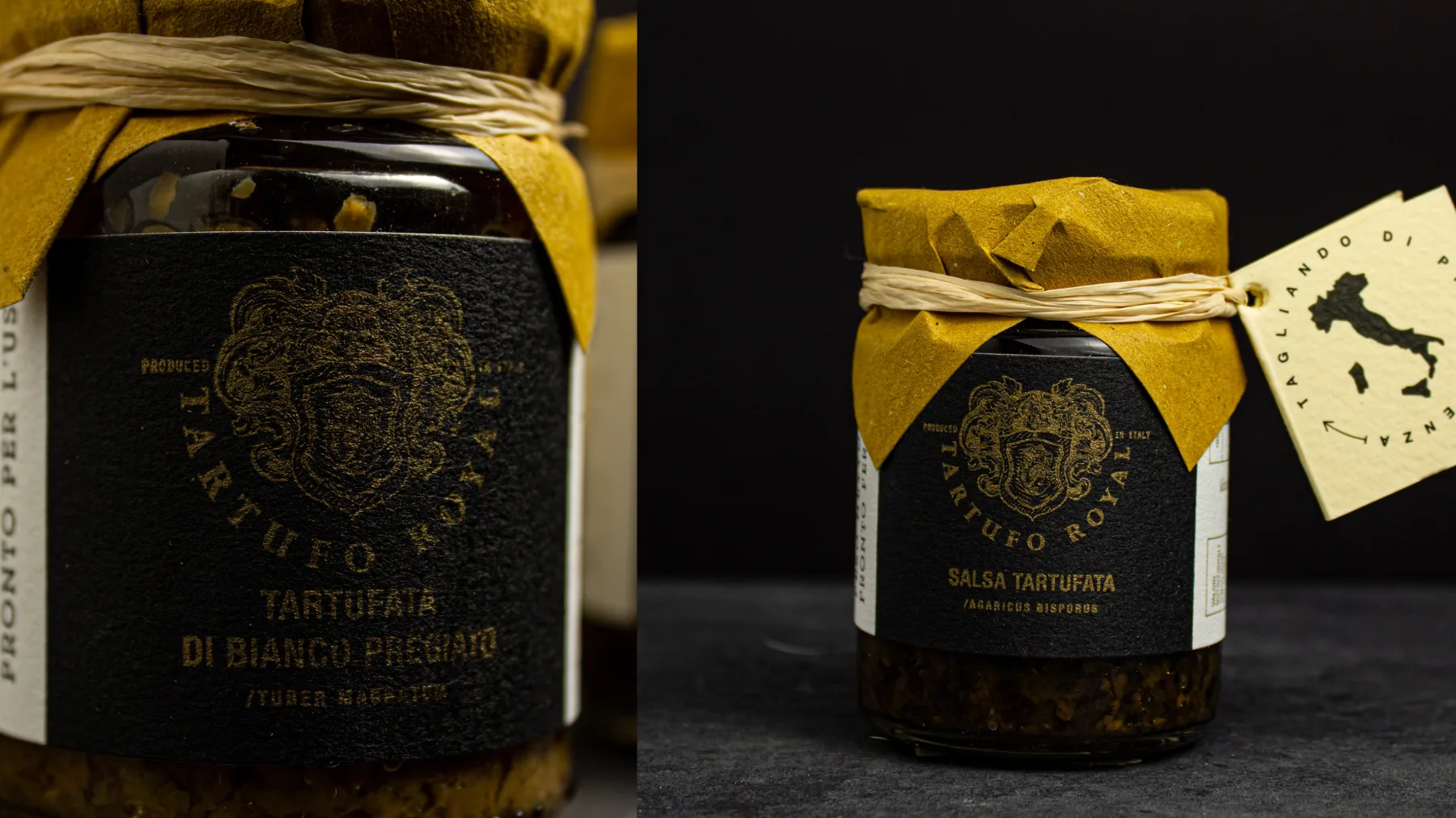
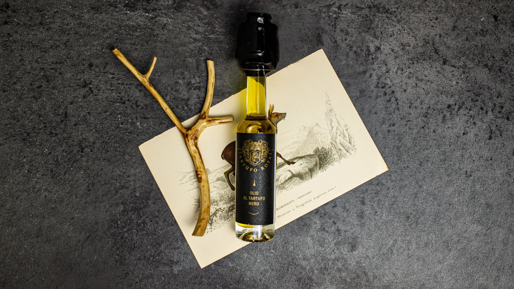
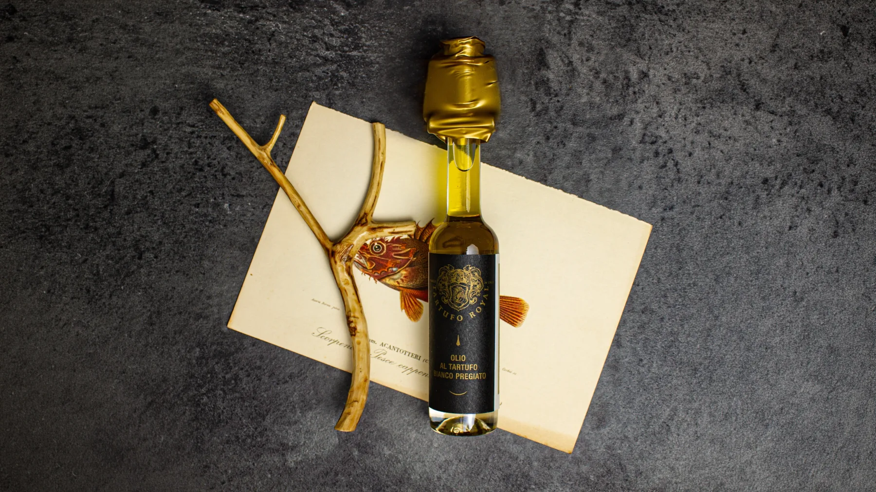
A visual identity for Tartufo Royal that uses heraldic language to tell of land, tradition and Italian quality.
The strategic premise
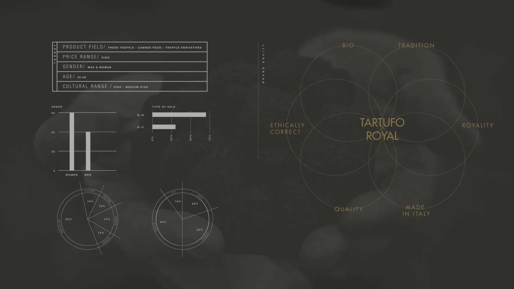
The truffle is not merely an ingredient: it is the meeting point between territory, waiting, agricultural labour and the culture of taste. TARTUFO ROYAL works in fine food with truffle products, from preserves to fresh produce.
The strategic challenge
The brief was to develop an identity able to express the quality and authenticity of a product worked and made in Italy, with a strong agricultural ethic, without imitating a generic idea of luxury.
The process and the vision
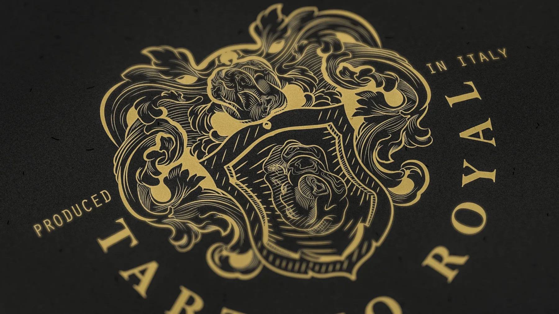
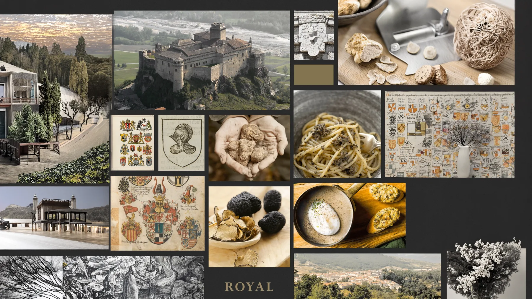
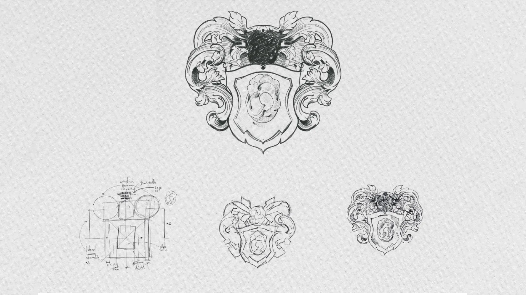
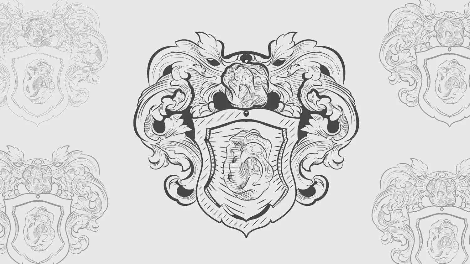
The stylistic direction sought a rustic imprint, rooted in medieval imagery. From this research comes a heraldic mark, a descriptive symbol in which formal construction and symbolic content work together.
The complexity of the sign also called for a simplified identifying version, designed for small-scale applications.
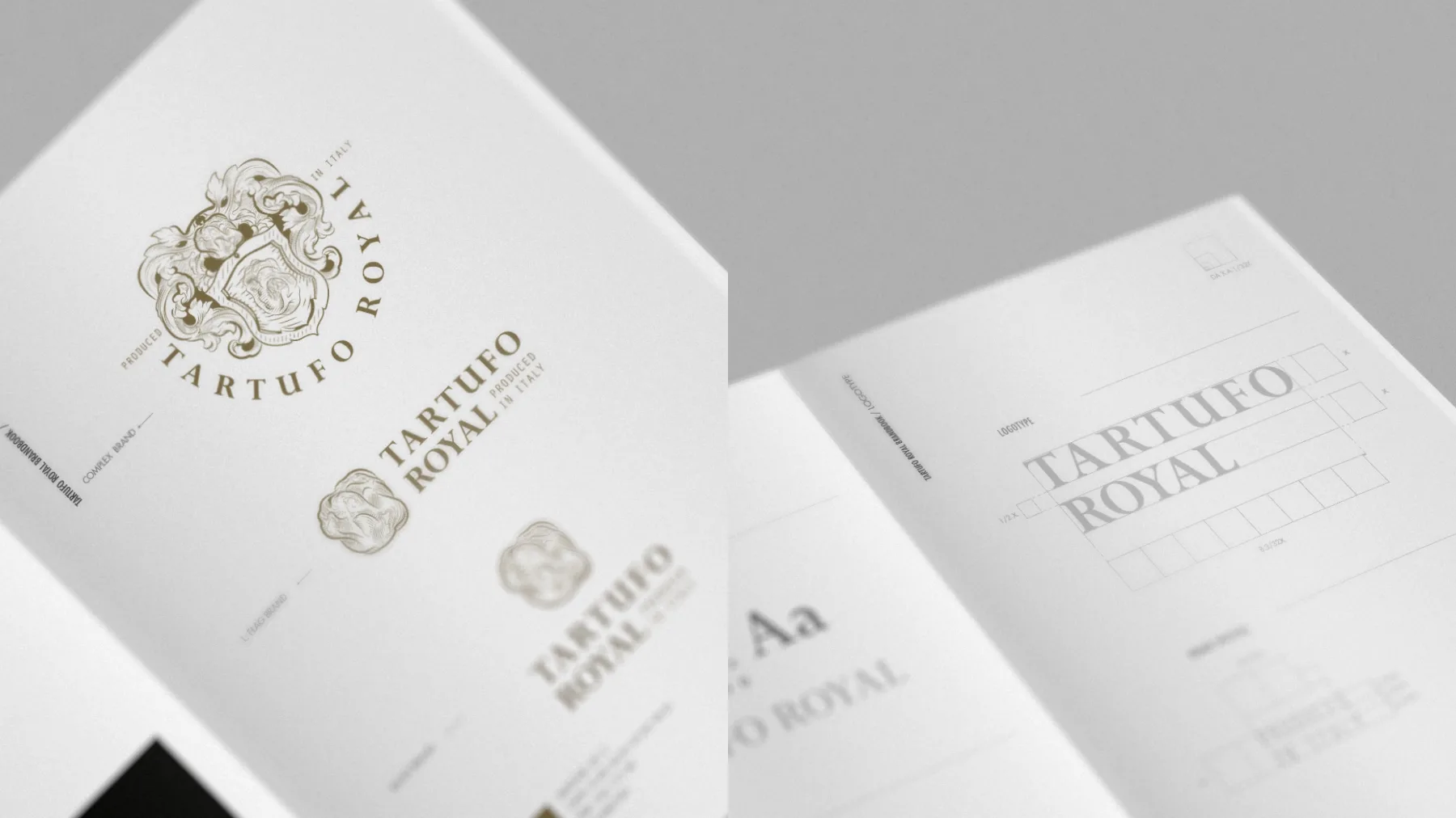
The design synthesis
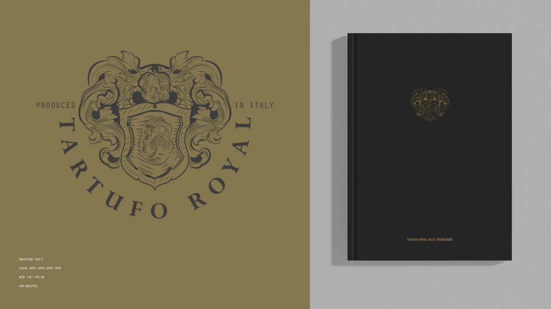
The result is an identity that brings the product into a dimension of authenticity and belonging. The heraldic mark holds the memory of the land, while the simplified version keeps function and recognisability.