
Journal
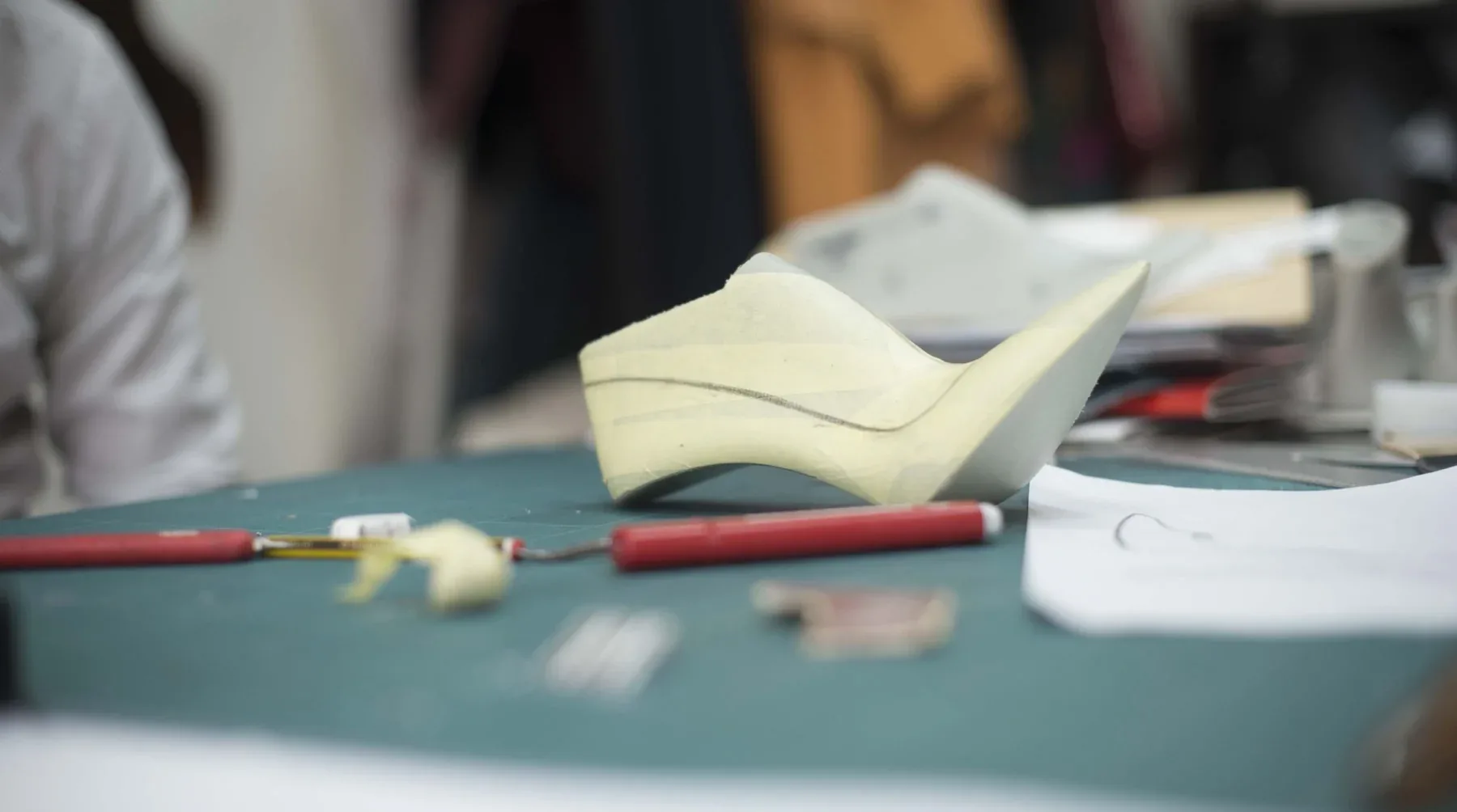
Form does not precede meaning
Beauty is not the goal of an identity project, it is the consequence of a meaning made clear beforehand, from Sullivan to Vignelli, by way of Grizzanti.
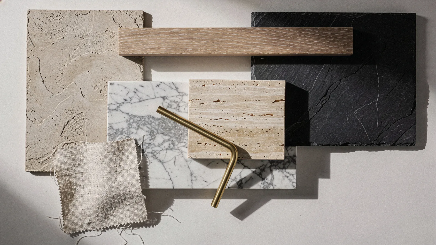
Material is perceived before it is seen
Before we look at a room we have already perceived it, and the materials it is made of decide what we feel, from Victorian jet to the boutique, down to finishes that imitate the real thing.
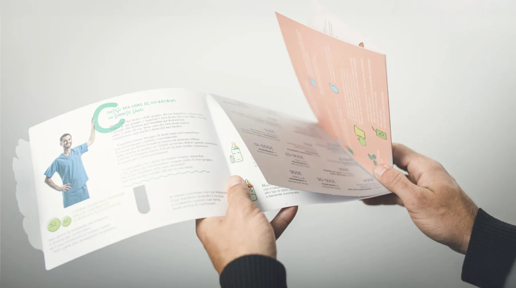
How to communicate with children, and what to avoid
Communicating with a child means rebuilding the context in which they feel safe, and every wrong shape, color or word pushes them away. Through the psychology of perception, the color code and the case of a leaflet for a pediatric dentist, a look at what to choose, what to avoid and why a friend of the child is a friend of the parents too.

The photographic filter as emotional engagement
Applying a filter doesn’t mean prettying up a photograph, it means declaring what we want the viewer to feel. Through concept, subject, environment and the psychology of perception, a look at how every visual choice becomes a word within a larger message.
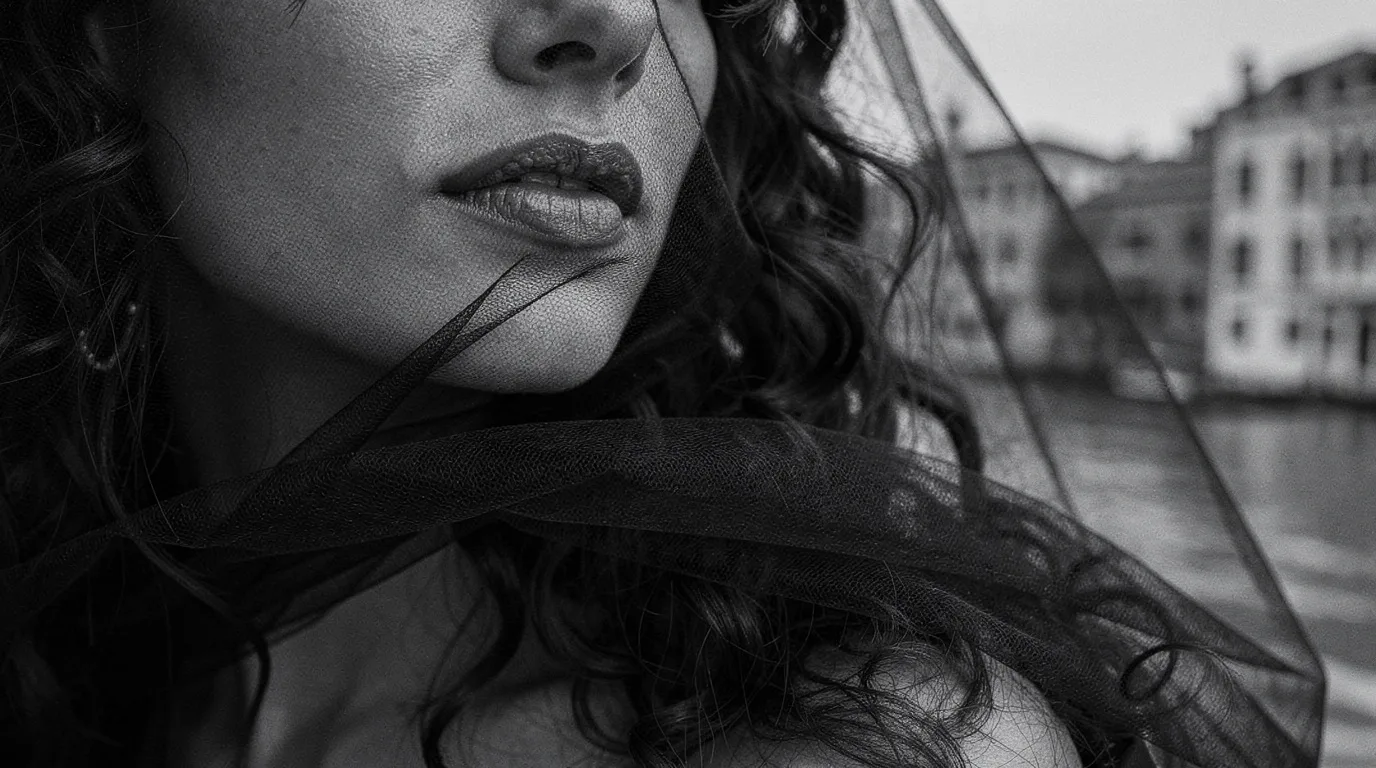
Luxury is not seen, it is recognised
Luxury is not measured by price or by the accumulation of details, but by the ability to build a coherent and recognisable perception. Matter, space, the senses and identity become the instruments through which a brand turns every point of contact into an experience of value.
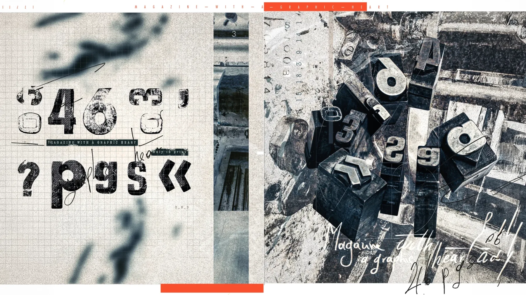
Why print on paper cannot die
Print is not merely a medium but a material that engages the body, activates memory and makes reading a more conscious experience. Between gesture, light and materials, an invitation to choose each medium according to how we wish to think and feel.
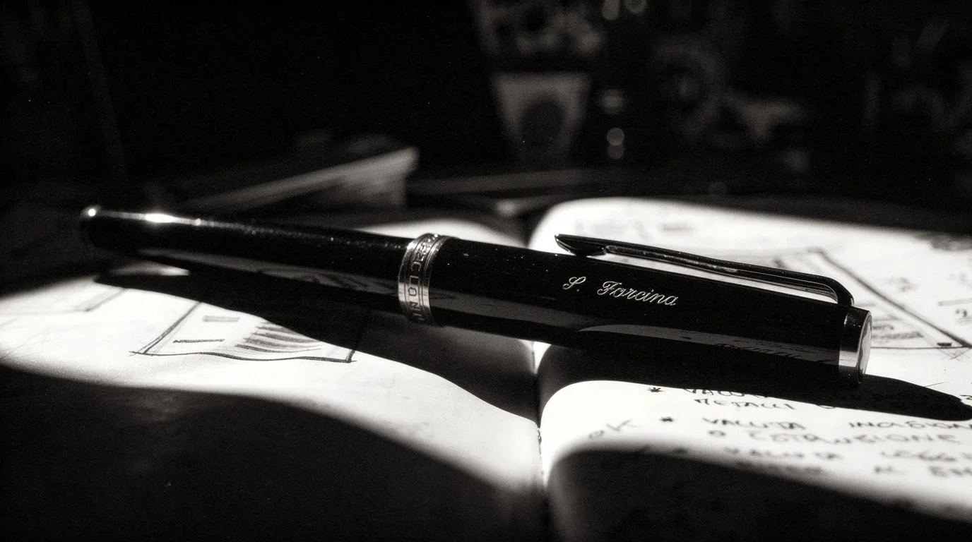
Manifesto
Design does not begin with the pursuit of beauty, but with the balance between form, function, culture and meaning. A design manifesto on the method by which observation, discipline and synthesis turn every visual choice into identity.