Toggle navigation
home
(current)
mind
contacts
HOME/
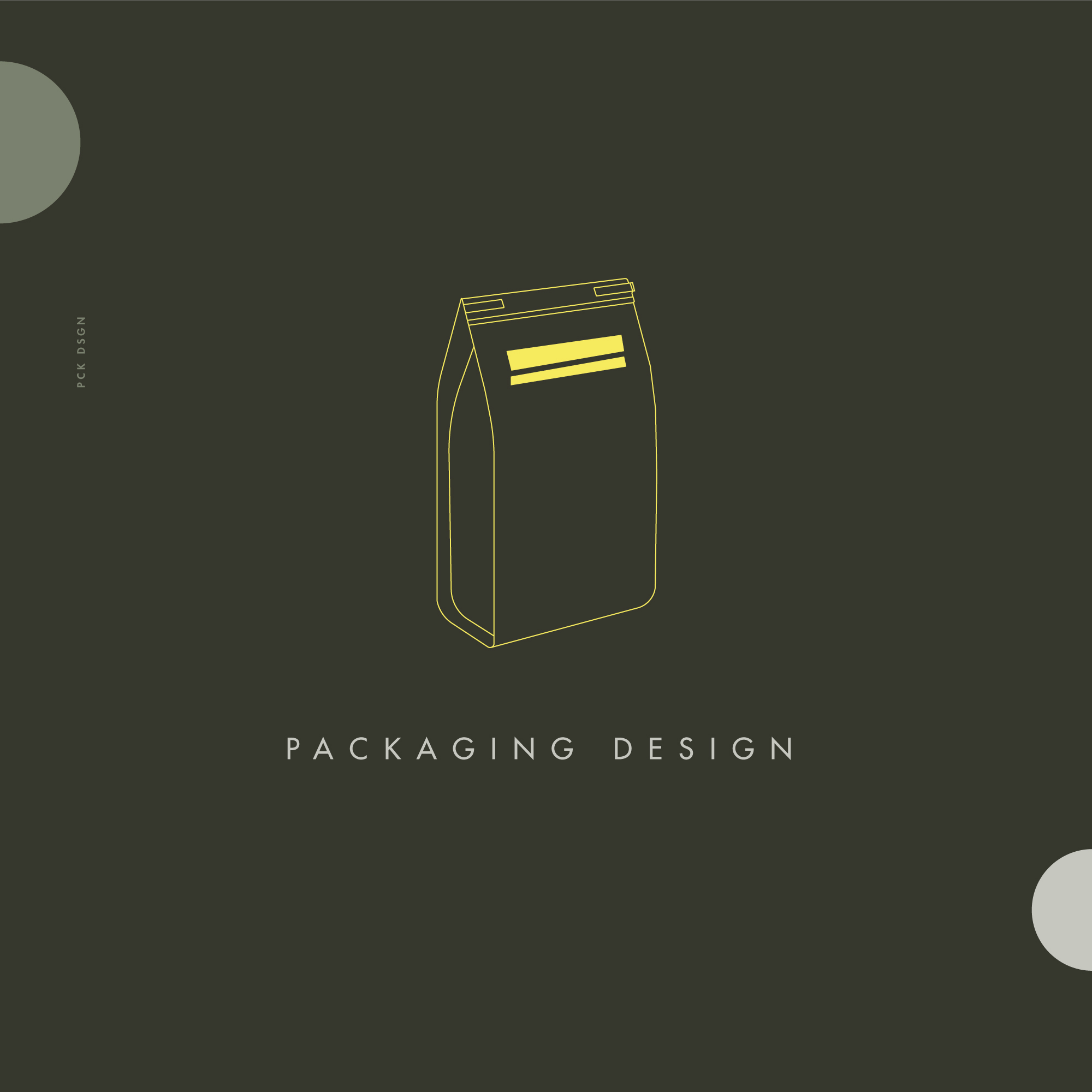
PLUTON pet food
PLUTON
—
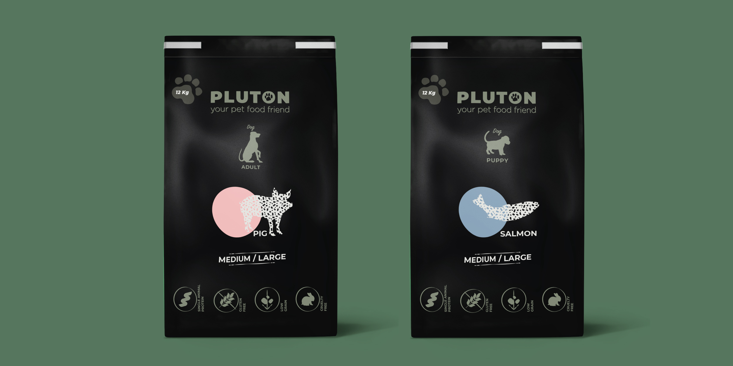
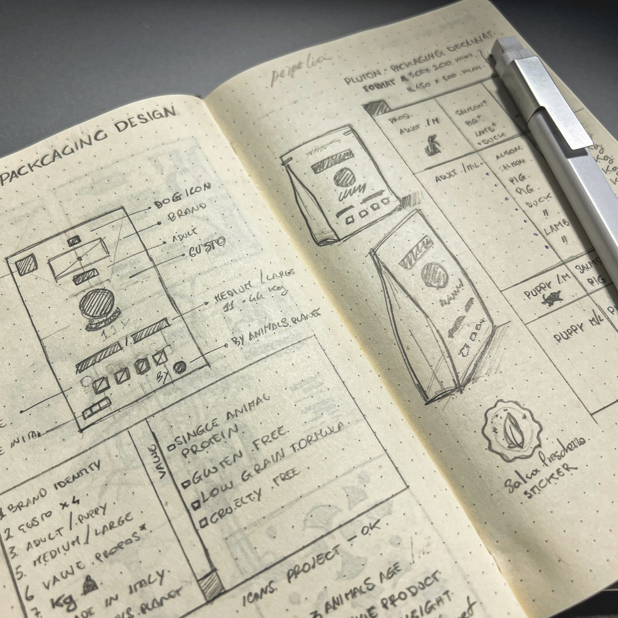
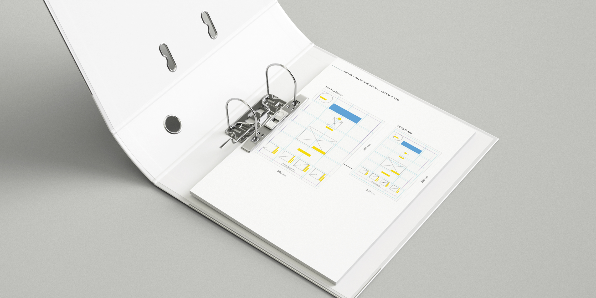
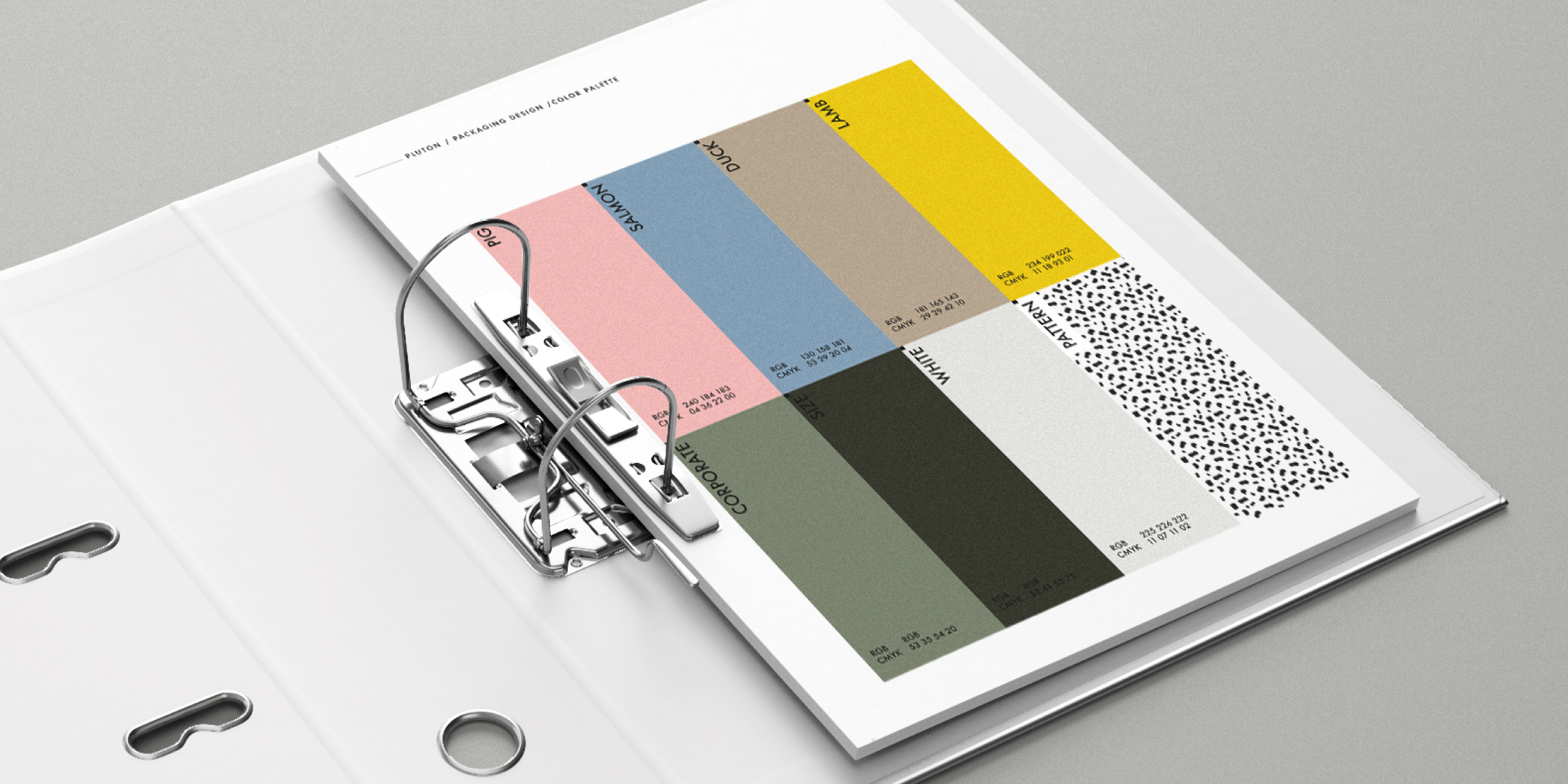
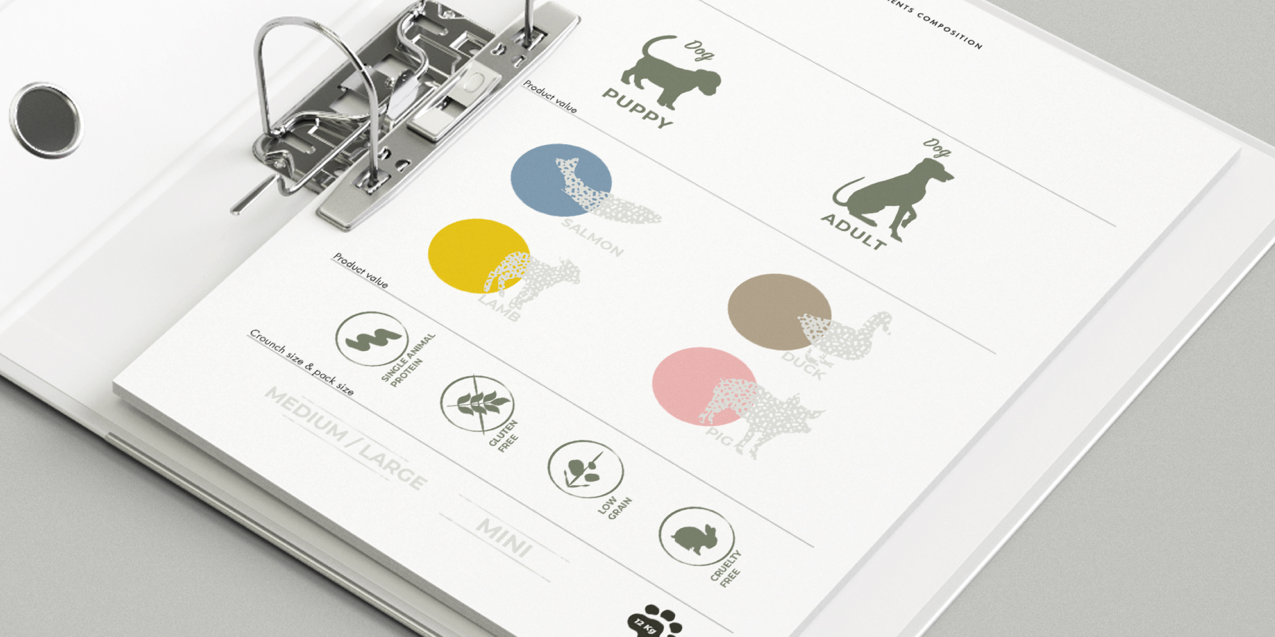
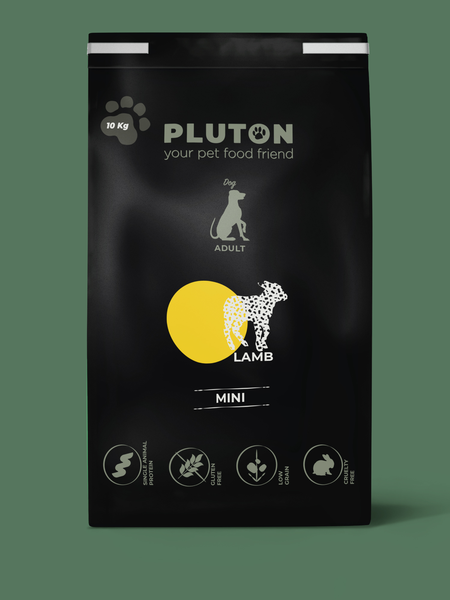
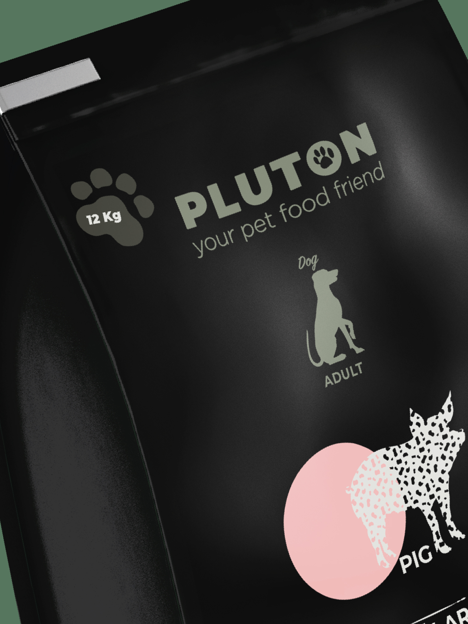
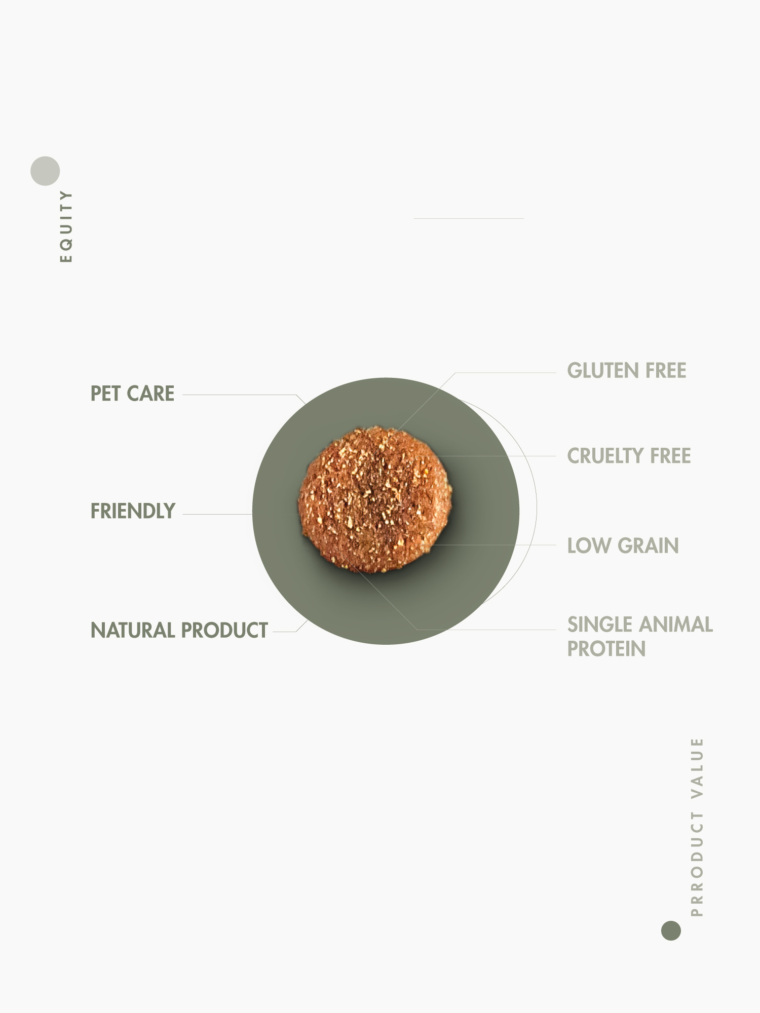
Is a Brand aimed at the pet food market, mono protein, low grain, gluten-free and not tested on animals The 100% made-in-Italy product is currently available in two different formats, f or puppies and adult dogs. The focus is on expanding product variety and animal type.
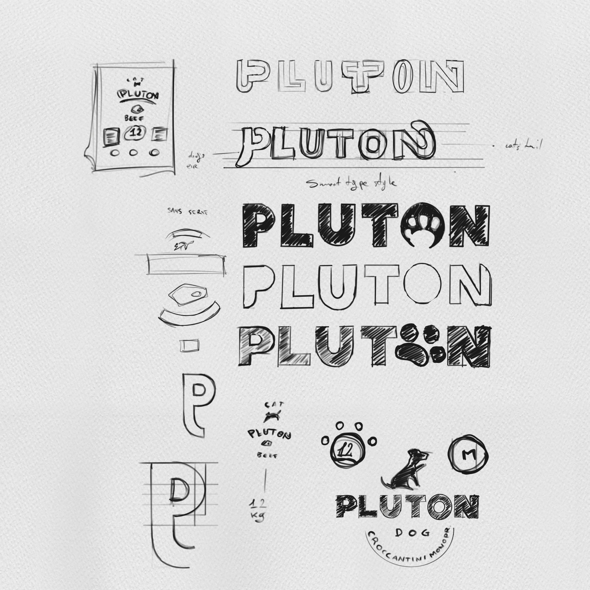
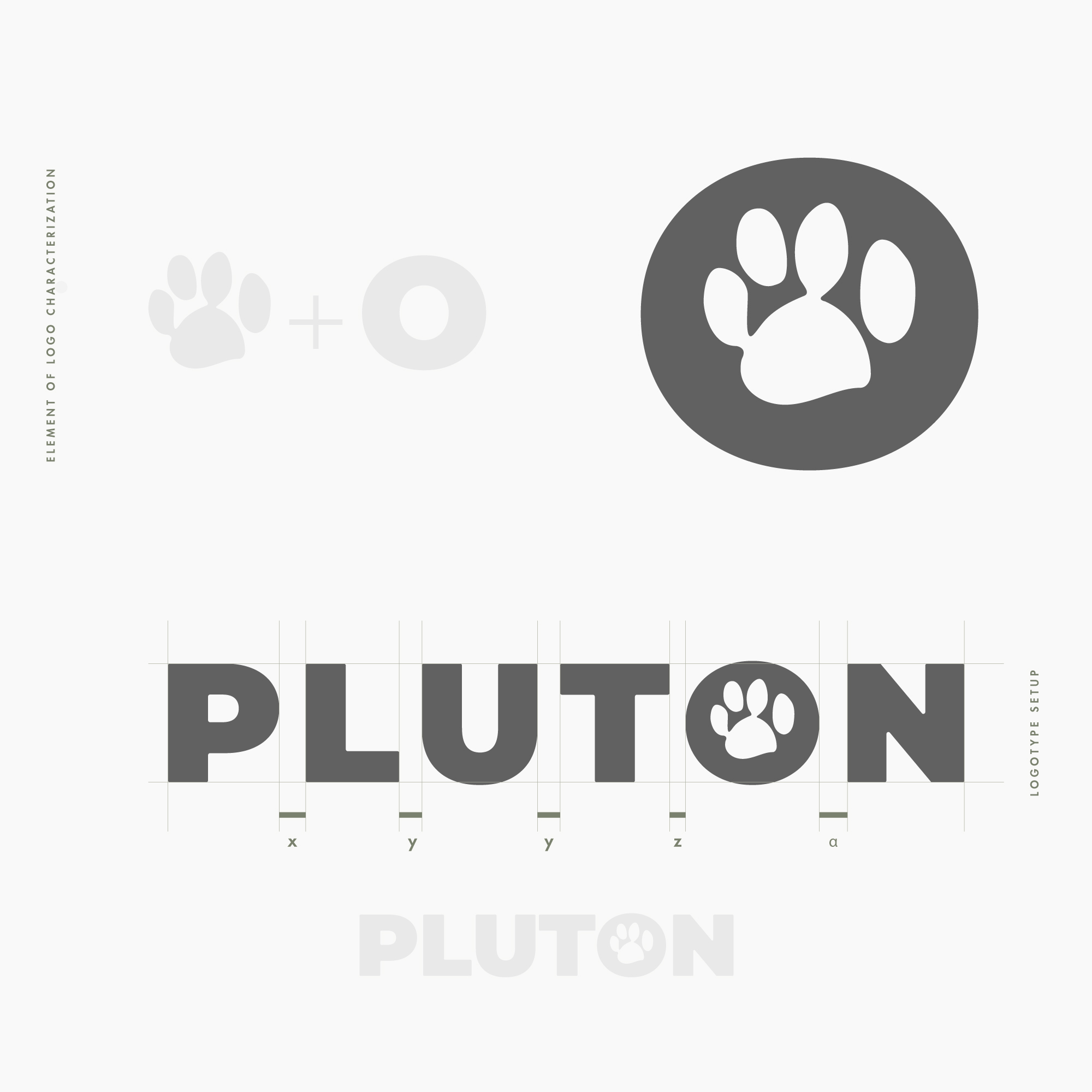
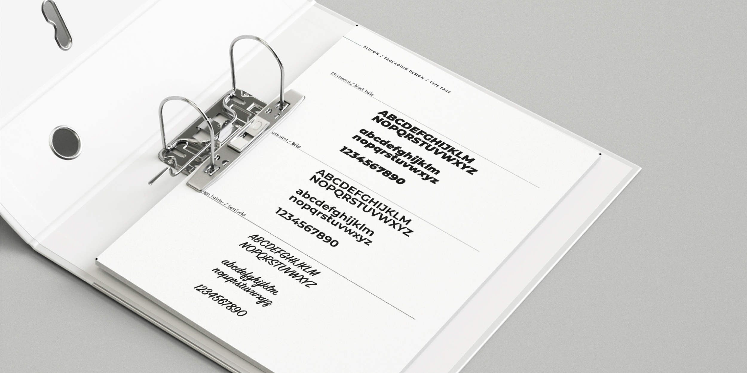
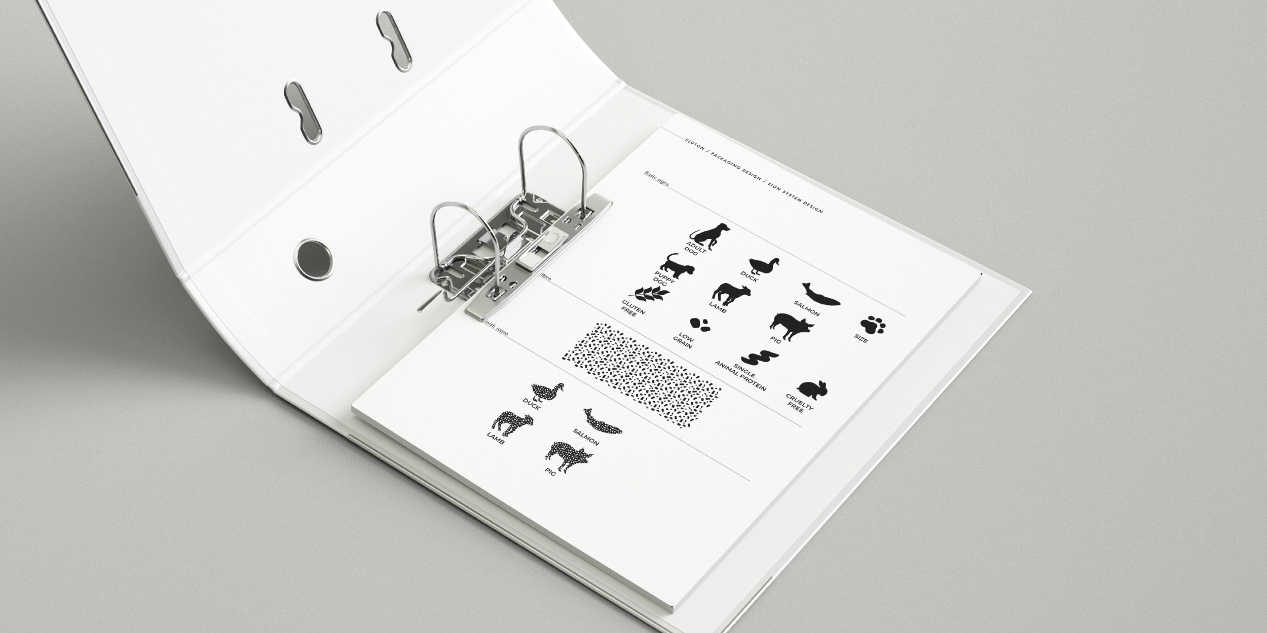
For the PLUTON brand-logo, I visually opted for the immediacy of the message, a linear typeface to communicate presence and science in reference to its firmly delineated and certified nutritional composition. taking advantage of the circularity of the letter O present at the end of the name to create a similarity with the morphology of a classic dog kibble and a planet and merging it with an element strongly present in people's mnemonic past, such as the footprint, in this case that of the brand founder's pet, I wanted to communicate in the immediate, the product's commodity positioning and intrinsically the planet of pet kibble.
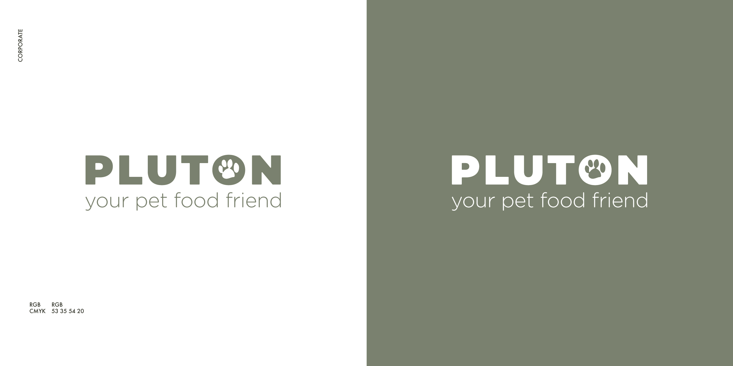
With a sharp circular geometry as well as conveying familiarity, sociability and trust, elucidating membership in the reference color code, the style of the superimposed symbol is contrasted, enhancing the details. With a structured grid the elements are placed and harmoniously balanced in the field building weights, forces indicate the correct reading hierarchies, stimulating visual attraction. The rest is reserved for your reading.
If you want discover more about the design, click here
If you want discover more about the design, click here
↥
BACK
TO TOP
PREV. PROJECT
NEXT PROJECT
PROJECT SELECTION
.COMMON
Simone Forcina©
our works
contacts
.NETWORKS
instagram
facebook
vimeo
behance
.PLACE
ITALY
Rome
Formia
.POLICY
Privacy
Cookie
.COMMON
Simone Forcina©
our works
contacts
.NETWORKS
instagram
facebook
vimeo
behance
.PLACE
ITALY
Rome
Formia
.POLICY
Privacy
Cookie
Simone Forcina {visual communication strategy & fine design 2022©/ p.iva 02828820593
Simone Forcina
{visual communication strategy
& fine design 2022©
p.iva 02828820593