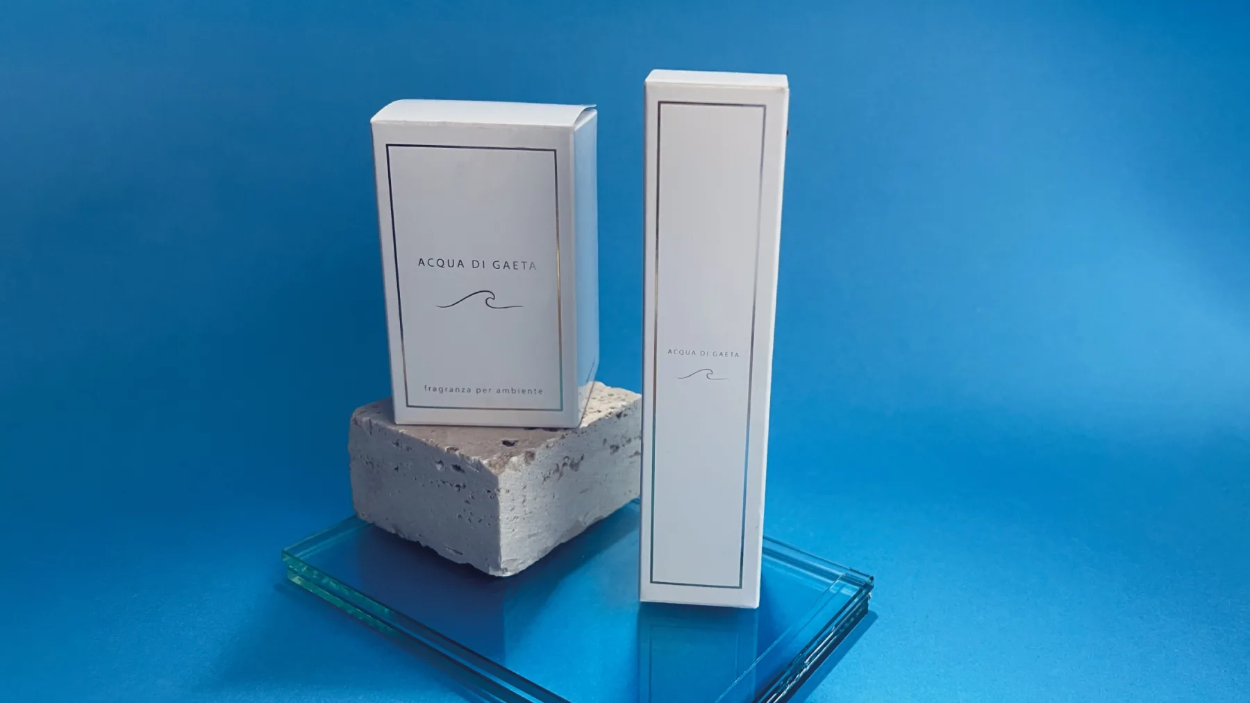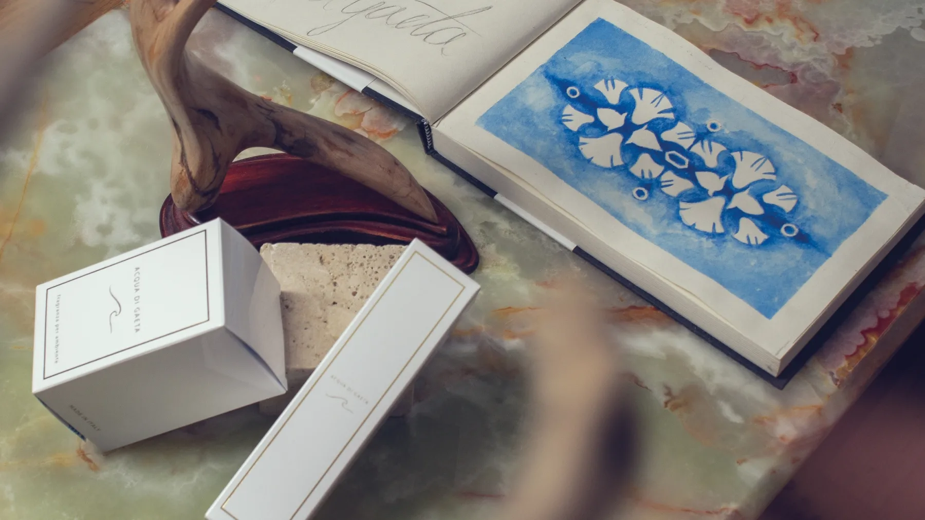
ACQUA DI GAETA - parfum
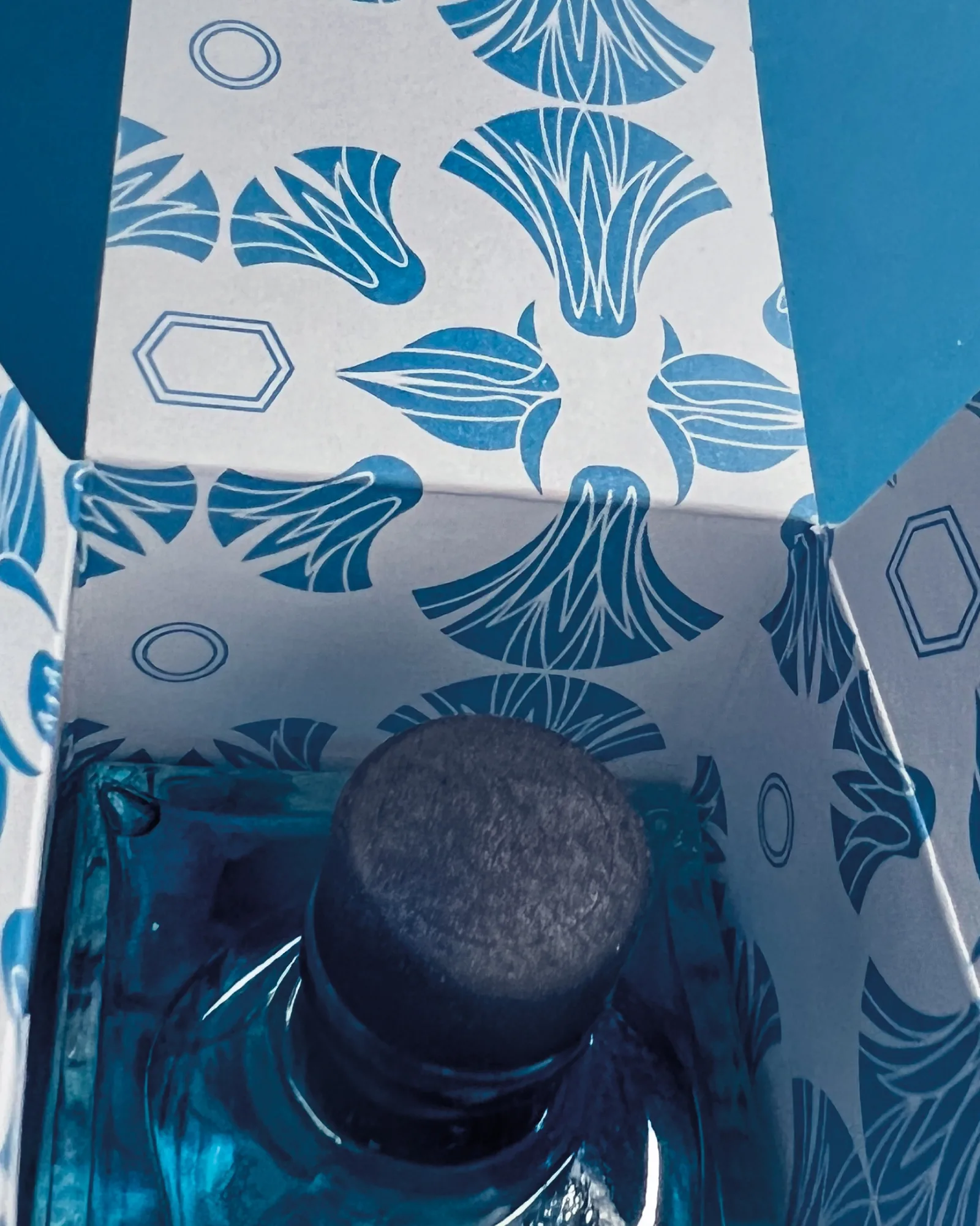
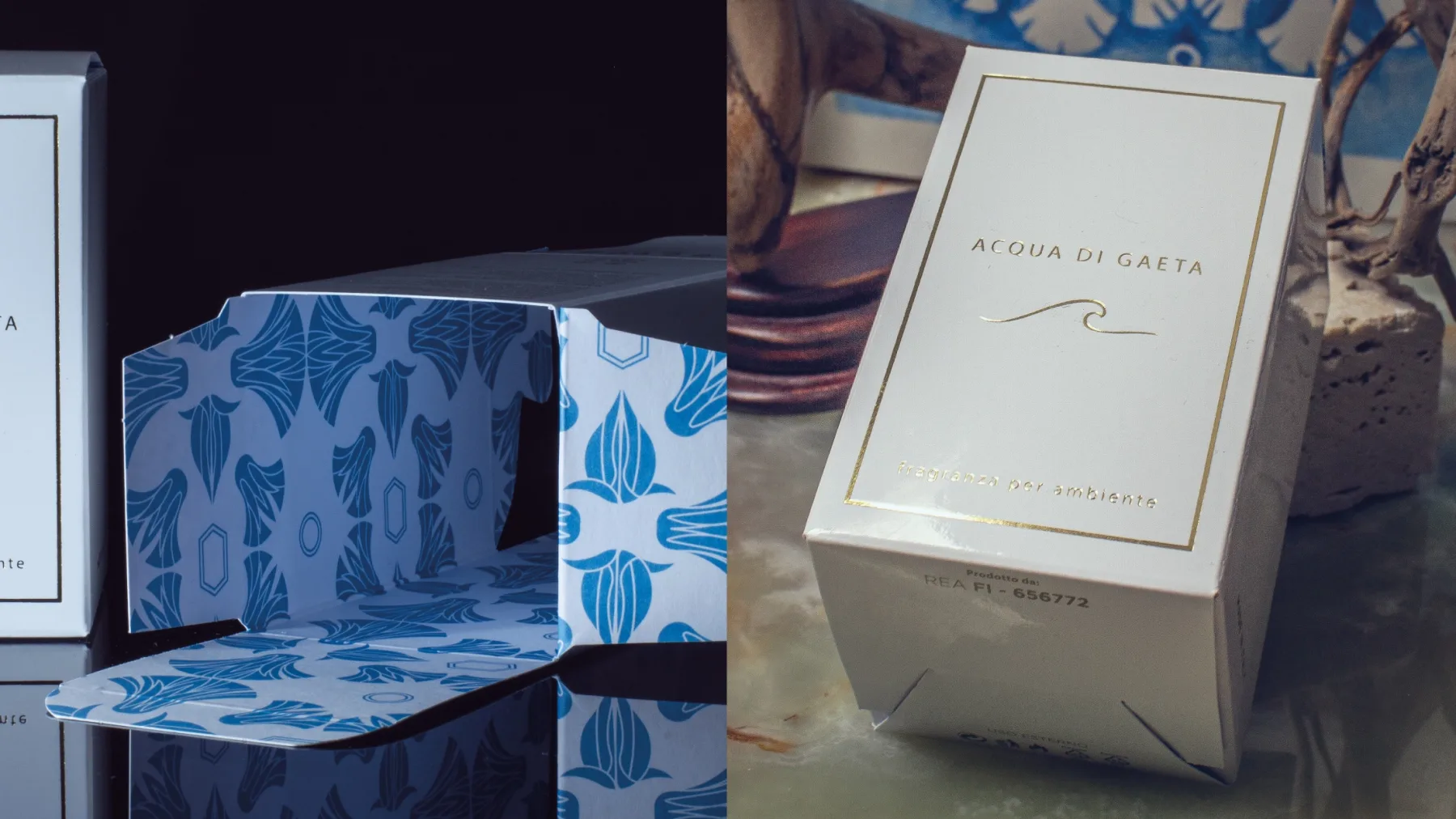
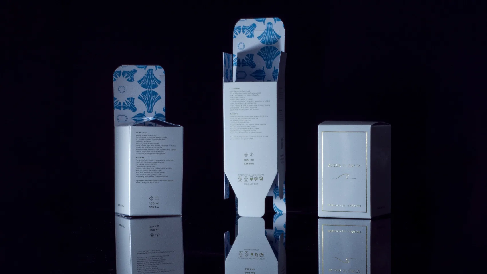
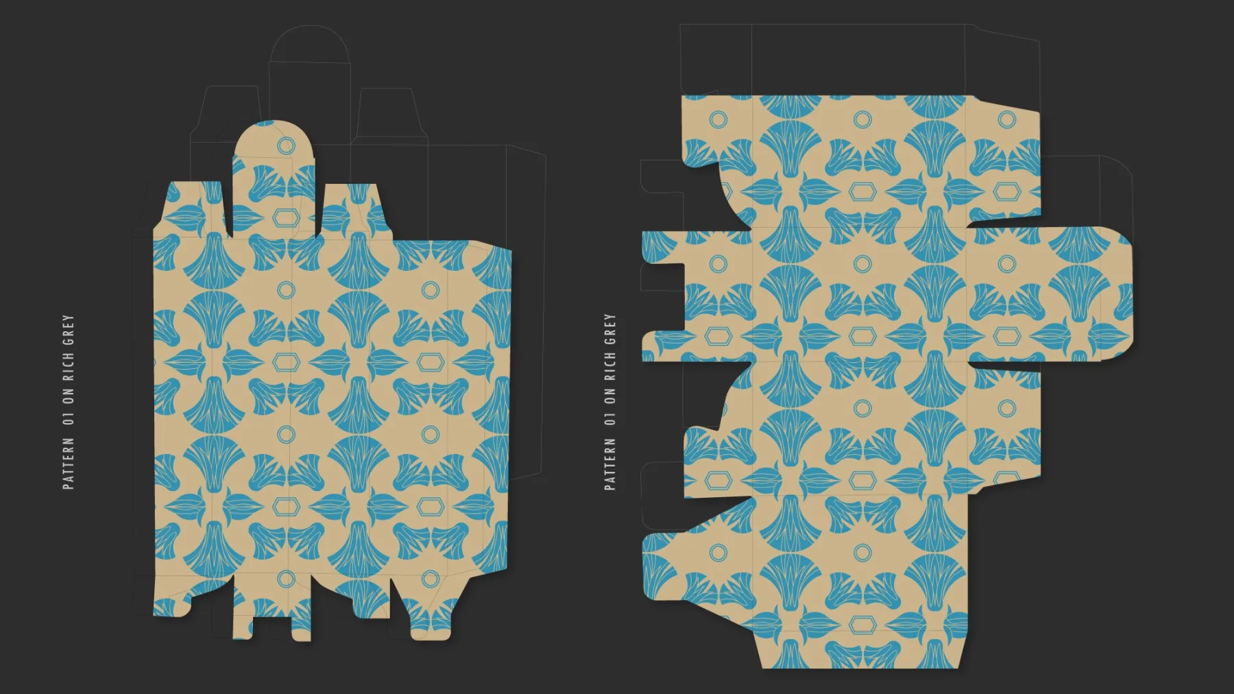
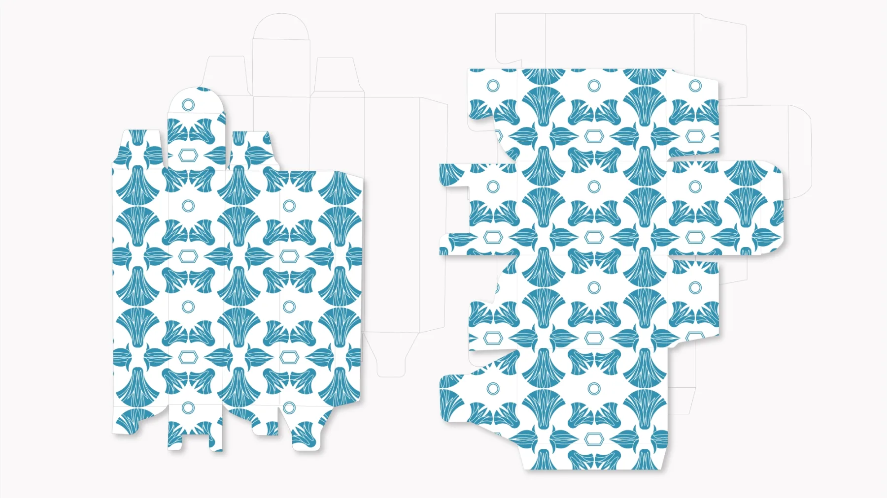
A texture for two packaging formats, born from the reinterpretation of the Egyptian lotus as a sign of memory, rhythm and belonging to a place.
The strategic premise
A perfume can tell of a place without illustrating it. For Acqua di Gaeta, brand equity comes from the will to give value to one of the symbolic towns of the Riviera di Ulisse, a crossroads of peoples, cultures and sea trade.
Gaeta carries an ancient history, interwoven with navigation and with the maritime republics of the eleventh century. The project had to translate that stratification into a visual presence able to accompany the product and strengthen the bond between fragrance, territory and Mediterranean imagery.
The strategic challenge
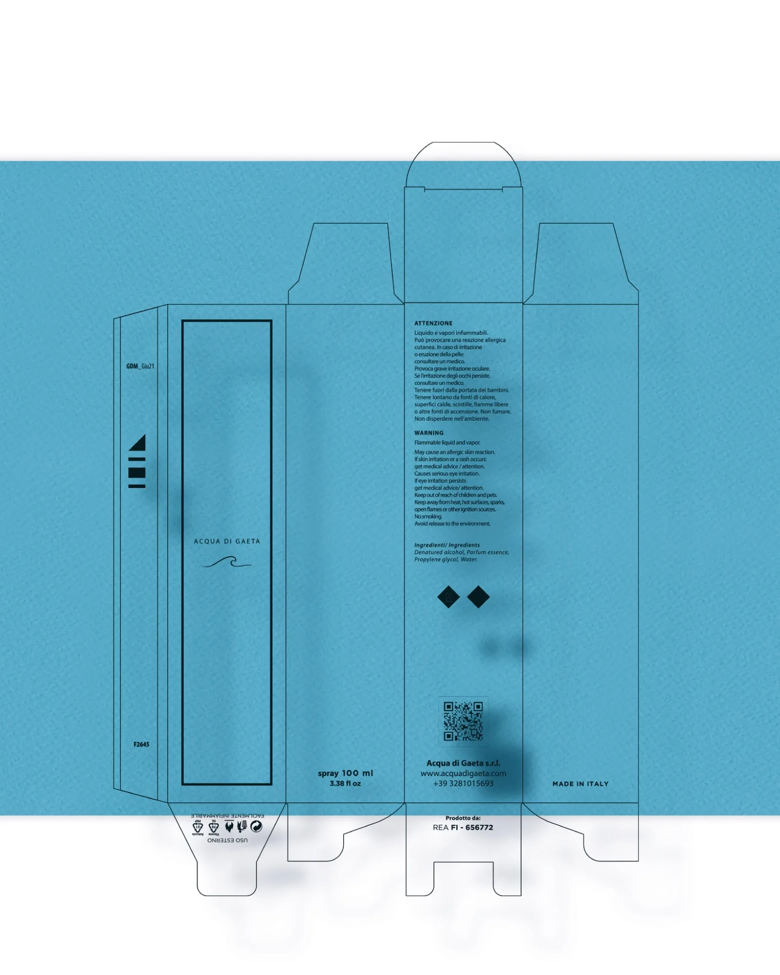
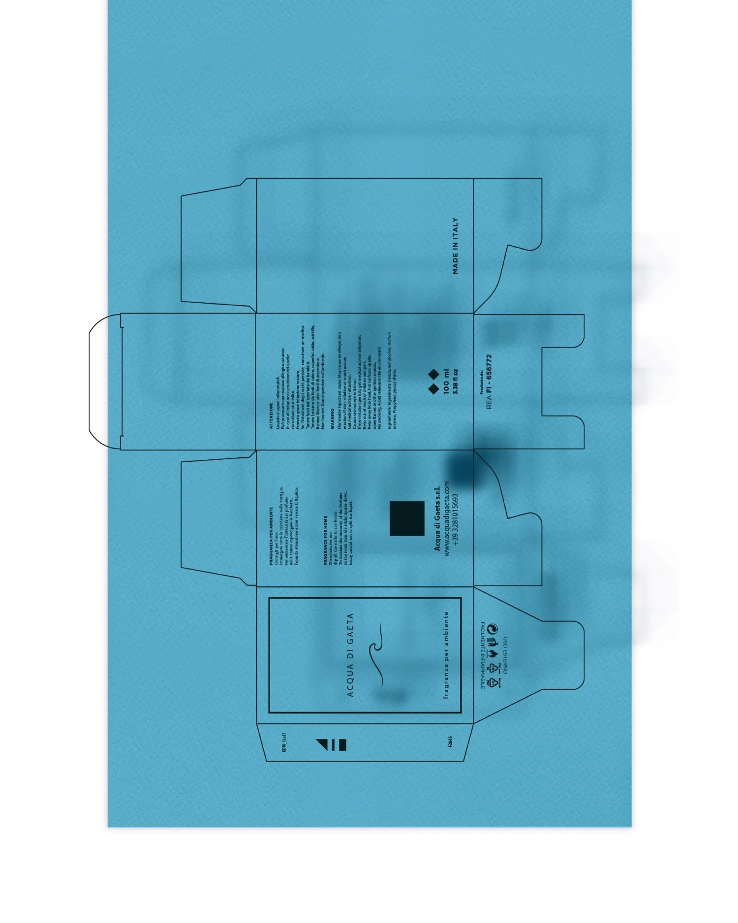
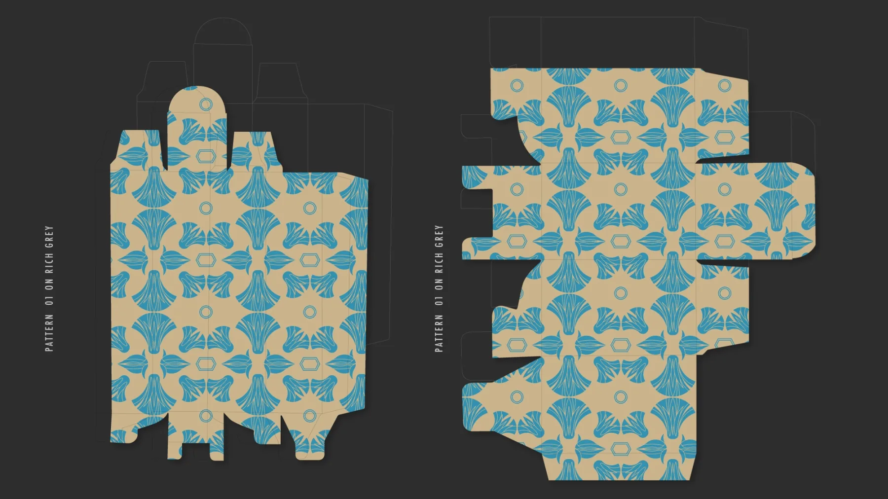
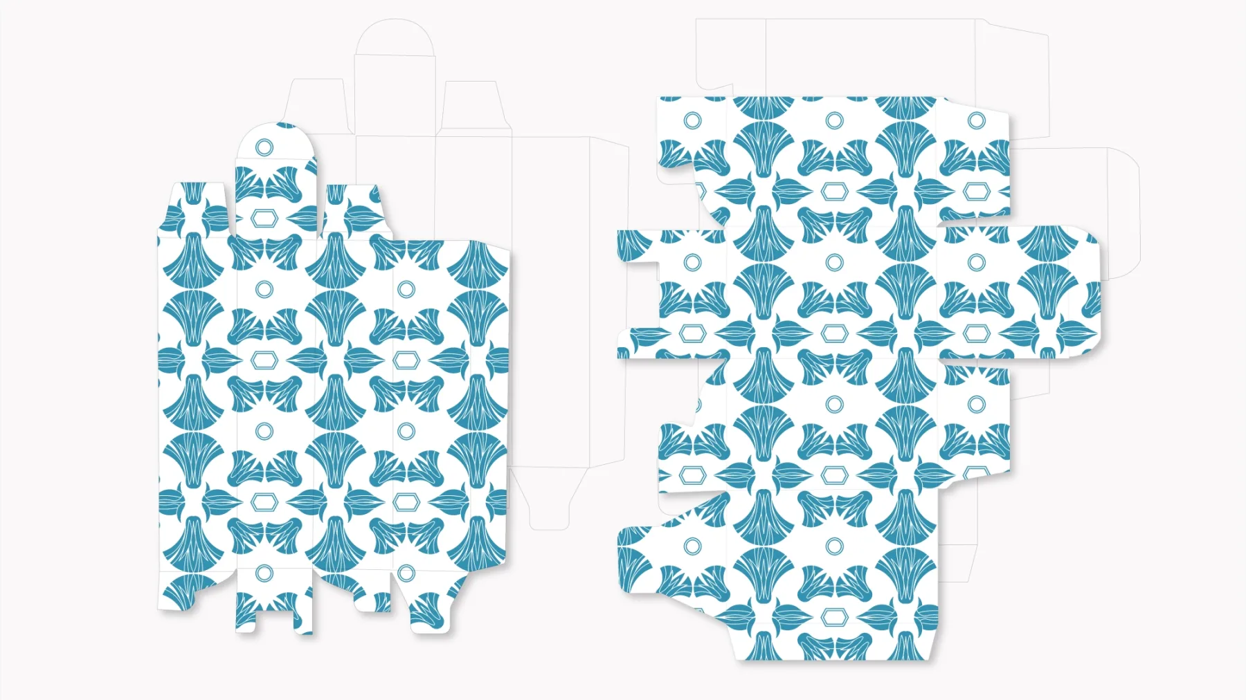
The brief was to develop a texture suited to covering two packaging formats while staying coherent with the brand's communication. The surface also had to convey the atmosphere of Gaeta's Christmas 2021, built around themes and figures drawn from different worlds.
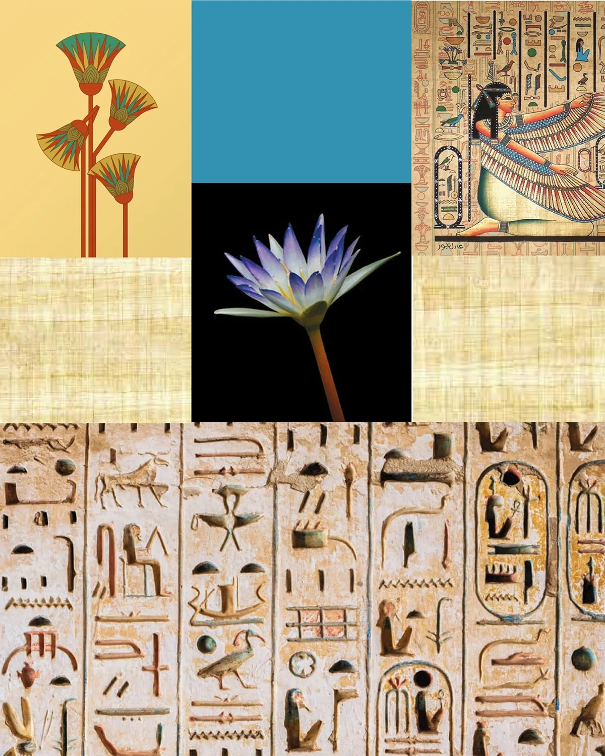
Among the subjects chosen for the illuminations was the Egypt of the pharaohs. The challenge was to select a reference able to enter into dialogue with the identity of Gaeta without being reduced to a decorative quotation.
The process and the vision
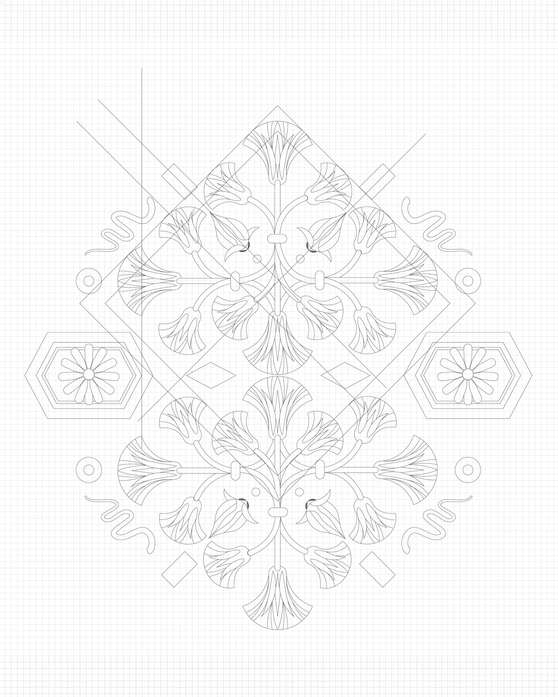
The analysis identified the Egyptian lotus as the most fertile point of connection. Its recurring presence in hieroglyphs makes it a sign charged with memory, yet a form open enough to be reinterpreted.
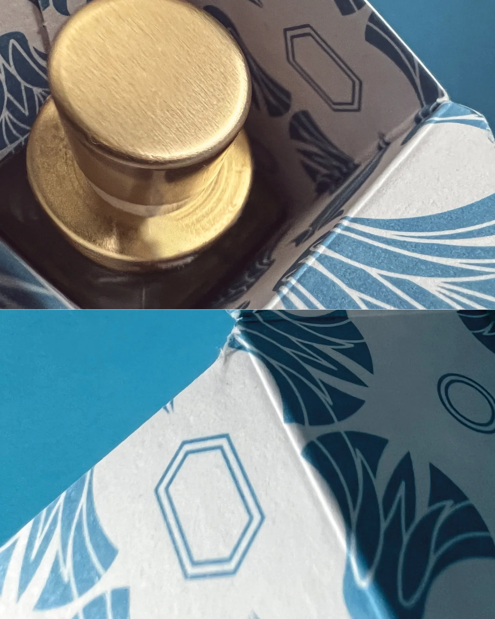
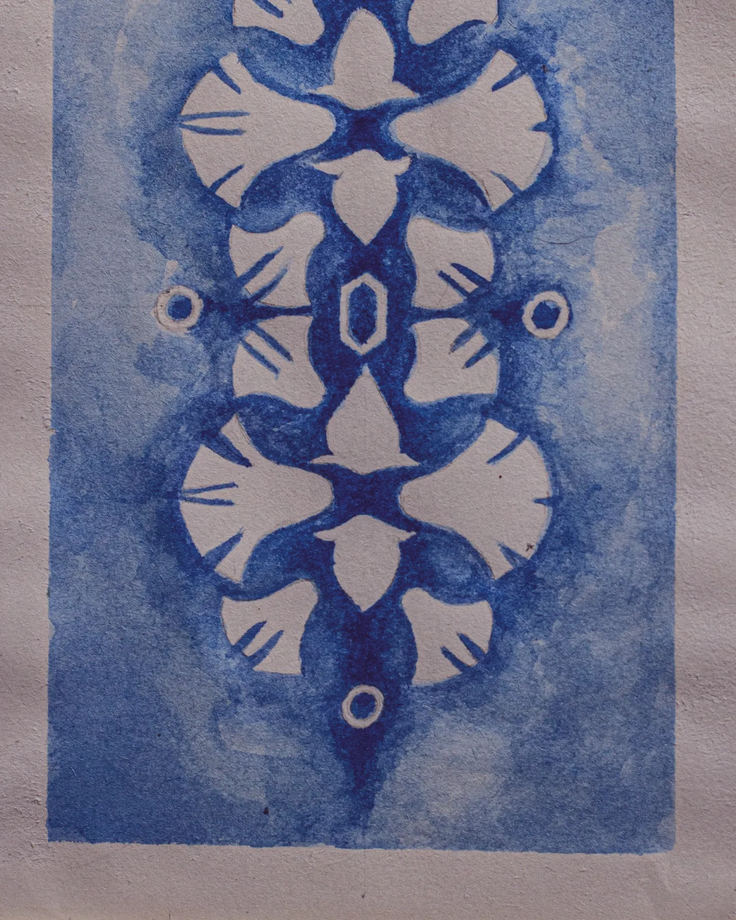
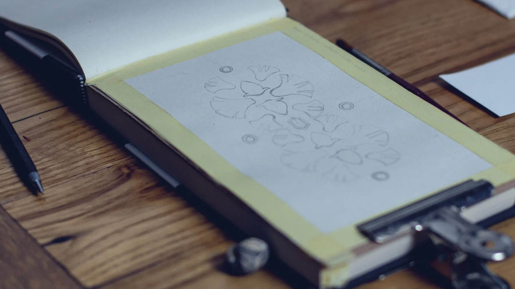
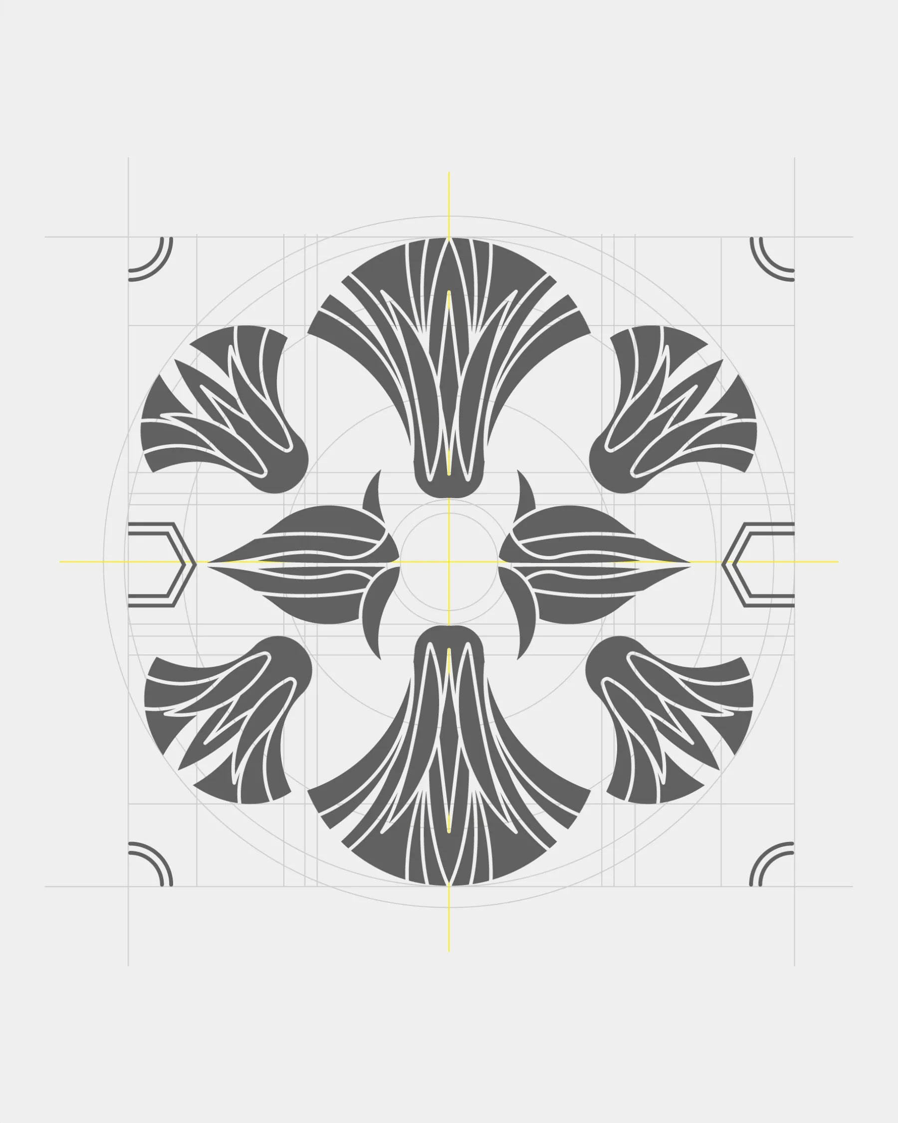
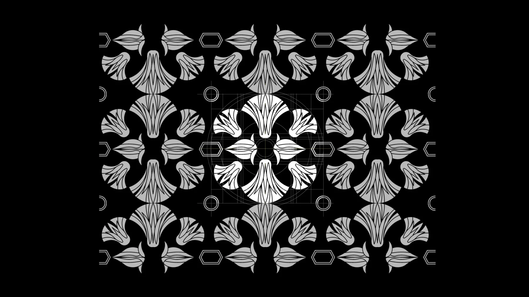
The flower was redrawn in its proportions, its sequence and its overall harmony. The form is not reproduced as an isolated image: it becomes a weave, a rhythmic presence able to accompany the surface of the packaging and to stay legible across both formats.


The design synthesis
The texture carries a fragment of history onto the product, turning the lotus reference into a visual system coherent with the story of Acqua di Gaeta. The surface becomes the meeting point between the town's Christmas, Egyptian imagery and the brand's Mediterranean culture.