Black Wood
The strategic premise
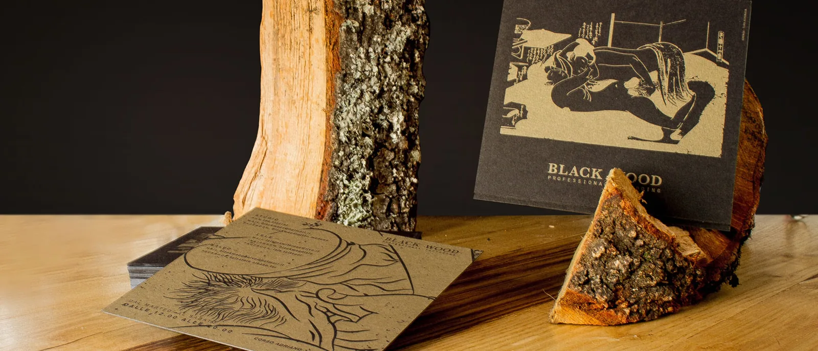
Black Wood is a tattoo studio working on the border between craft and art, and it needed an object to hold in the hand that already spoke of drawing, even before the name.
The first sketches
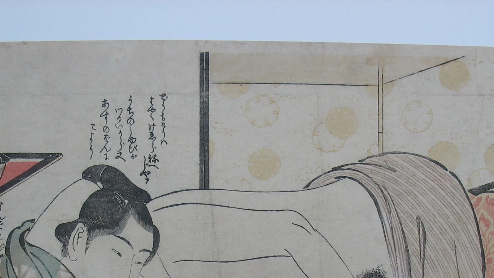
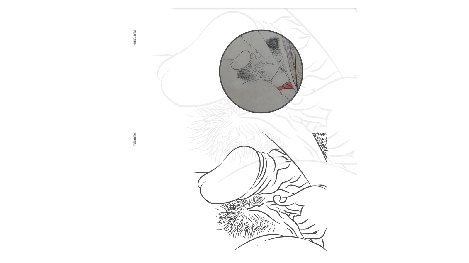
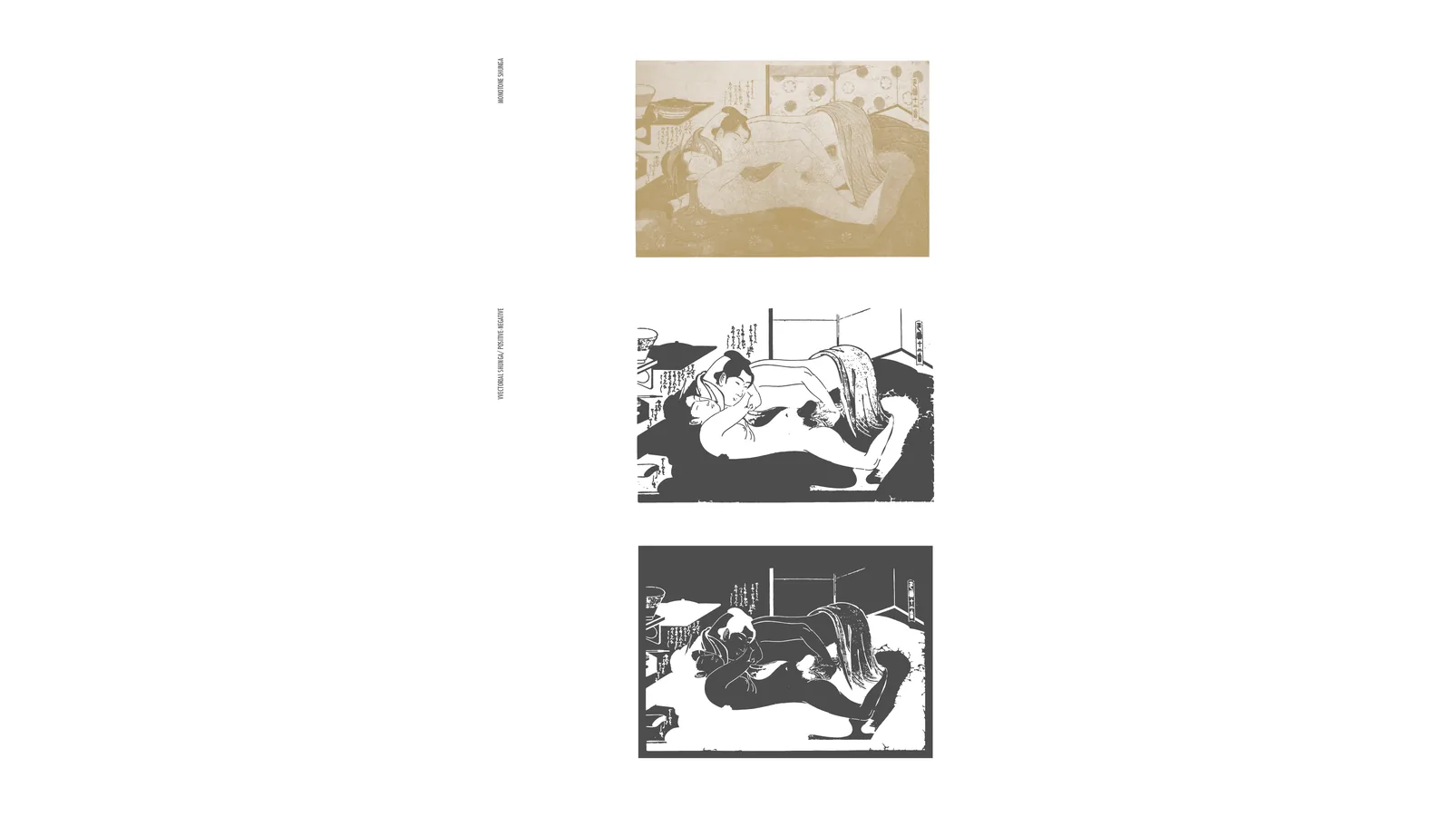
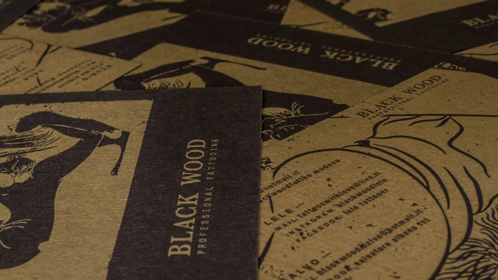
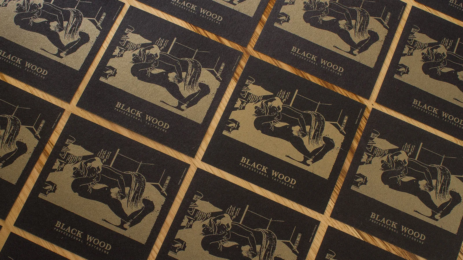
The starting point is an ukiyo-e print by Torii Kiyonaga, the eighteenth-century Japanese master, redrawn in line the way a tattoo stencil is prepared, line after line, until the details that stand on their own are isolated.
Development
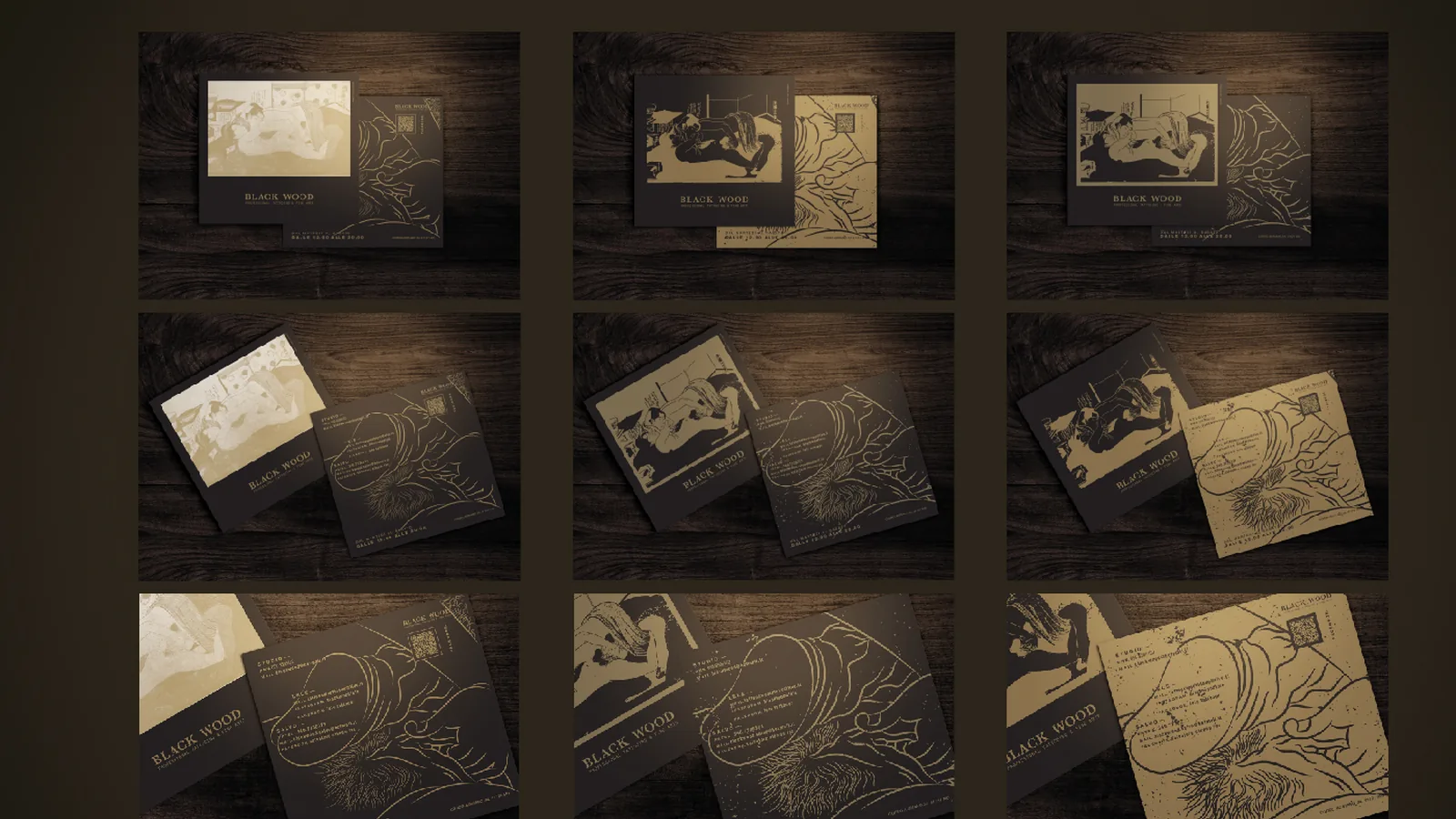
The drawing leads to several solutions for the front, positive and negative, tested on different backgrounds before choosing black card with gold.
The system
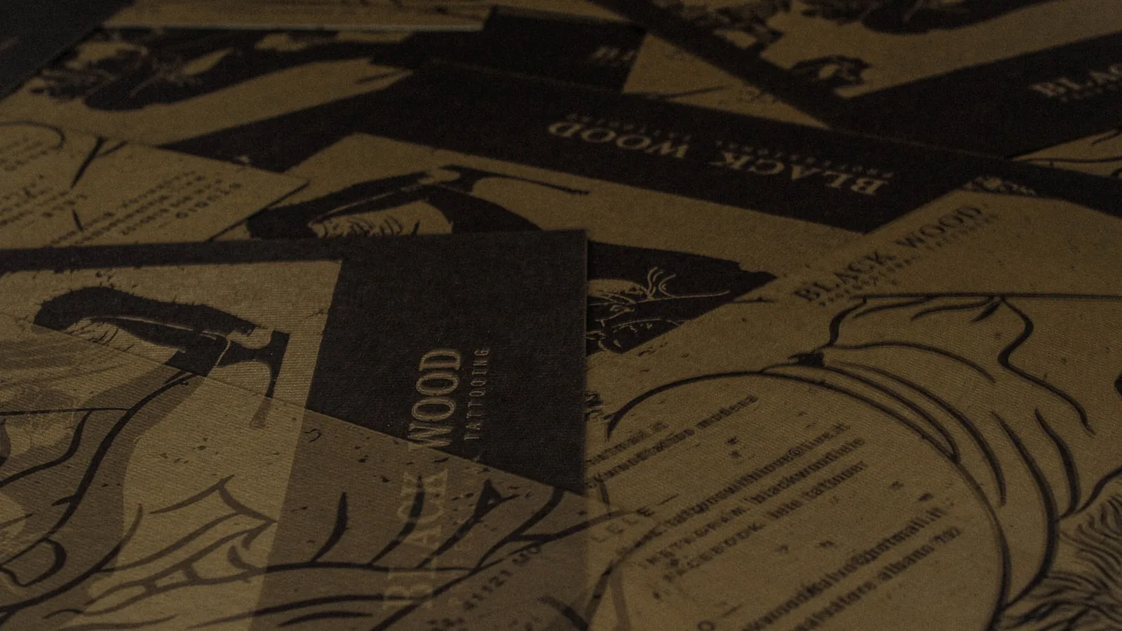
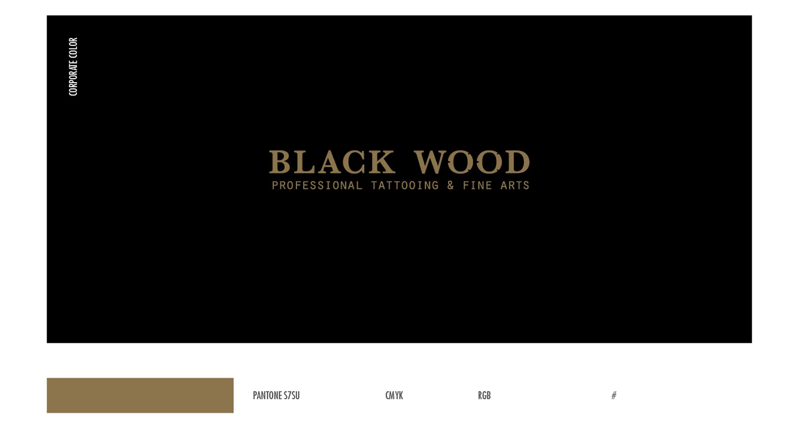
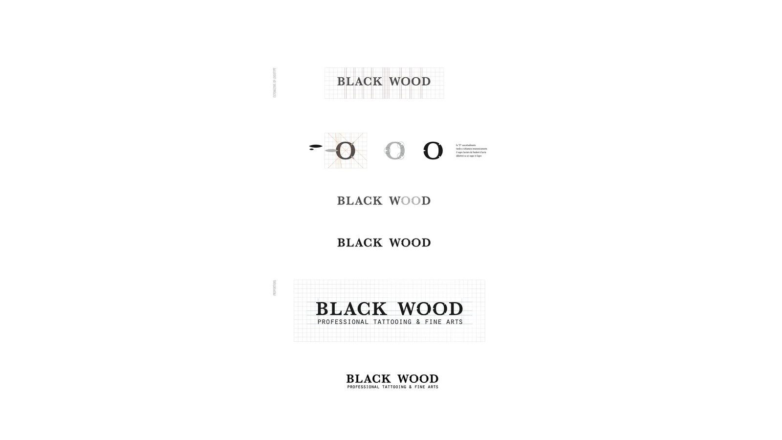
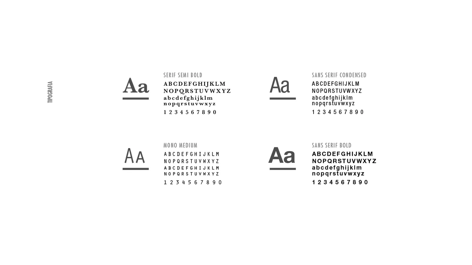
The logotype is a spaced, restrained serif in capitals, above the words professional tattooing & fine arts; the palette stops at black and a matt gold, and the wood in the photographs echoes the studio’s name.
Applications
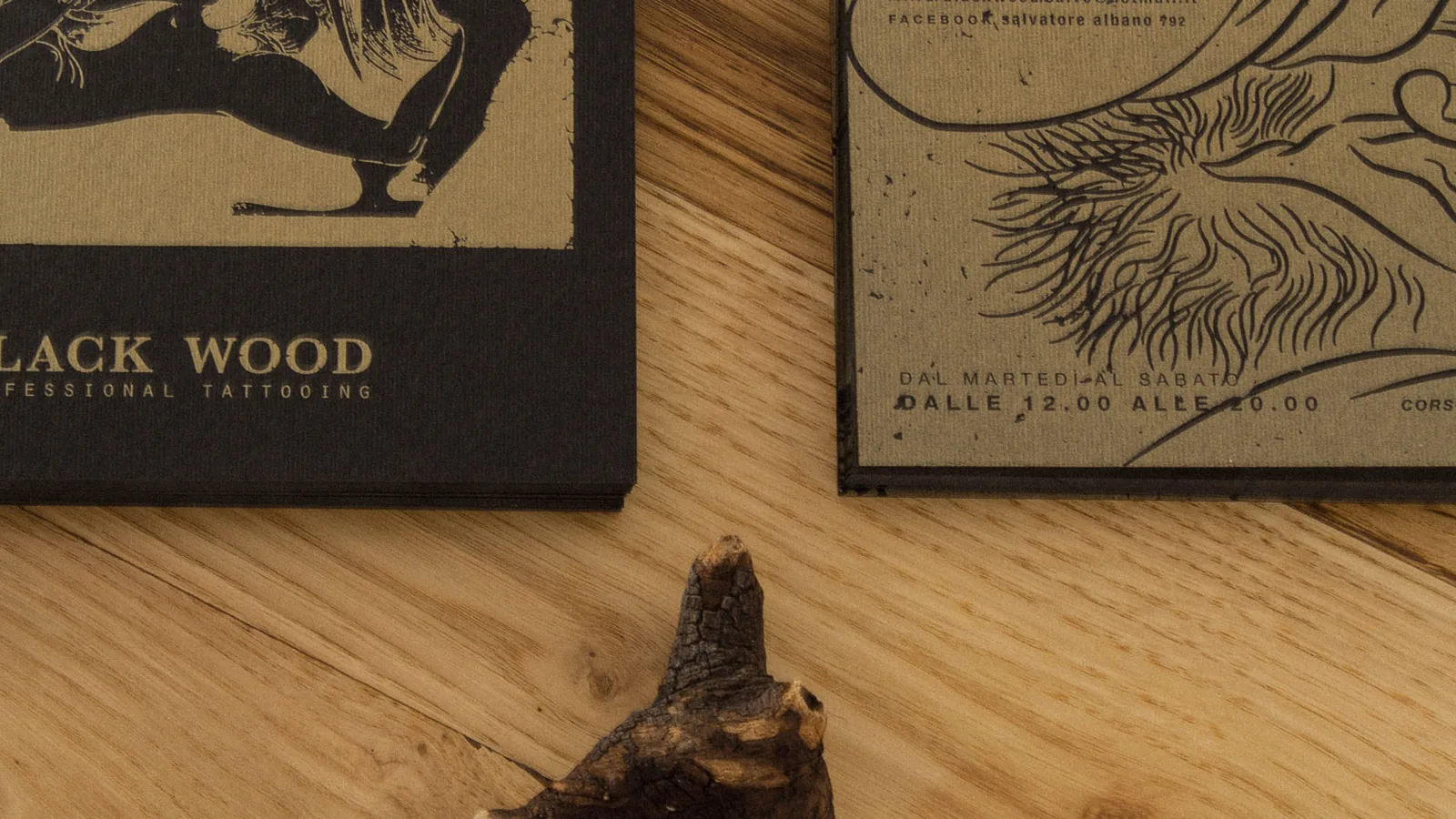
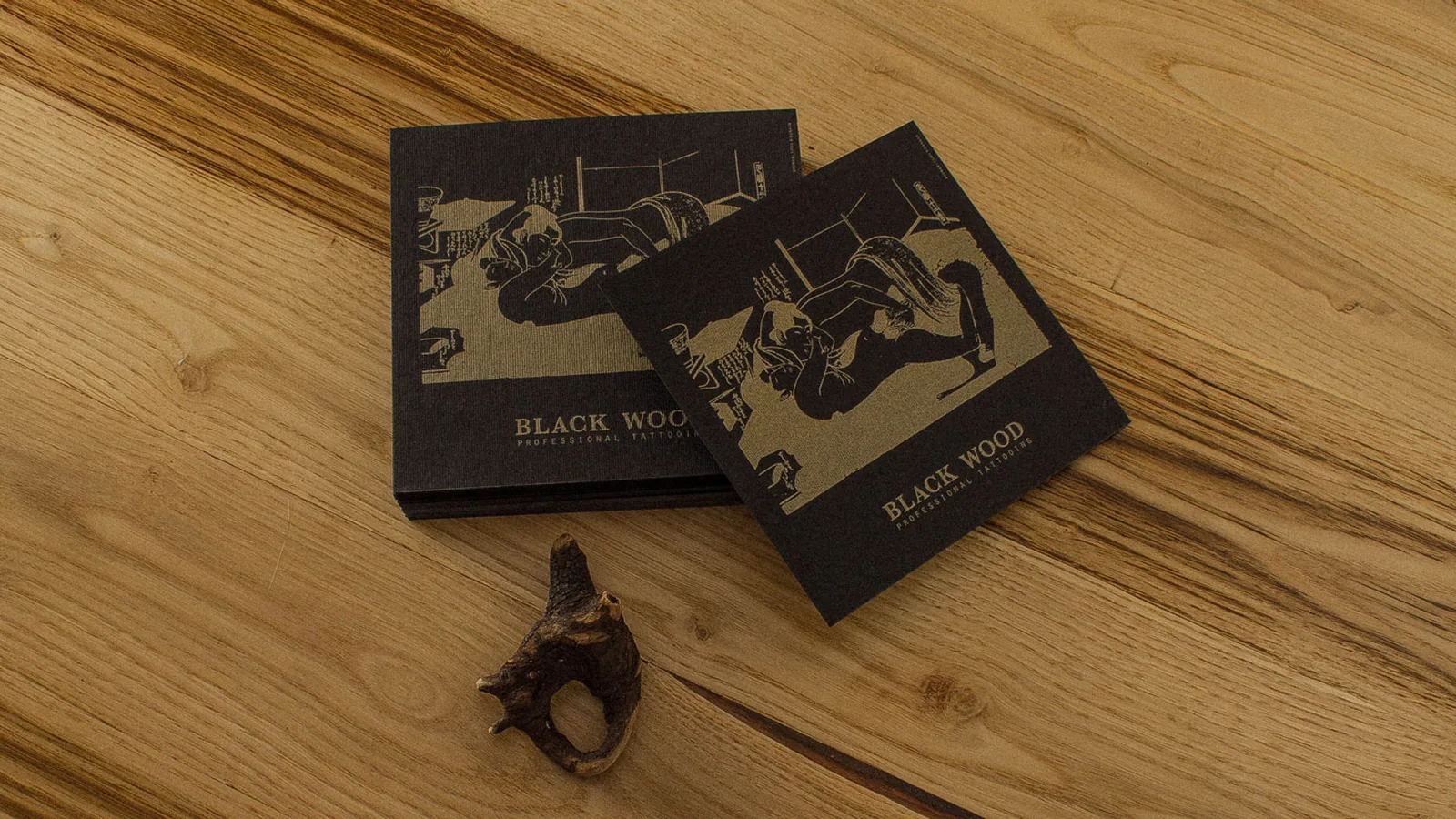
Postcards and cards carry the drawing full bleed on black card, with gold emerging only where the line calls for it.
The outcome
The result is a card kept like a print, because it carries outside the studio the same idea the studio puts on skin, drawing above all.
Let us talk about it, or keep exploring the rest of the work.