Hair Outfit
The strategic premise
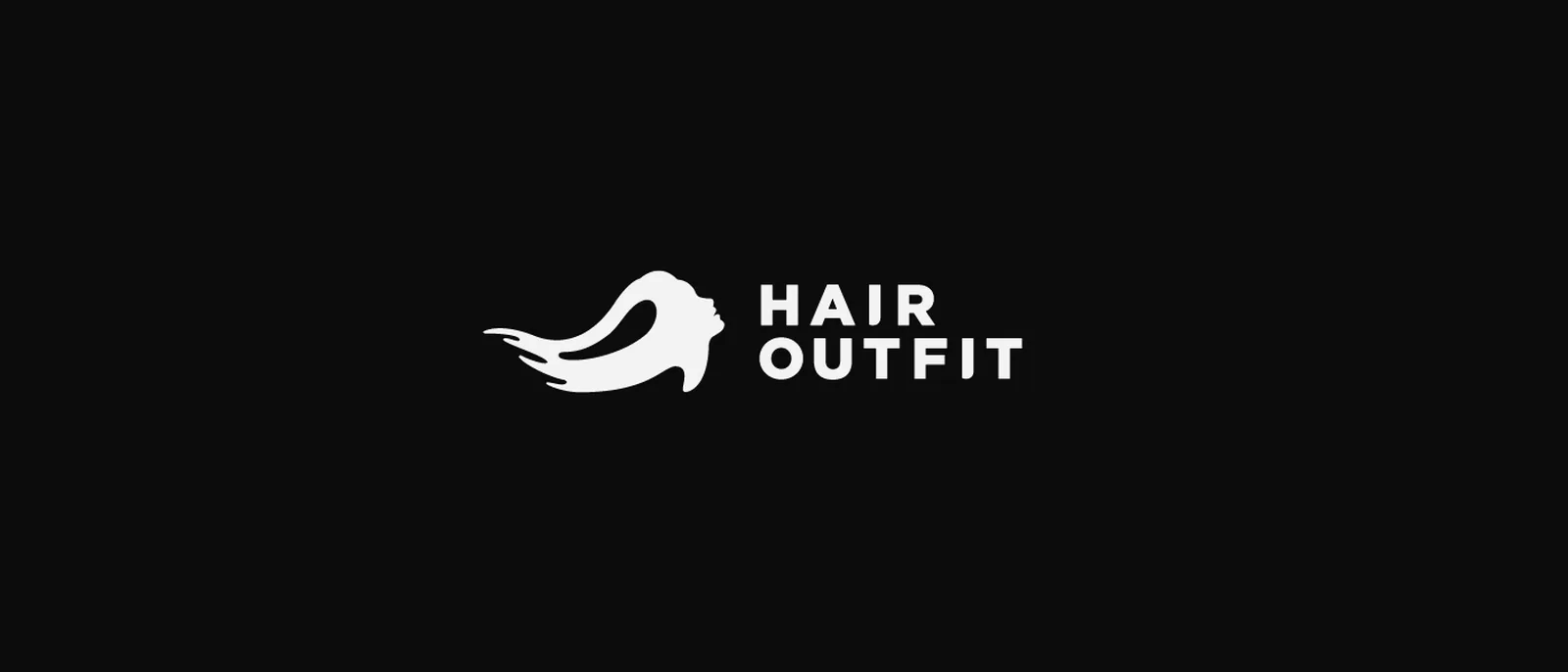
Hair Outfit grows out of Antonella Pietrangeli’s method, a consultation that begins without a mirror, with a conversation and a choice of fabrics, and reaches colour only once the client has recognised the tones that flatter her; the name comes from the method and means the outfit of the hair, because hair is the one accessory you never leave in the wardrobe.
The first sketches
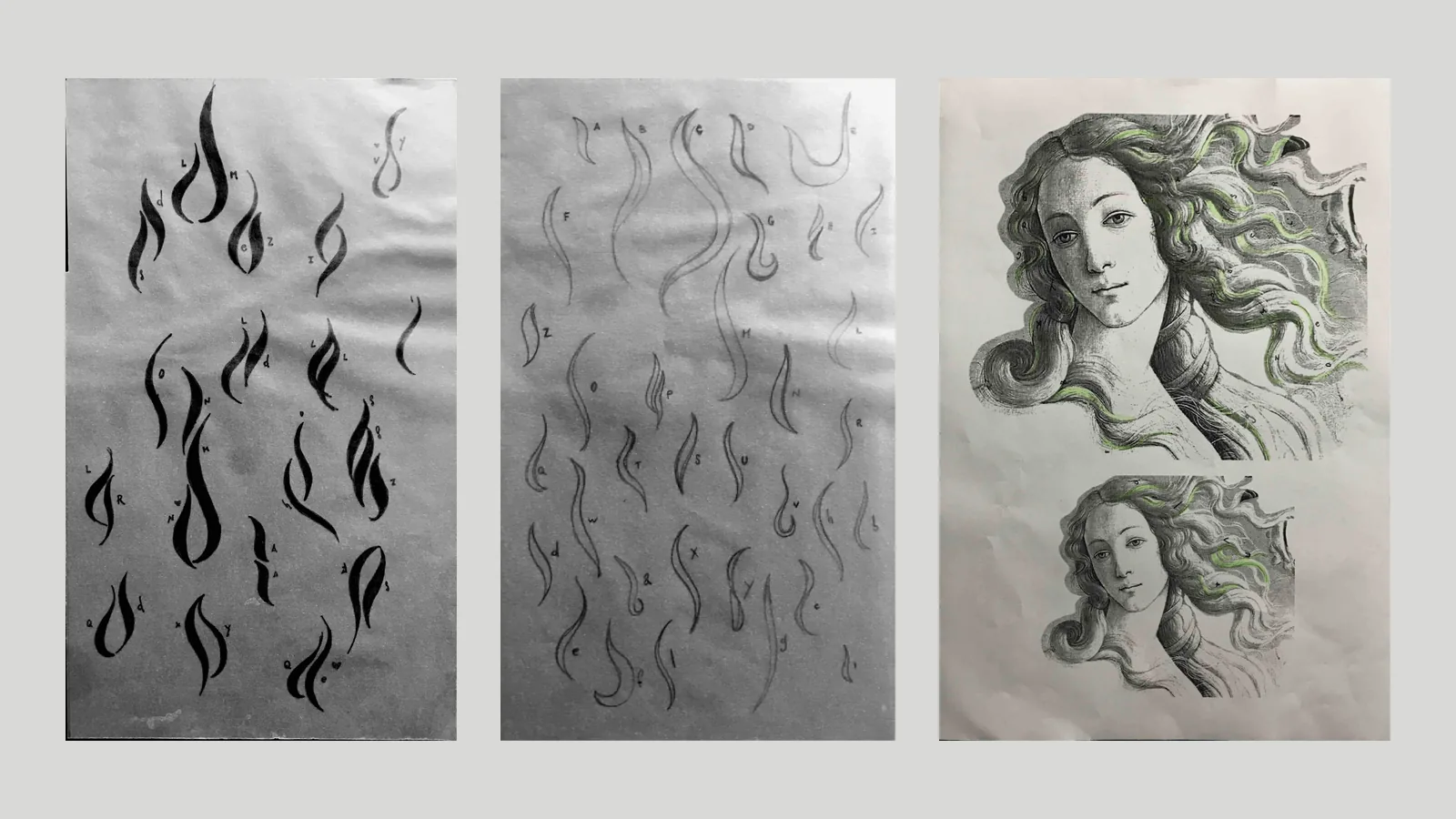
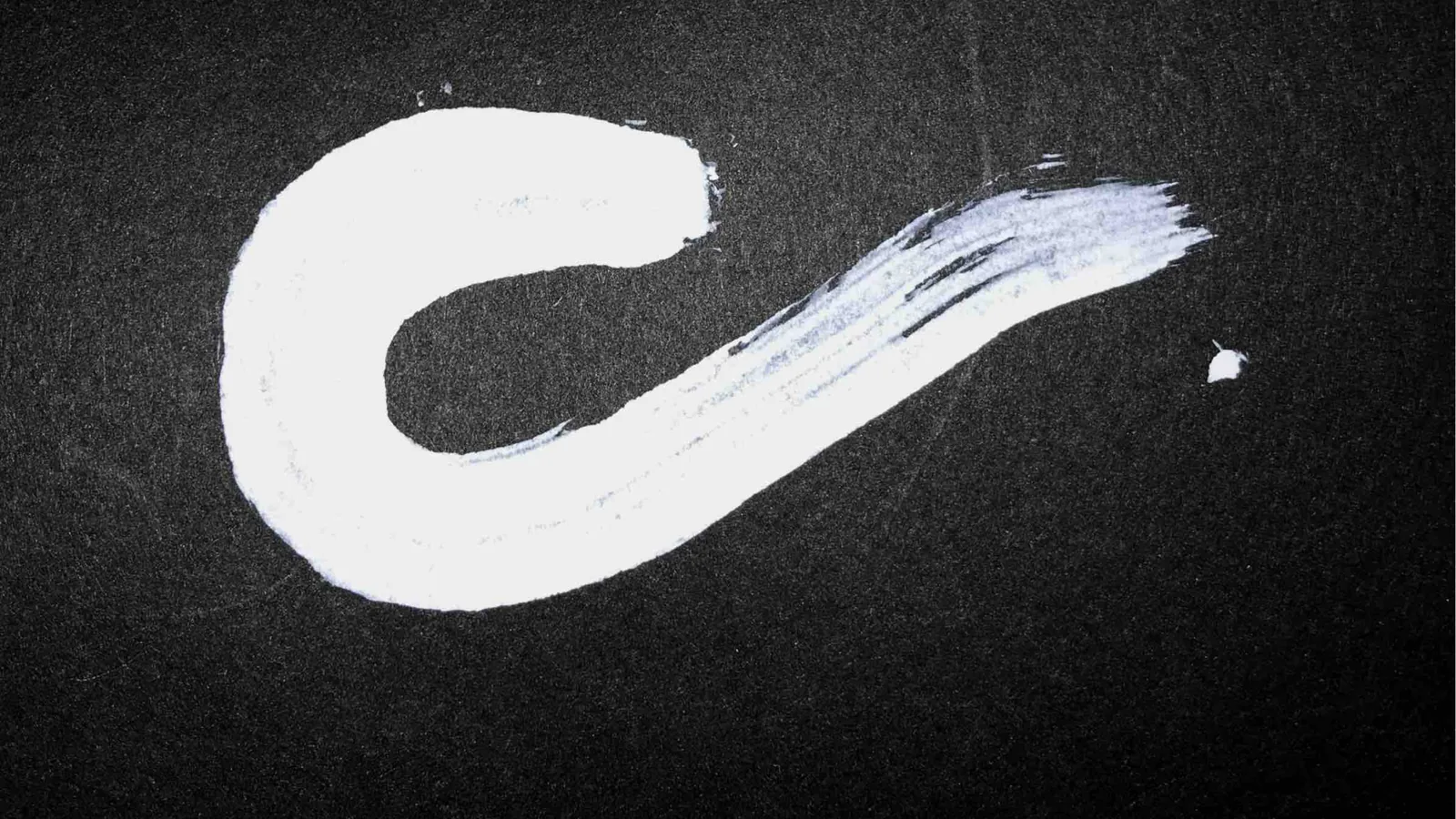
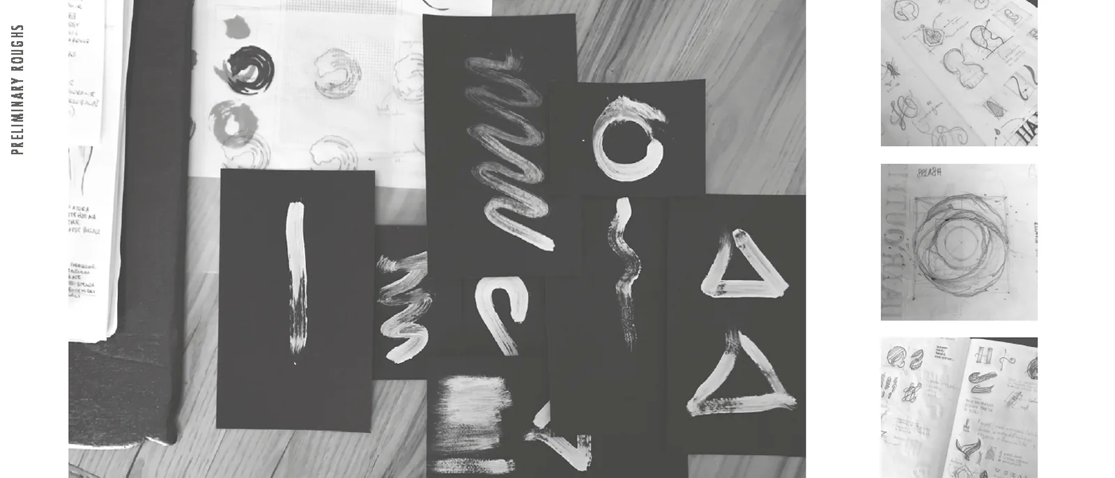
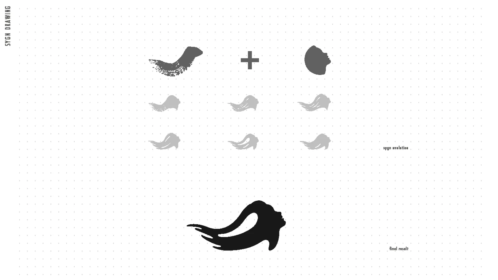
The mark is born from the brush used to apply colour, first with dozens of white strokes on black paper searching for the movement of a lock of hair, then with ink sketches of Botticelli’s Venus, where the hair becomes the very shape of the figure.
Development
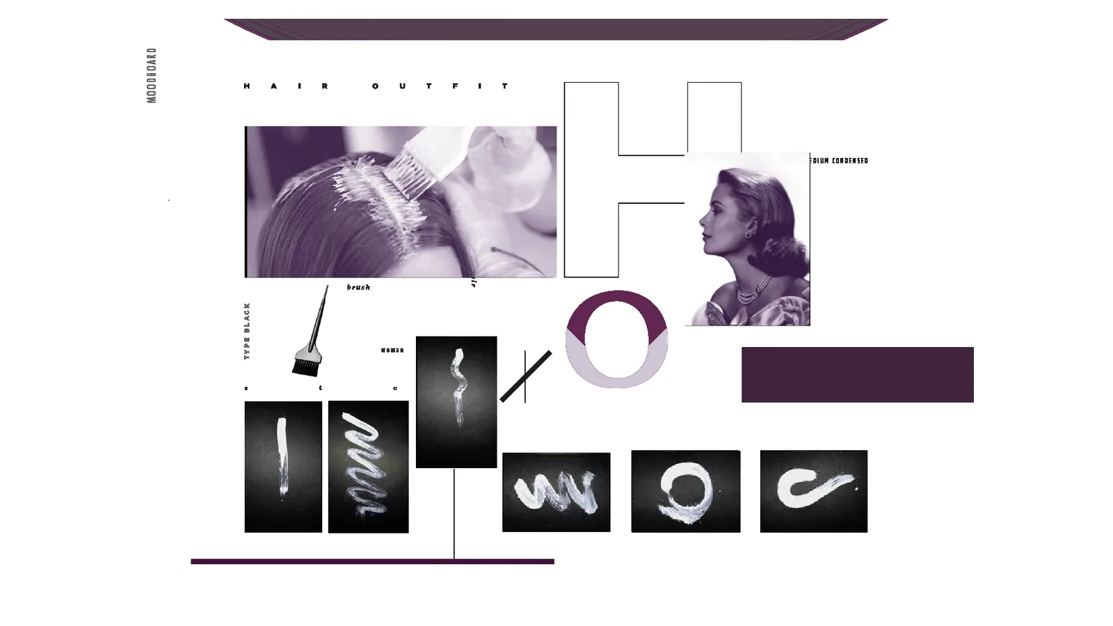
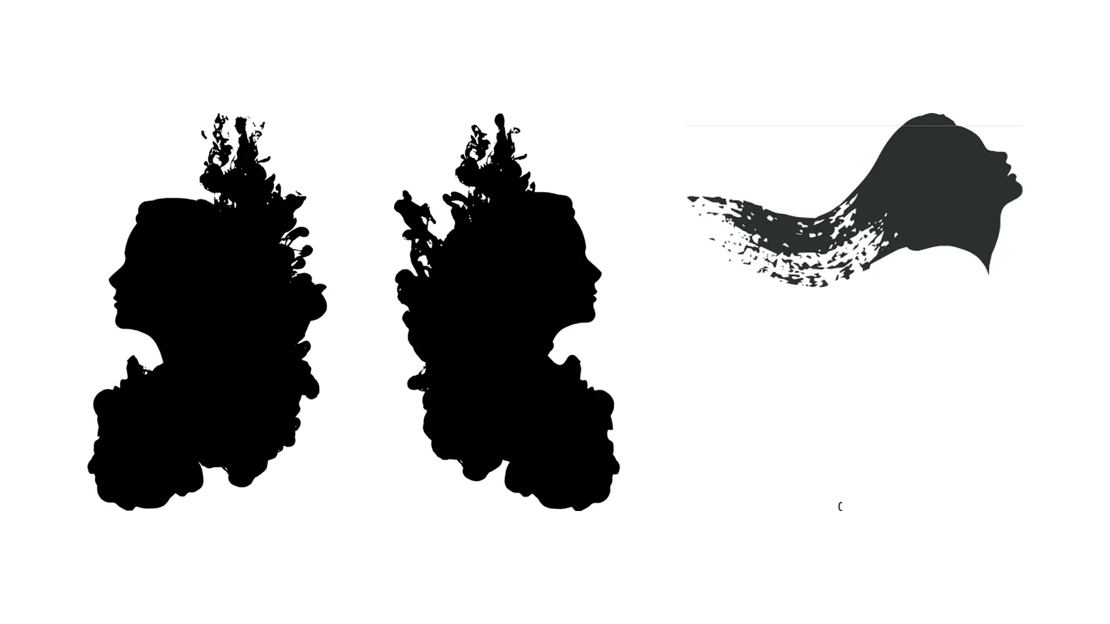
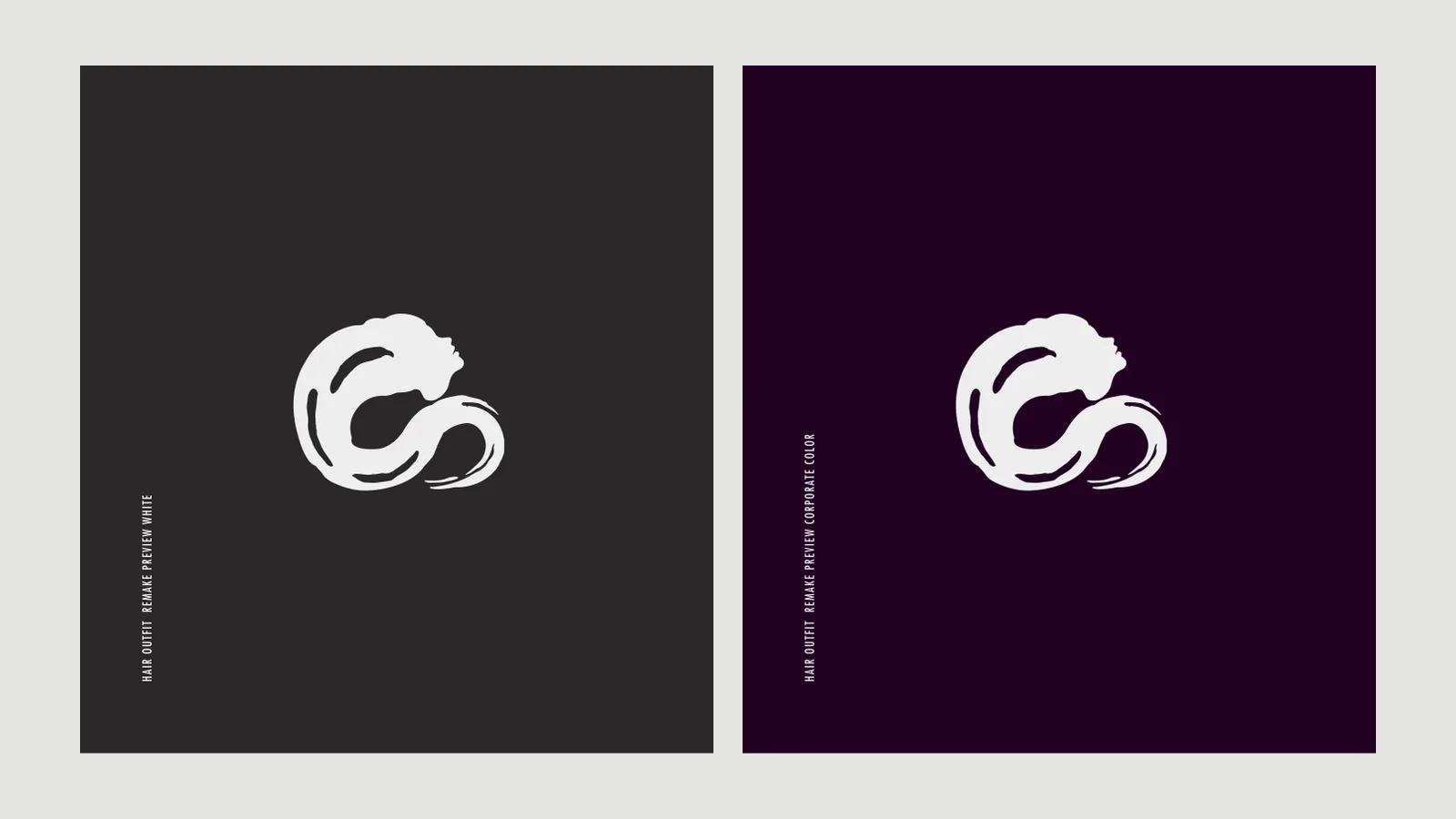
The tests lead to an iconic choice, the profile of a woman dissolving into a brushstroke; the mark holds together the tool of the trade, the woman the salon speaks to and the gesture that transforms her, and it was tried in black, in white and on purple before being redrawn as a solid shape.
The system
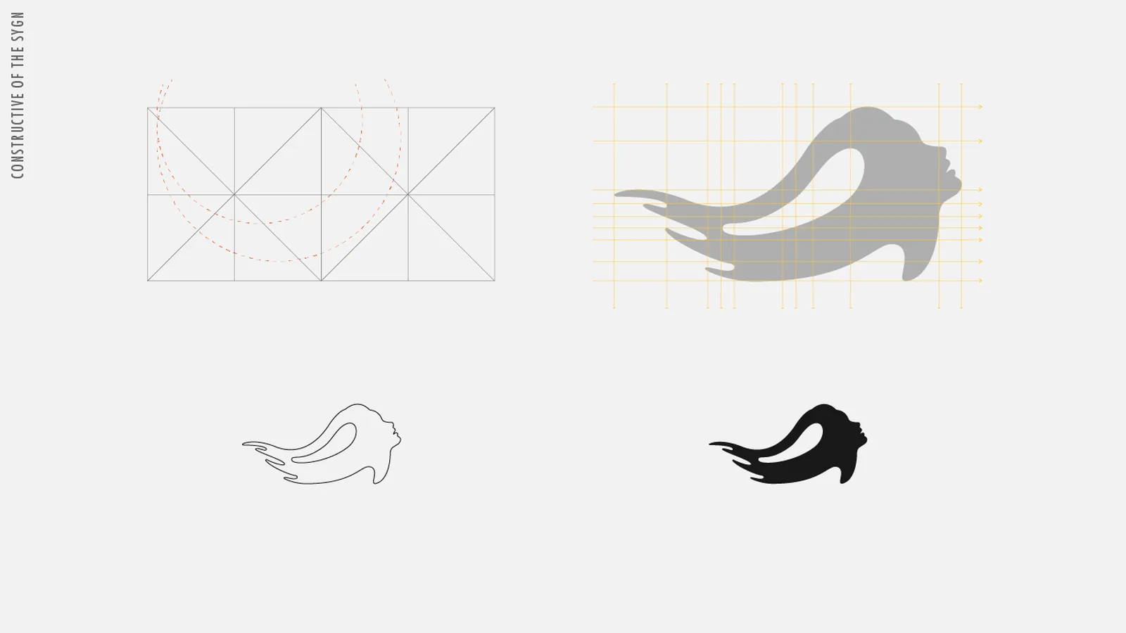
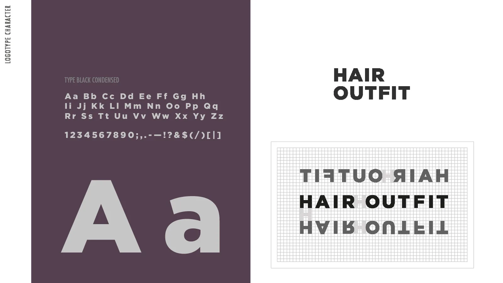
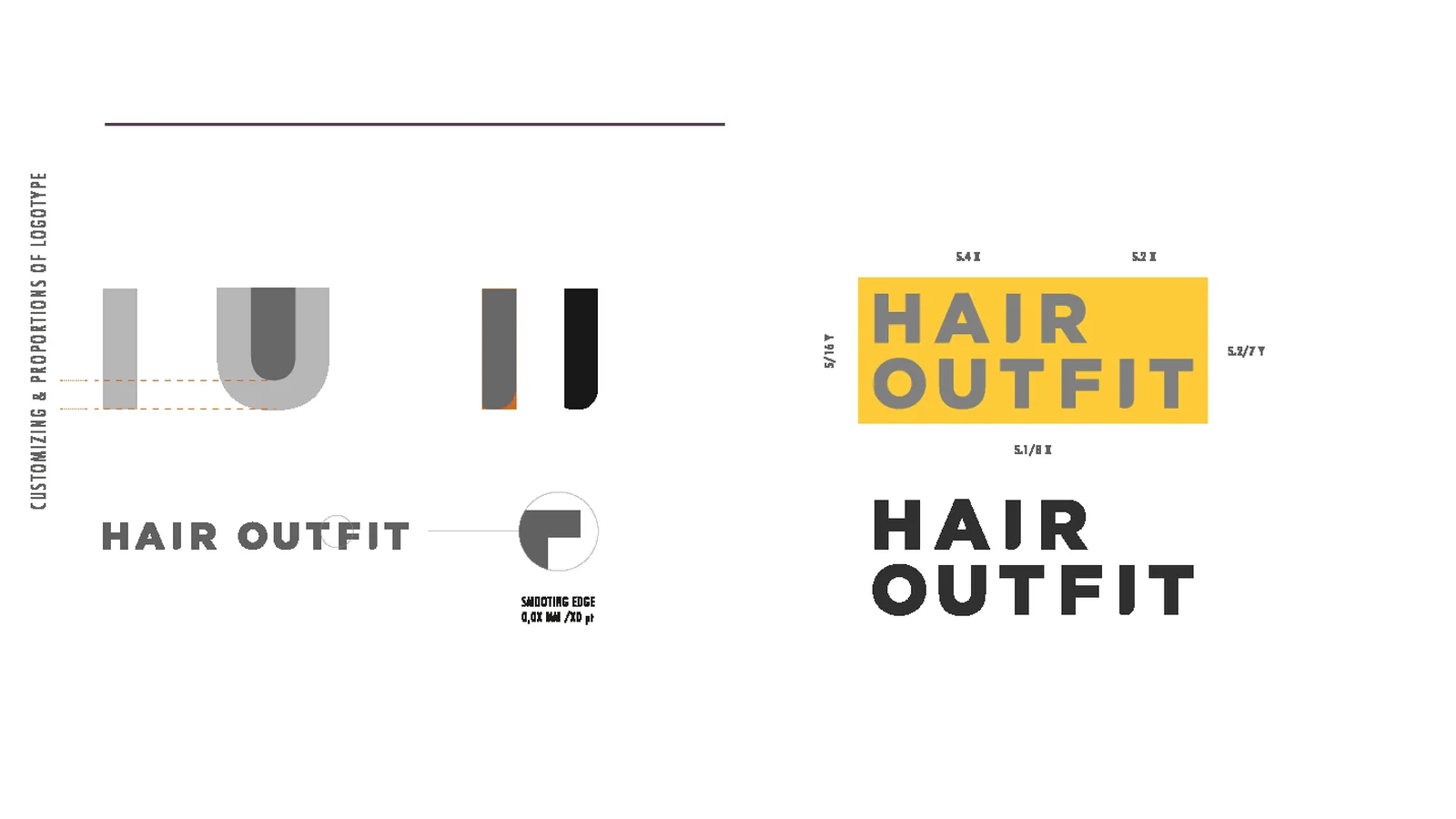
The logo is built on a grid of squares and diagonals that governs the curves of the brushstroke, next to a compact two-line logotype and the payoff “Colour dresses your identity”; the brand book sets construction, versions, typefaces and the plum purple that serves as the brand colour.
Applications
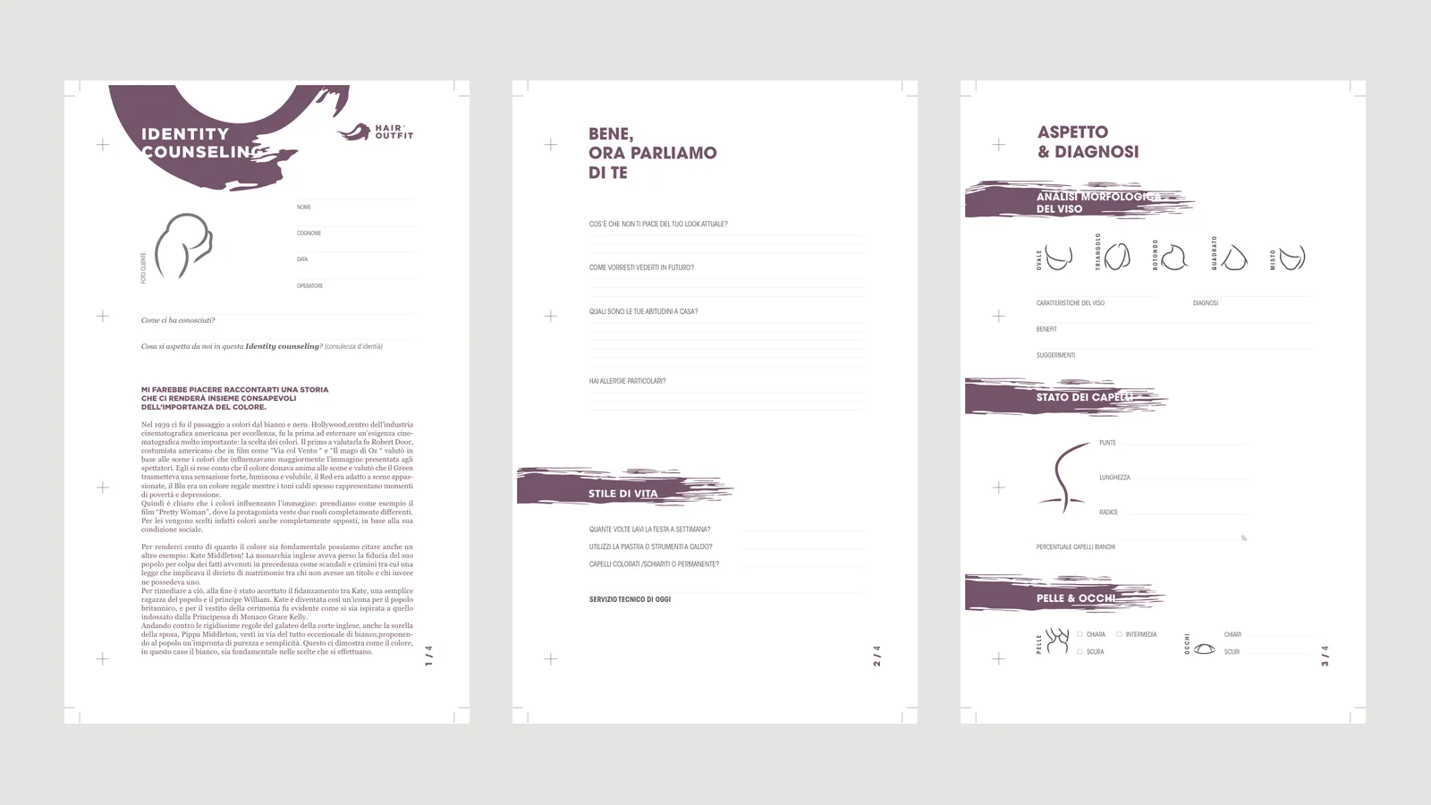
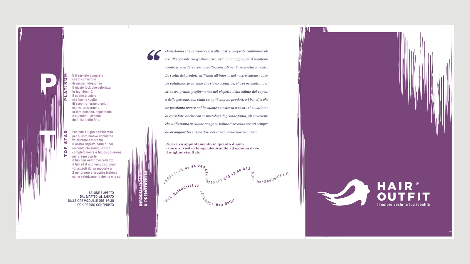
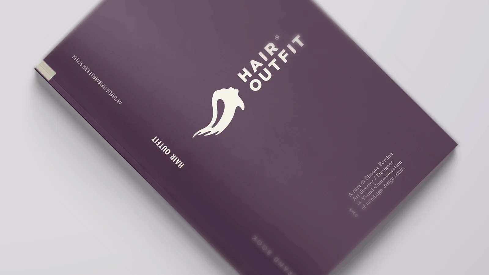
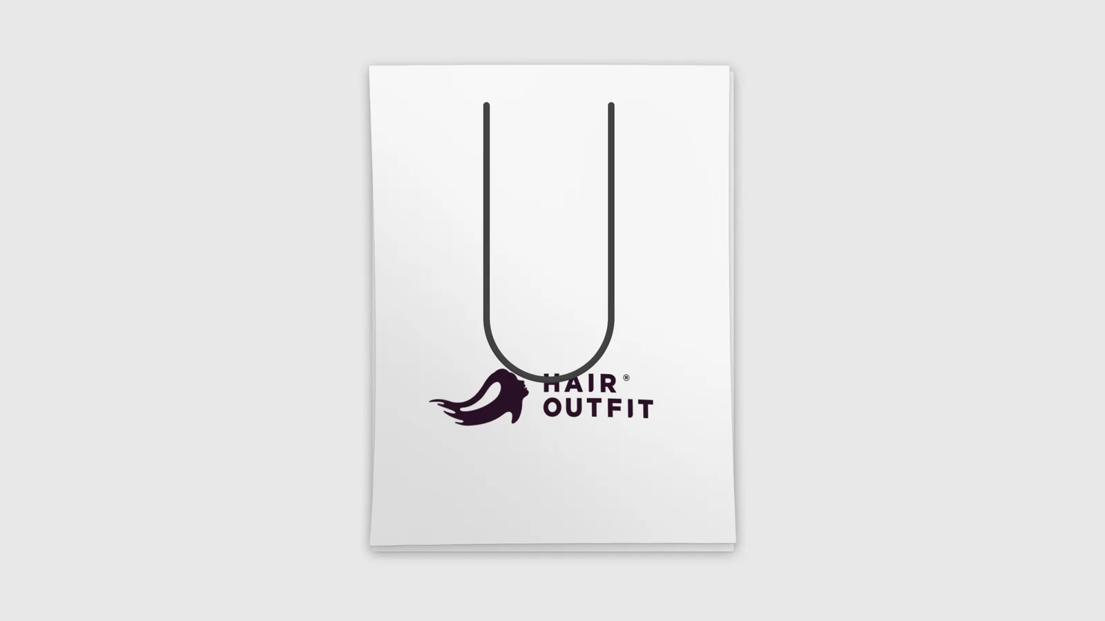
Beyond the consultation cards the system reaches the promotional brochure, which tells the story of the salon, the method and the team, the brand book and the shopping bag, with the purple brushstroke opening and closing every page.
The mark in motion
The animation starts from the construction grid and fills it until only the profile remains, in the brand purple, so the mark shows itself as it takes shape.
The outcome
The result is an identity born from a method rather than a trend, a mark recognised as a gesture of the trade that speaks to the women the salon serves, promising them not another image but the colour they already have.
Let us talk about it, or keep exploring the rest of the work.