Toggle navigation
home
mind
contacts
HOME/
ACQUA DI GAETA PACKAGING DESIGN
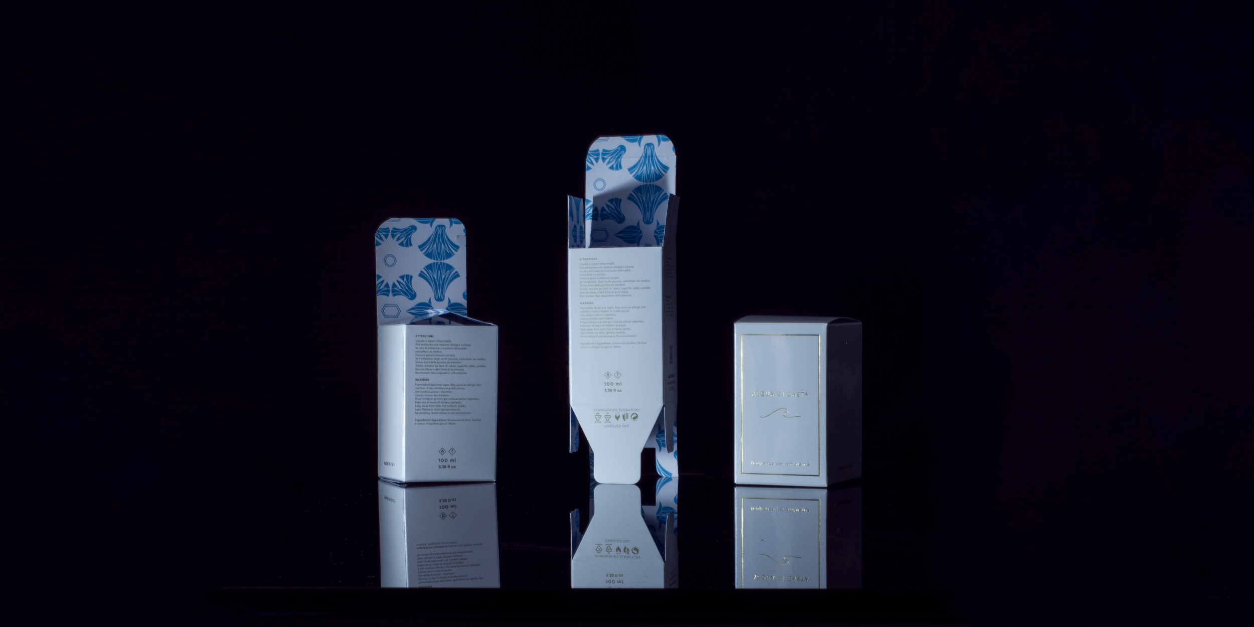
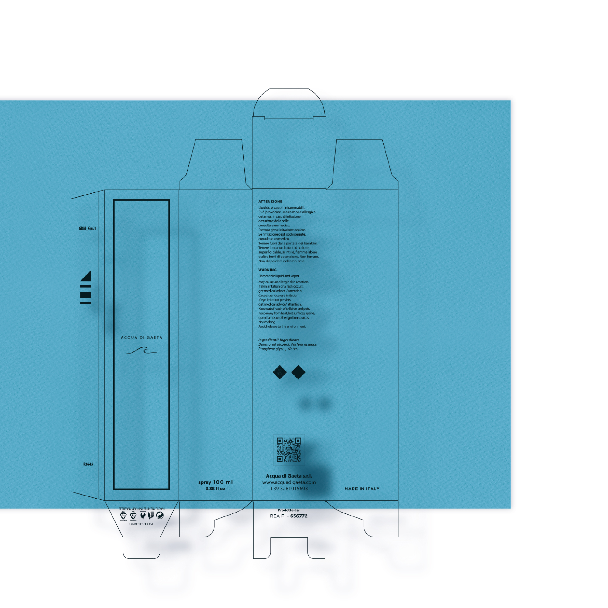
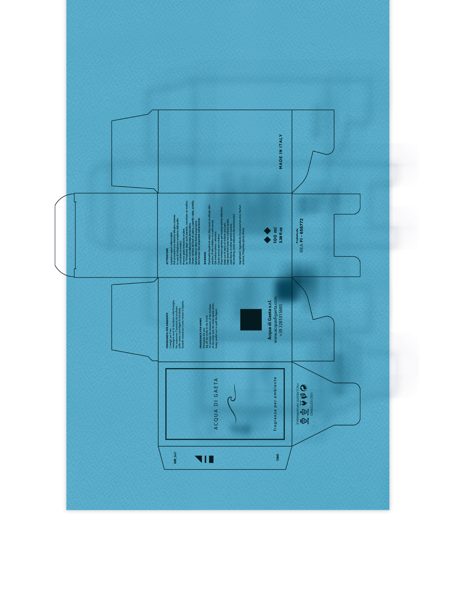
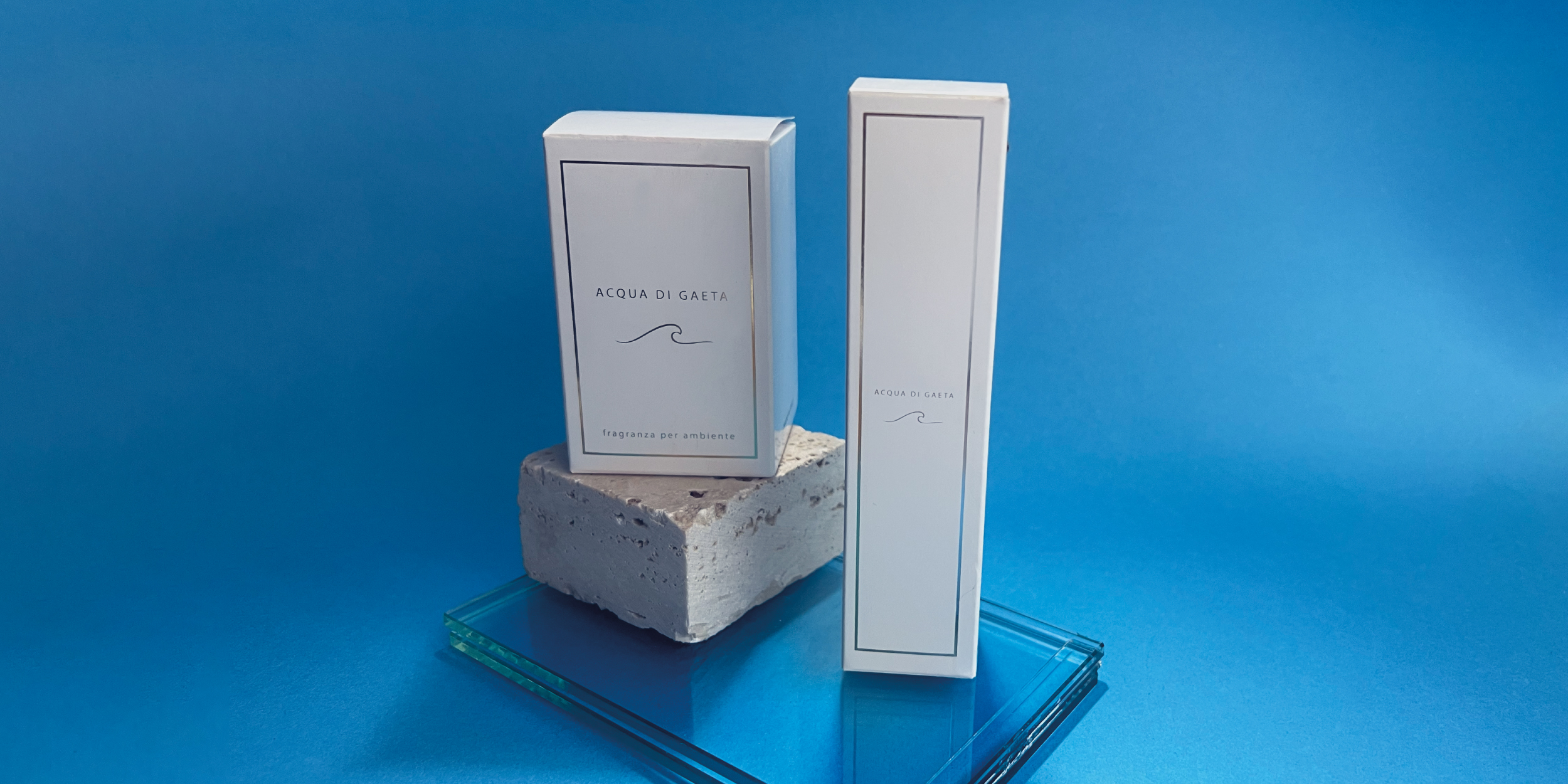
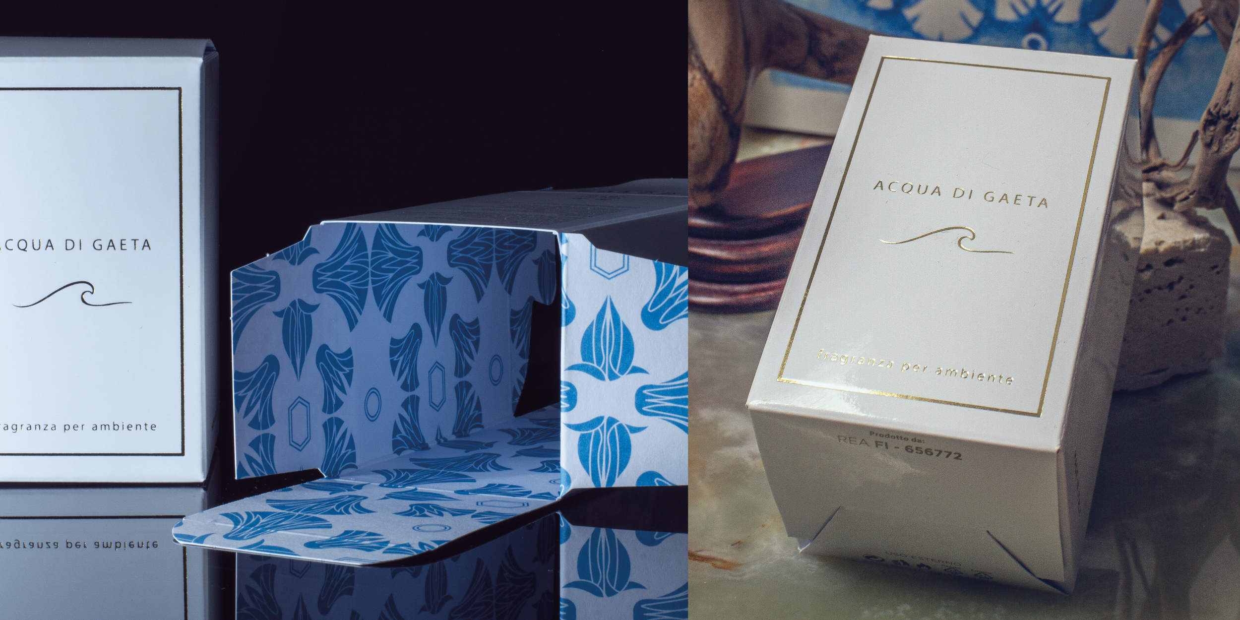
Acqua di Gaeta
—
Is an Italian brand operating in the system of the fragrances and perfumes. Through its Brand Equity it aims at the culture and enhancement of one of the symbolic places of the Ulysses Riviera, a destination for international tourism and the cradle of various peoples and cultures whose source of livelihood was the sea, The sea and trade through it, which is why its name stands out among the maritime republics of the 11th century, Gaeta.
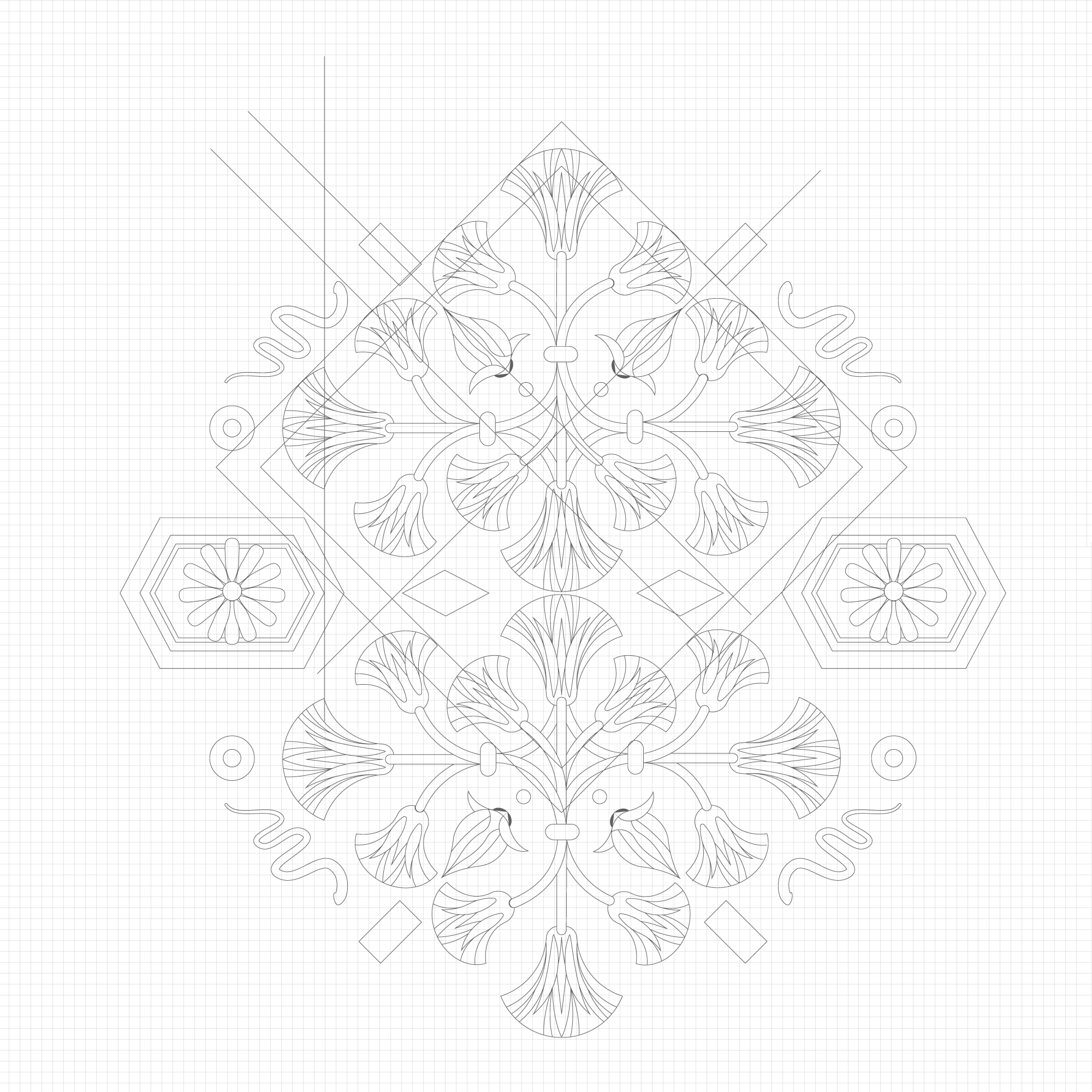
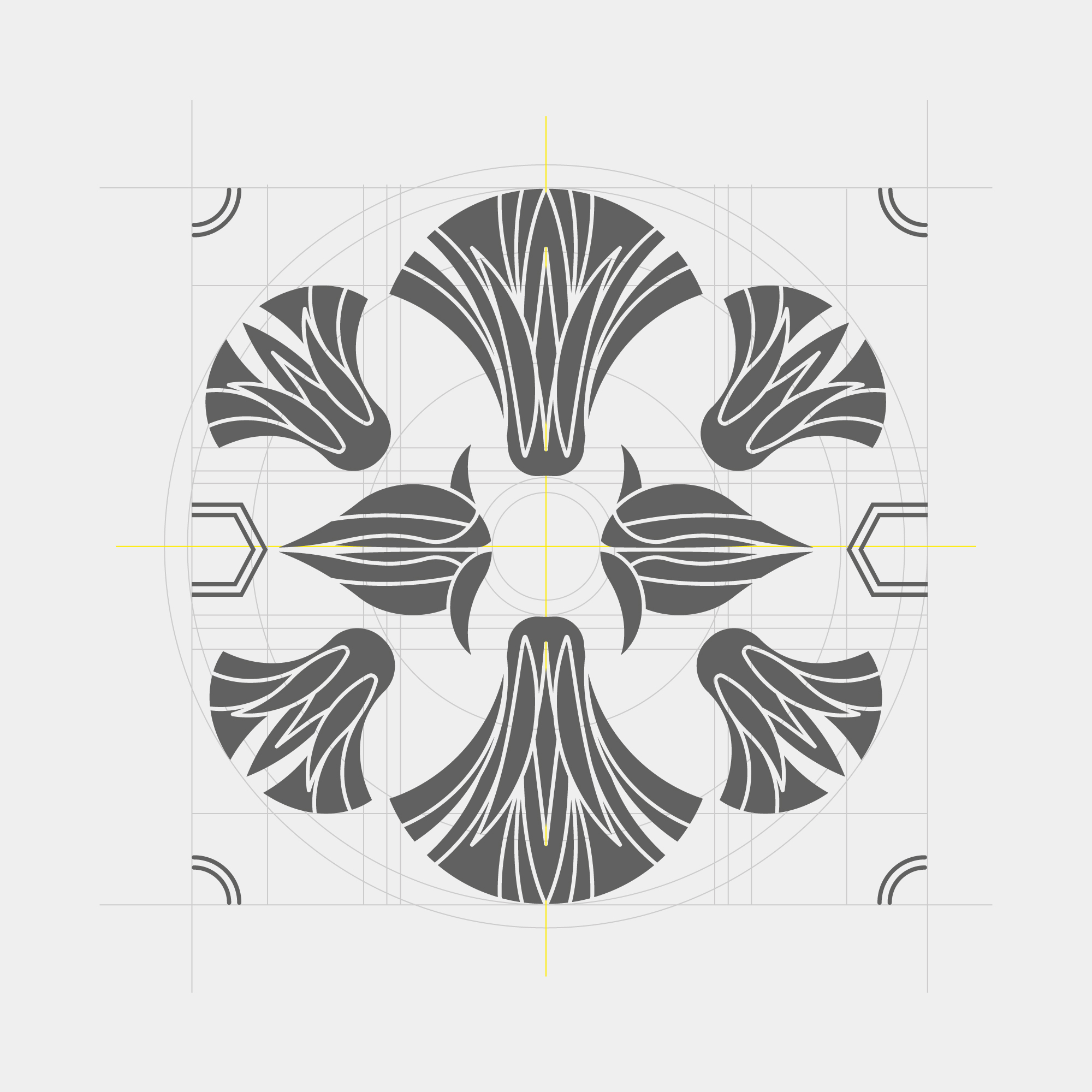
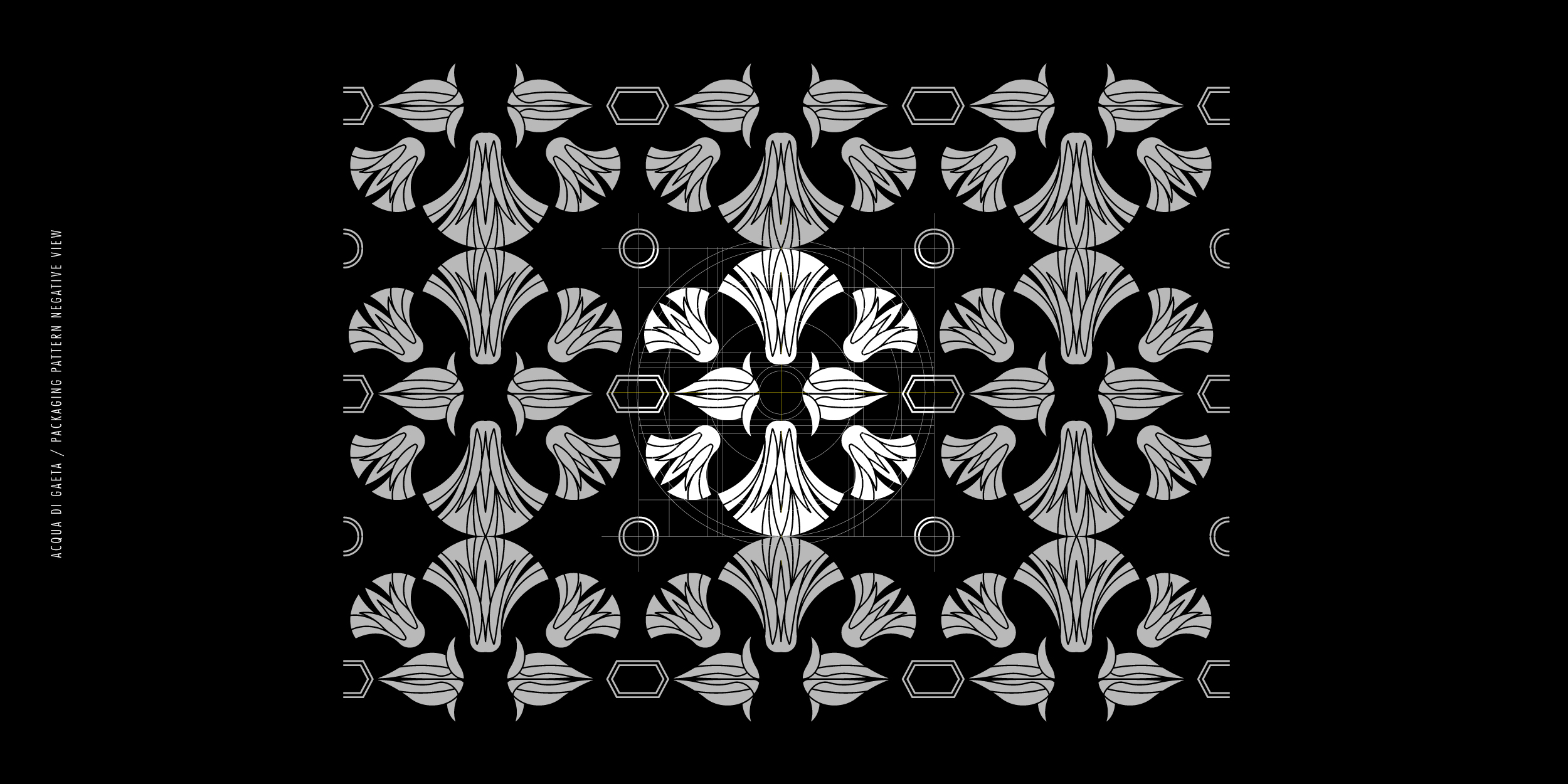
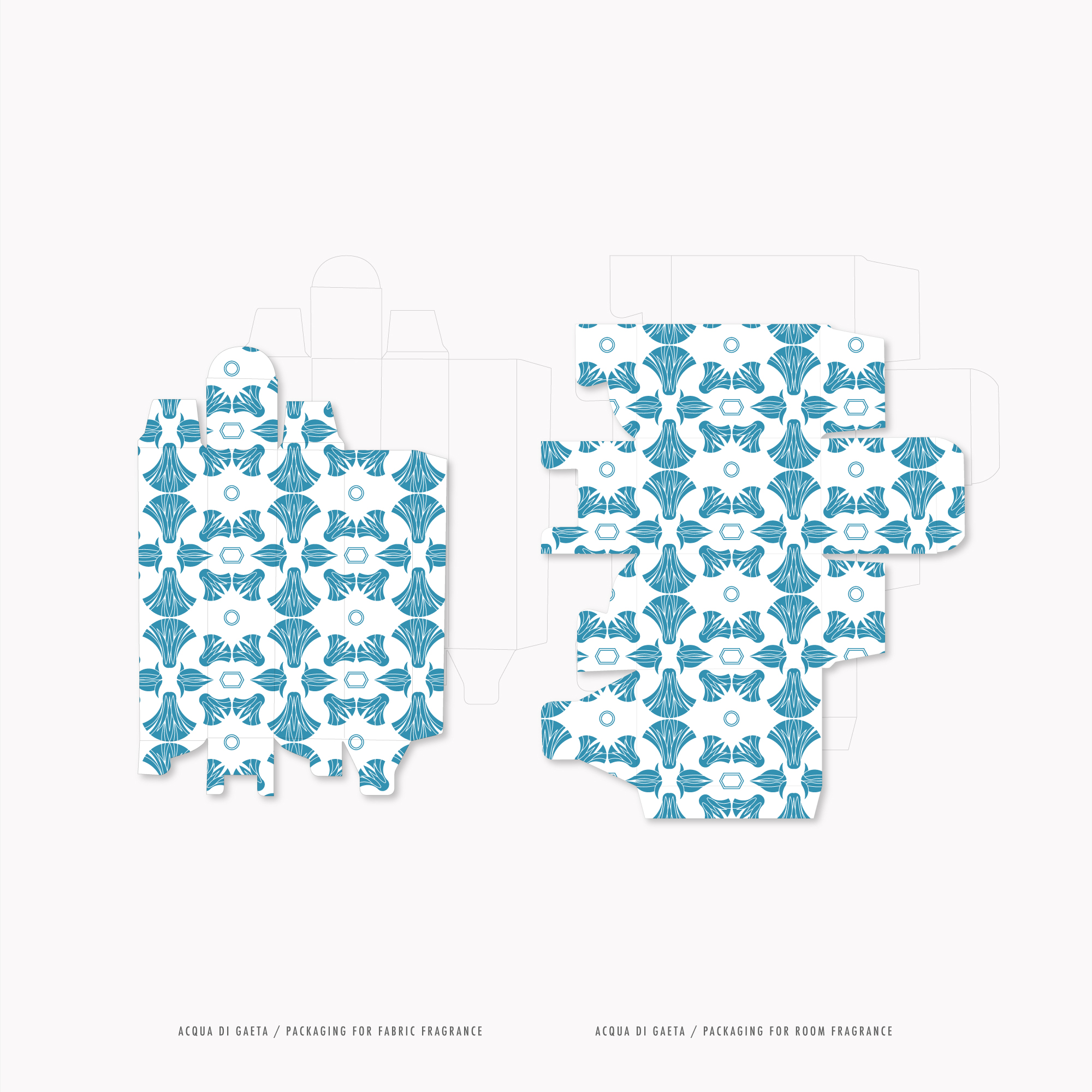
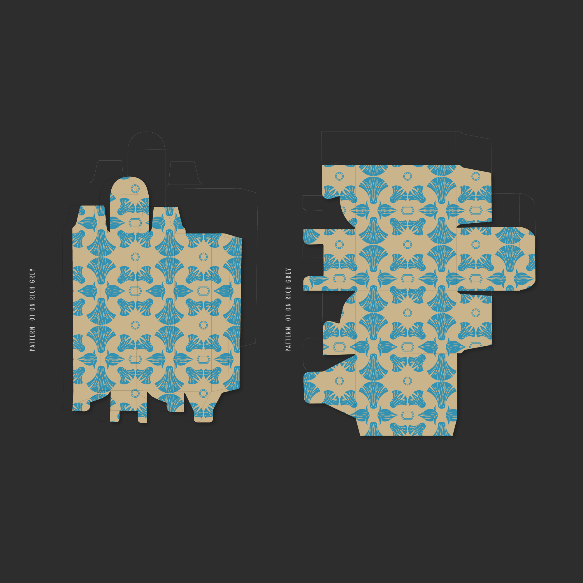
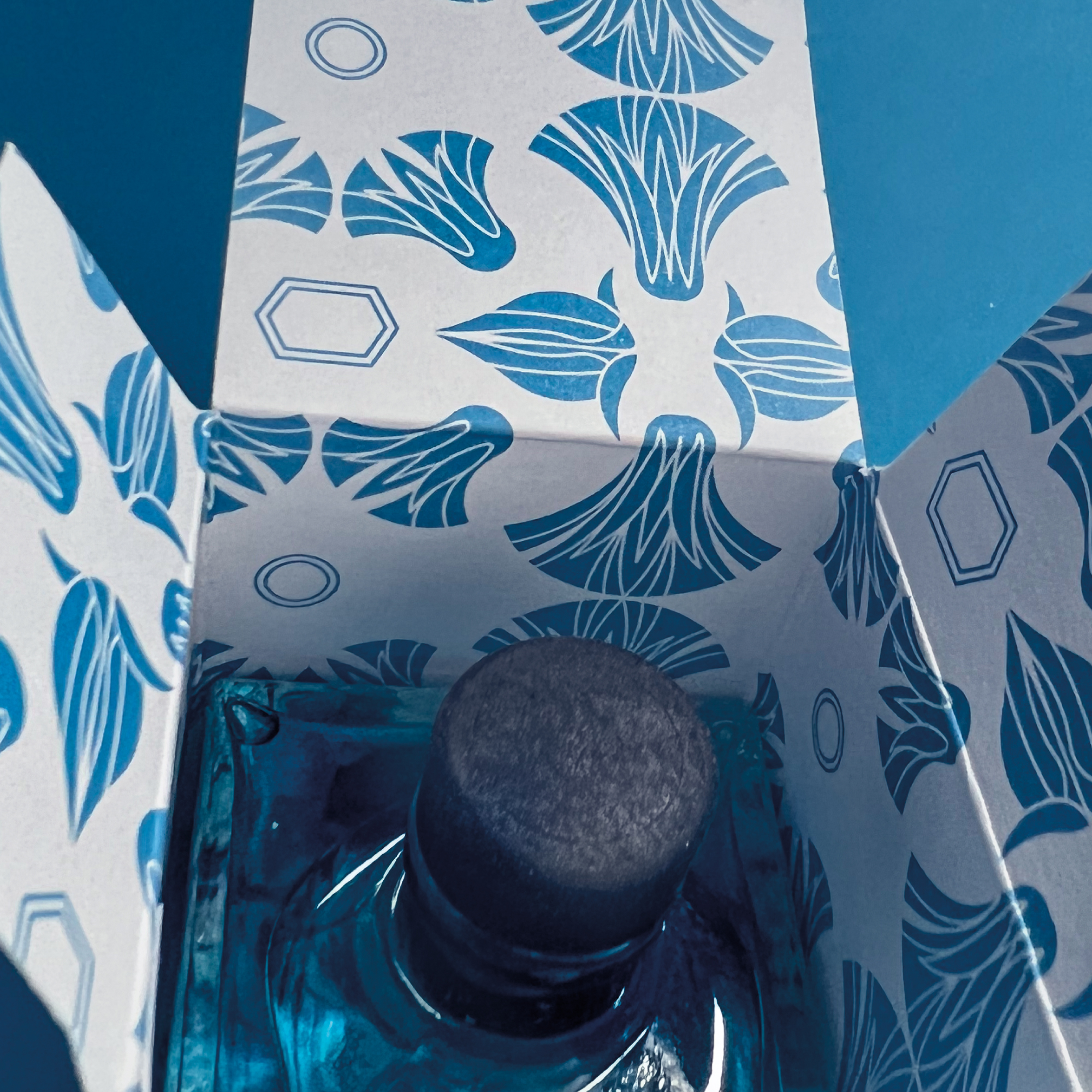
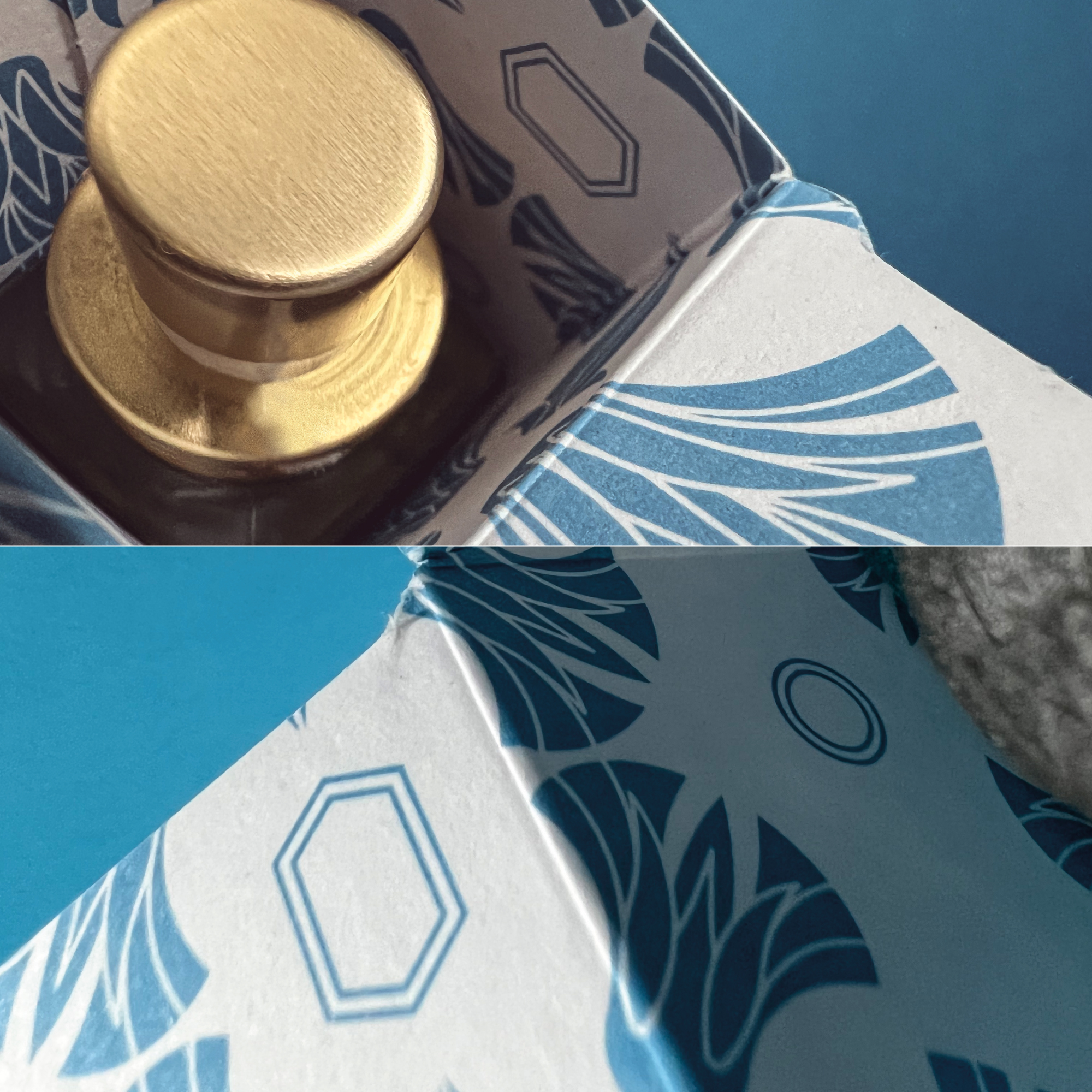
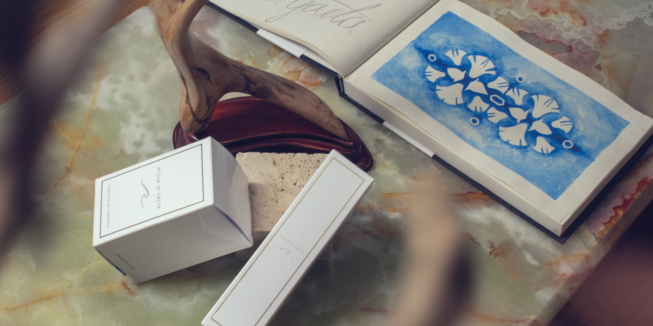
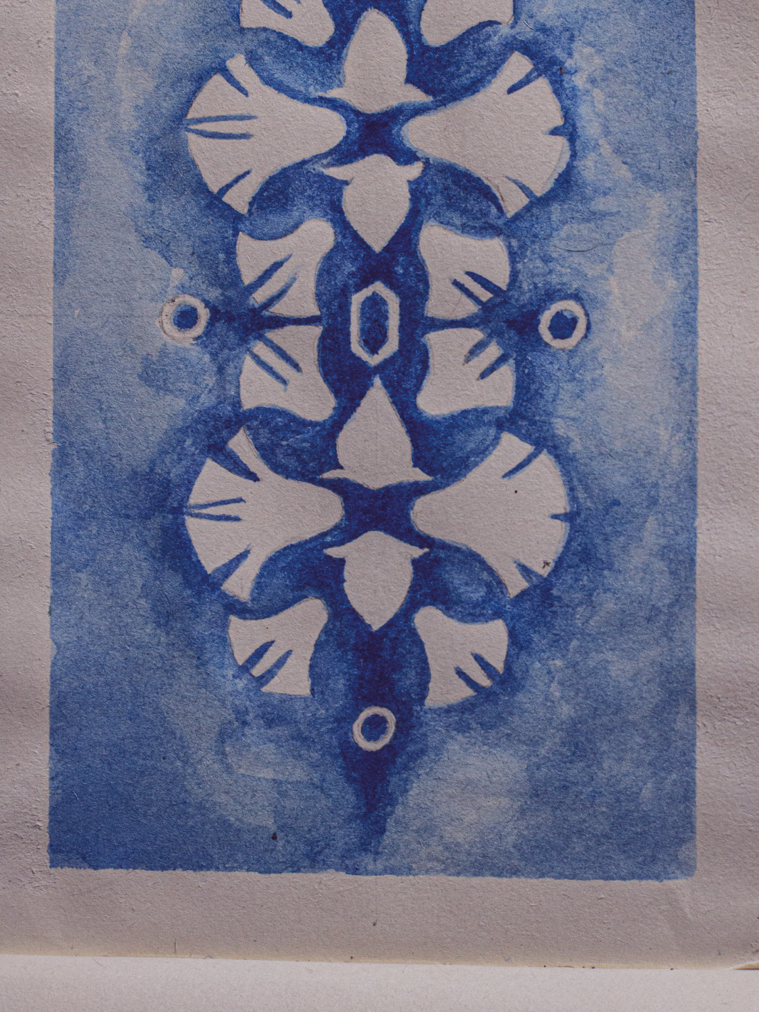
The request was for a texture capable of covering two packaging formats, while maintaining consistency with the brand communication and the ability to communicate Gaeta's Christmas 2021, characterized by themes and characters related to different concepts and worlds. That Christmas among the themes adopted for the luminaries was Pharaonic Egypt,
and after careful analysis I assessed that was the most suitable. I extracted an element of profound significance, from the correct symbolic connection with the brand, the Egyptian lotus, from its almost ubiquitous presence in Egyptian hieroglyphics. I redesigned its shapes, sequence and overall harmony resulting in what follows.
If you want discover more about the design, click here
If you want discover more about the design, click here
PREV. PROJECT
NEXT PROJECT
PROJECT SELECTION
↥
BACK
TO TOP
.COMMON
Simone Forcina©
our works
contacts
.NETWORKS
instagram
facebook
vimeo
behance
.PLACE
ITALY
Rome
Formia
.POLICY
Privacy
Cookie
.COMMON
Simone Forcina©
our works
contacts
.NETWORKS
instagram
facebook
vimeo
behance
.PLACE
ITALY
Rome
Formia
.POLICY
Privacy
Cookie
Simone Forcina {visual communication strategy & fine design 2022©/ p.iva 02828820593
Simone Forcina
{visual communication strategy
& fine design 2022©
p.iva 02828820593