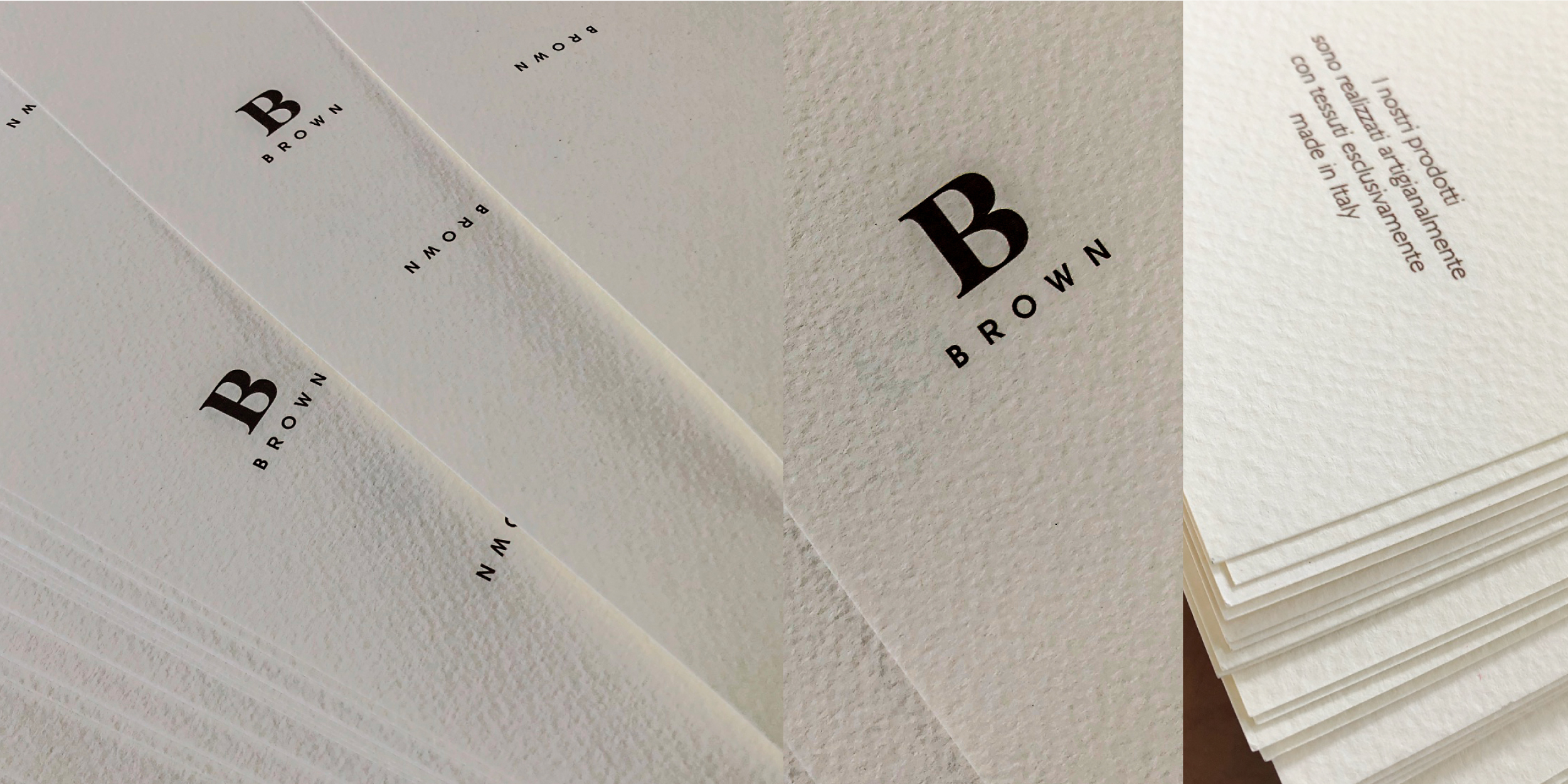
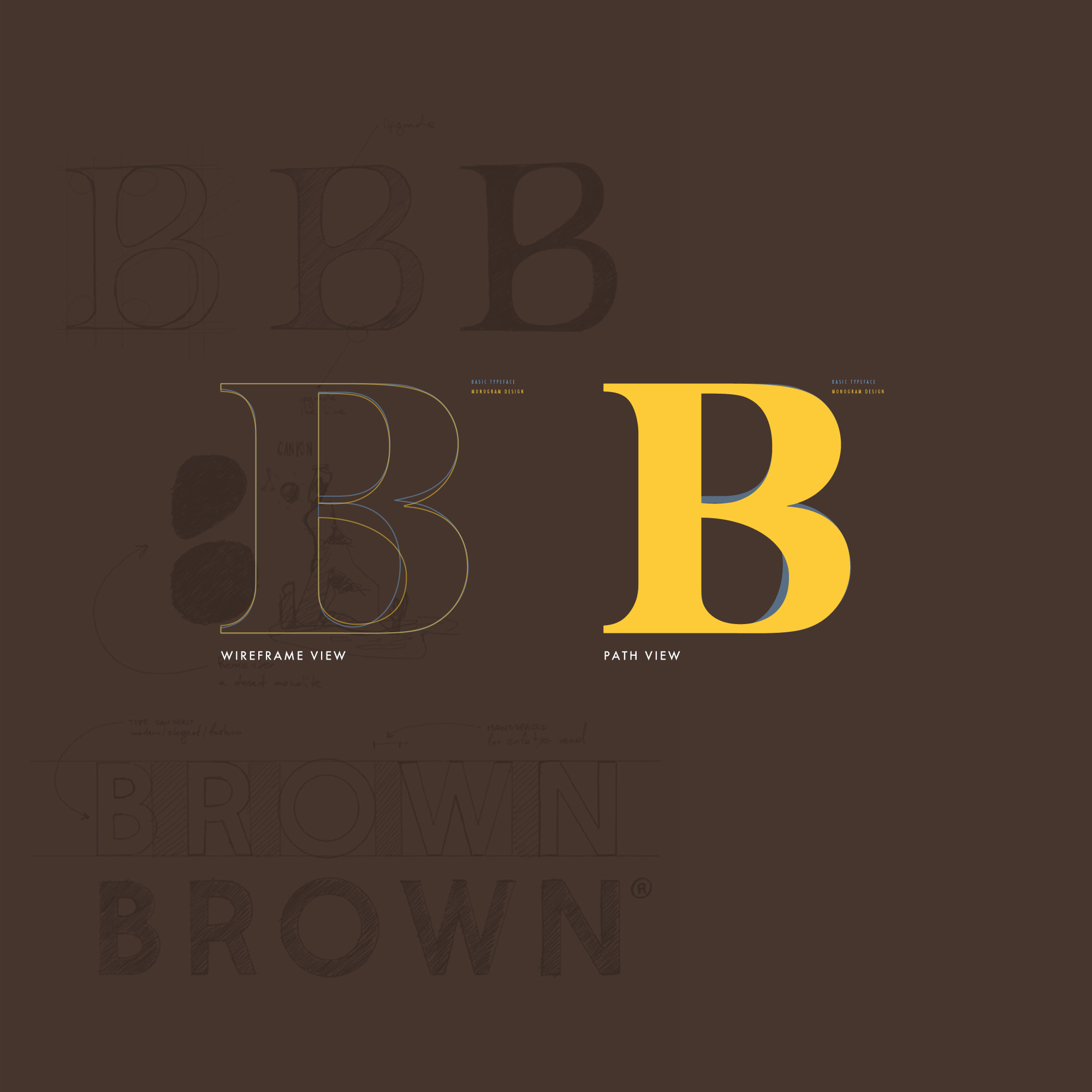
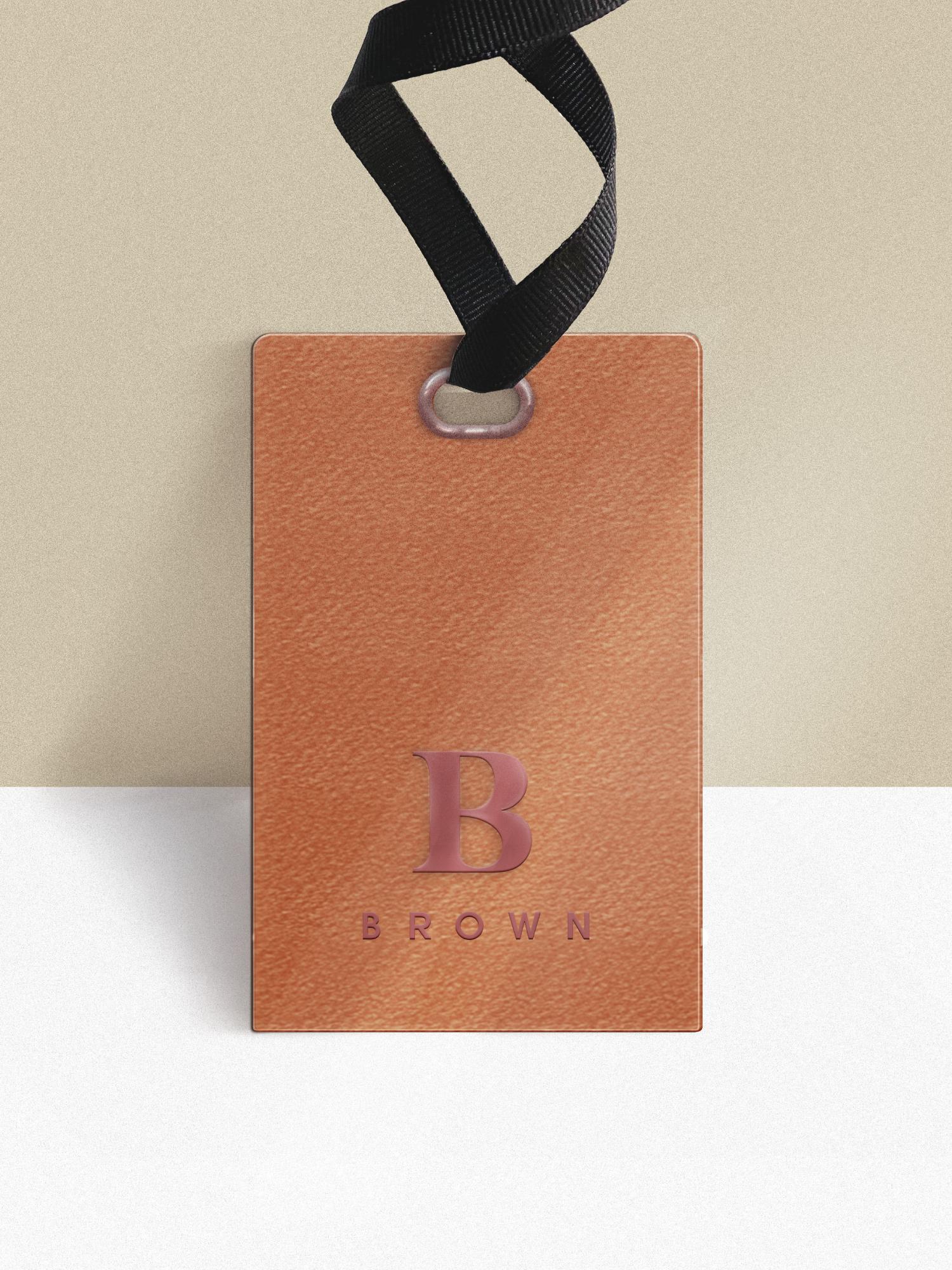
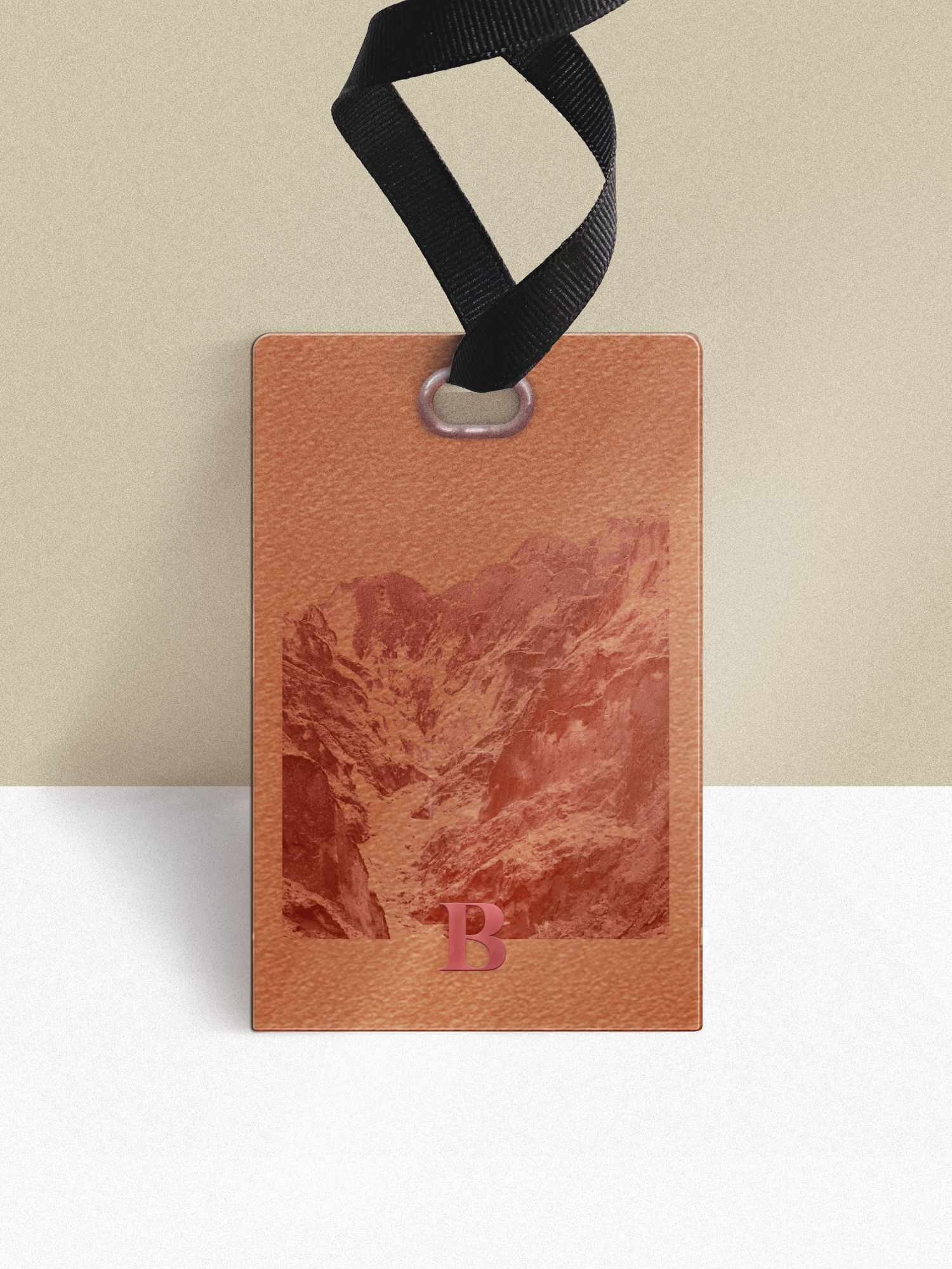
Through the use of a monogram extracted from a typographic family of origin
ancient Romanesque typeface,
it expresses an intrinsic value cultural value.
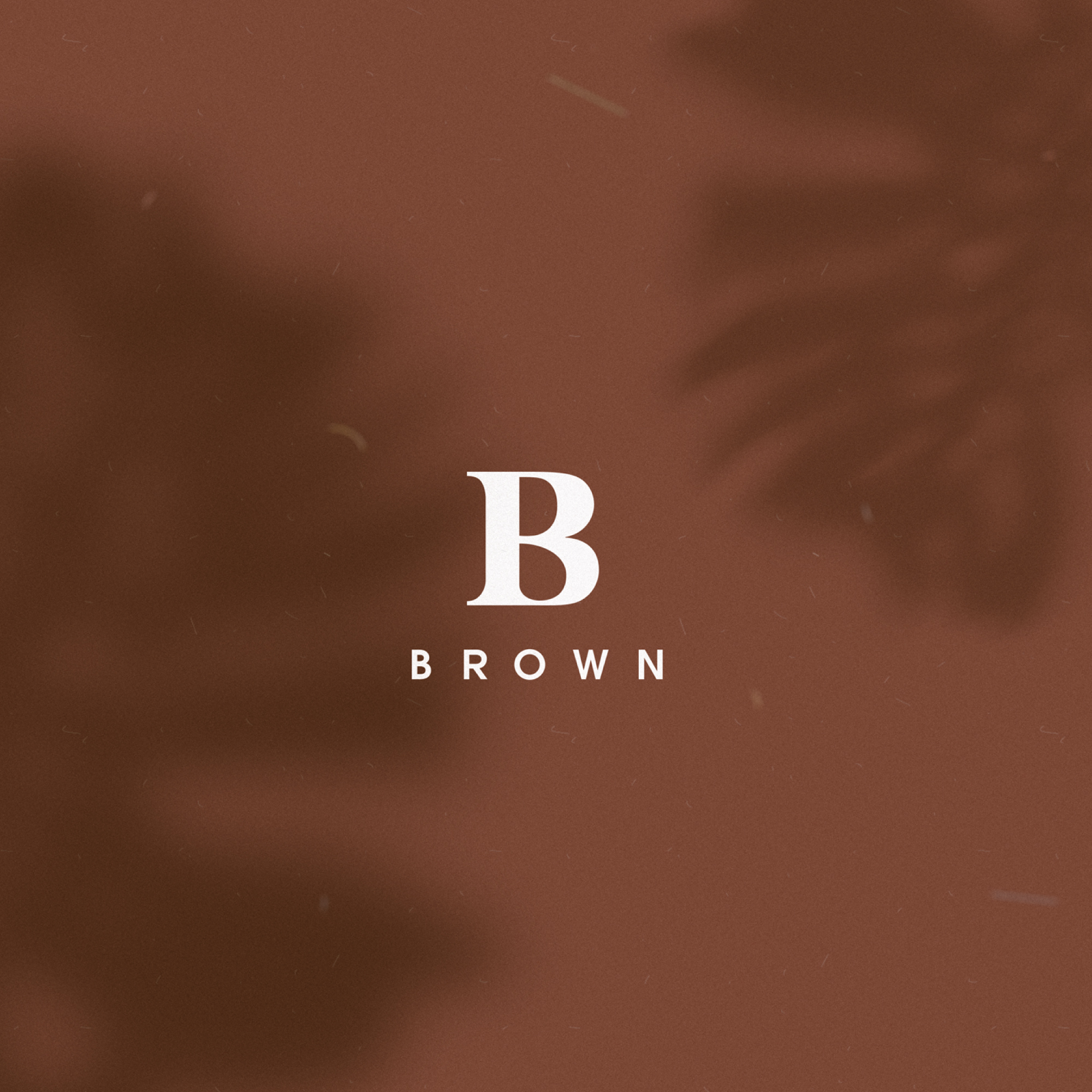
The character's graces are slender and elongated and convey in the reader
a feeling of elegance,
the sinuous curves of the 'B' help the concept of sensuality femininity,
and through a graphic intervention applied to the gaps created by the letter
a harmonisation of the curves, the concept of female sensuality was emphasised,
female sensuality.
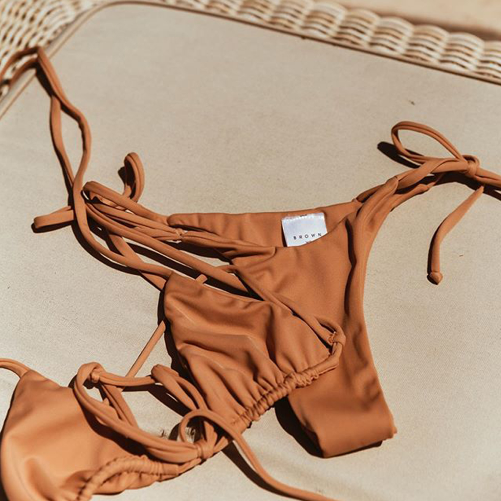
The monogram itself used as a brand identification symbol
is imprinted in people's perceptual past as a fashion symbol.

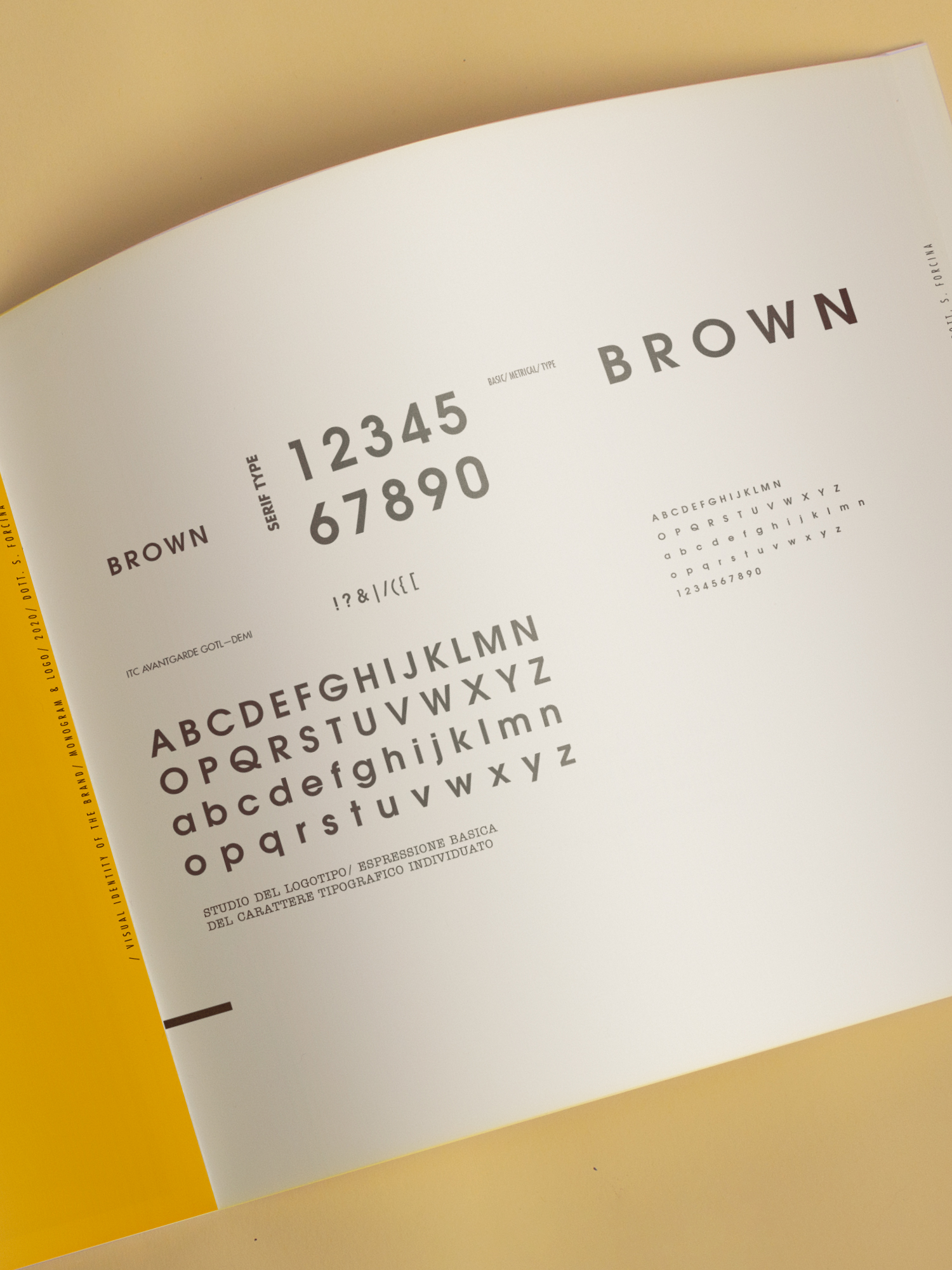
Wanting to emphasise this latter concept, we opted for a logo
'BROWN', typed or in a linear, graceless, geometric font,
capable of conveying elegance, technique, stability and refinement,
through a modern expression modern expression that, in contrast to the graced symbol,
tends to generate contrast and thus rhythm and visual rebound,
which psychologically corrupts the reader's gestalt by inducing interest.
Through the corporate colour, red-brown, the link is communicated with the earth,
understood as a natural element and ground of life.